JHDD Branding Report — 2026.07.28
Pentagram New York’s designs for the men’s health brand Rugiet feature unabashedly phallic elements.
These recent cases show that brands are increasingly defining their equity not by broad, unchallenging appeal, but through highly specific, sometimes unconventional, visual and conceptual choices. This specificity helps them navigate relevance in disrupted sectors or carve out unique market positioning. The focus shifts from universal acceptance to forging proprietary cultural signals that resonate deeply with defined audiences.
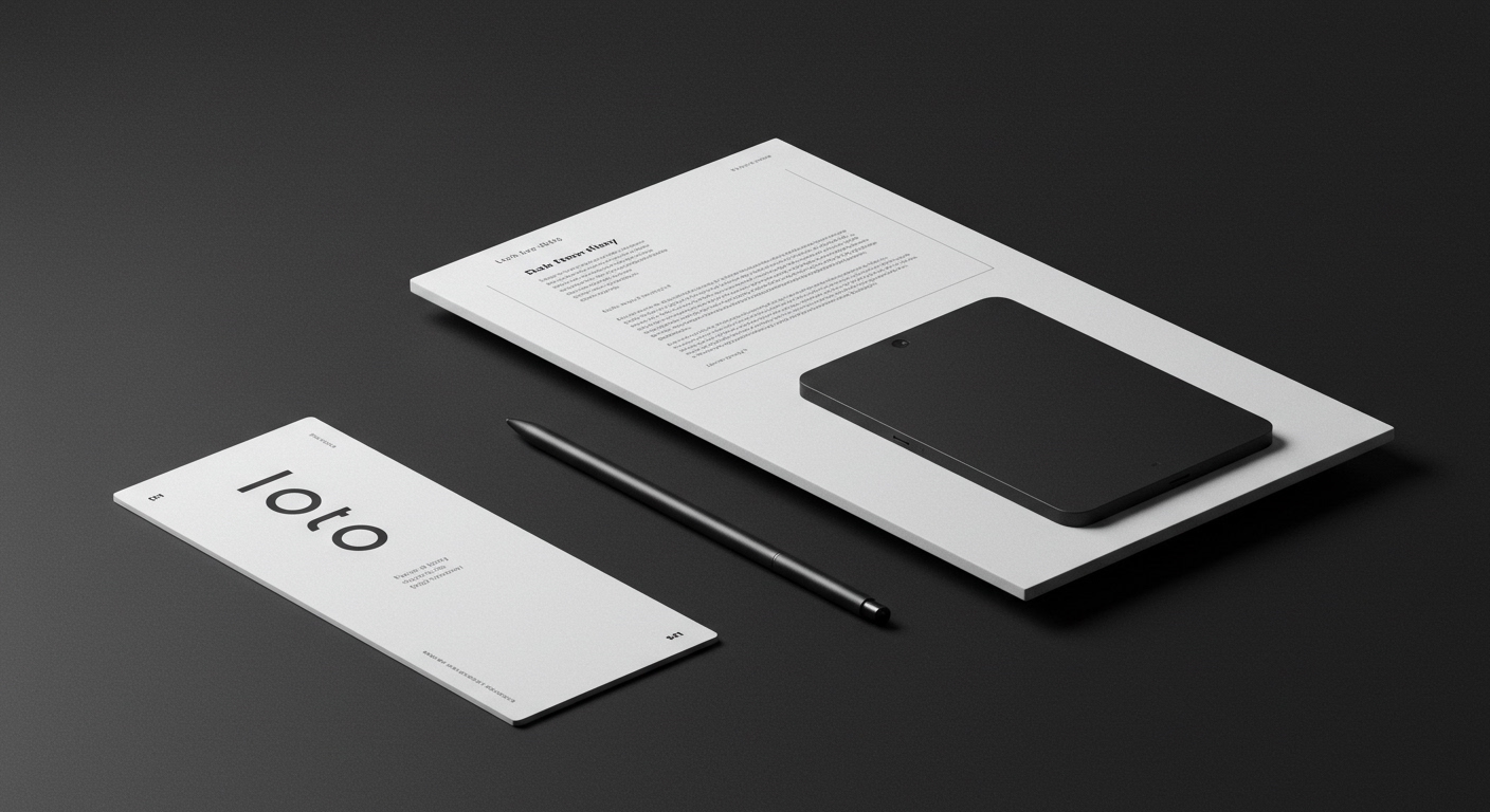
Consider Pentagram New York’s identity for Rugiet. Conventional wisdom dictates that health brands, especially those dealing with sensitive subjects, should adopt a clean, clinical, and universally inoffensive aesthetic, prioritizing broad acceptance. Yet, Pentagram leaned into designs described as “unabashedly phallic,” directly connecting the visual language to the product’s physiological intent. This approach directly contradicts the mainstream belief that safe, generalized visuals are paramount for building trust and ensuring accessibility across a wide demographic. Instead, this bold directness establishes an immediate, visceral connection with the product’s specific function and target demographic, effectively cutting through ambiguity and fostering a distinct sense of confidence and efficacy. The visual system does not pander to universal sensibilities; it declares its purpose with unapologetic clarity, creating a strong, memorable cultural signal for its intended users.
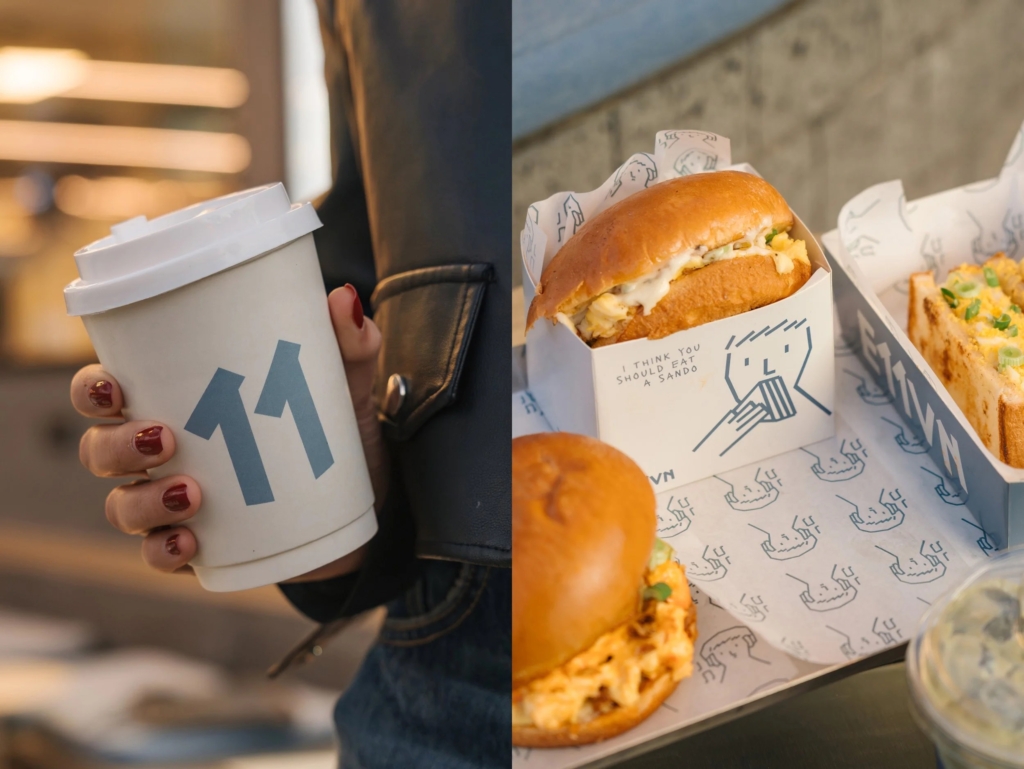
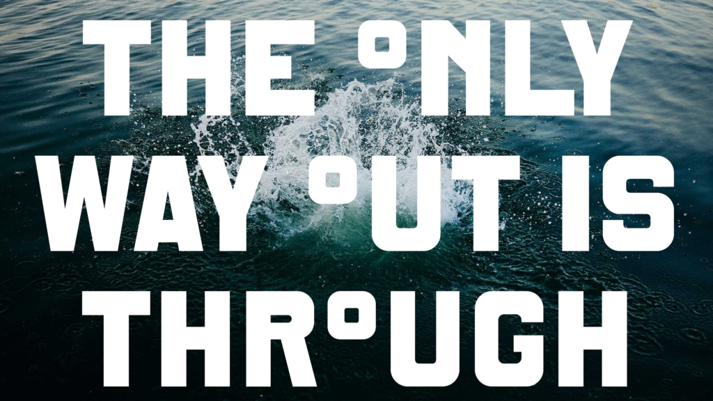
This move signals a strategic pivot for market positioning, away from sanitized, broadly appealing brand communication towards an assertive, even provocative, clarity that leverages cultural signals. The efficacy of Makebardo’s charming illustrations for Cairo cafe/music venue E11VN, which worked to “rescue a rather hideous brand name,” further emphasizes the critical power of a distinct visual identity to overcome verbal shortcomings or conventional category pressures. Similarly, DutchScot’s branding for Fjord, a sauna and cold plunge experience, deliberately avoids being exclusively positioned as “wellness.” Its “industrial, conceptual, and starkly beautiful” aesthetic places it uniquely between architecture, hospitality, and outdoor recreation. These examples collectively demonstrate that a brand’s visual language, when precise and unique, can override other potential brand weaknesses and build significant equity. In an increasingly AI-generated content landscape, where generic visuals can be easily replicated and diluted, unique and often daring visual systems become indispensable brand assets. By early 2028, brands that prioritize generalized, risk-averse visual languages for broad appeal will demonstrate measurably weaker recall and lower cultural resonance compared to those that embrace bold, specific differentiation, ultimately impacting their long-term equity.
This push towards specificity meets resistance from corporate brand governance committees and legal teams. Their mandate often prioritizes de-risking public perception and adhering to broad internal guidelines, inadvertently promoting a visual homogenization that erodes true brand distinctiveness. These internal forces often value absence of negative feedback over presence of strong positive cultural signaling, stifling the very qualities that build robust brand equity.
A branding professional should, this week, audit a current project’s visual identity for instances where “safety” might have diluted “specificity.” Specifically, challenge the team to articulate which elements, if made more pointed or unique, could strengthen the brand’s proprietary cultural signal, even if they appeal to a narrower, more defined audience. The goal is to maximize unique resonance, not minimize potential friction.
TL;DR
Brands build stronger equity by using distinctive visual identity to declare specific cultural signals, rather than seeking broad, generic appeal.
Curated References


About this editorial — This piece was developed using AI-assisted research and curation across multiple industry sources. All analysis, opinions, and predictions represent the editorial perspective of JHDD. Sources are linked in the references section above.