JHDD Branding Report — 2026.07.27
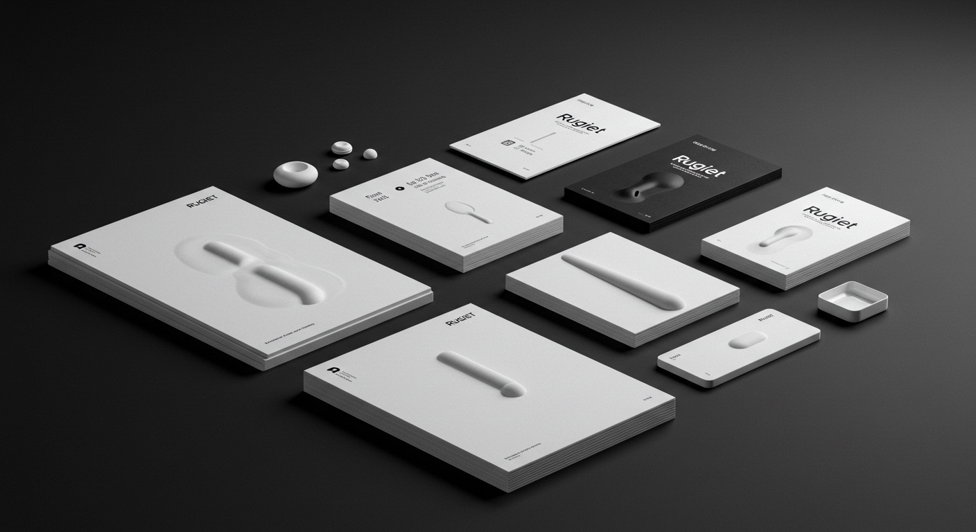
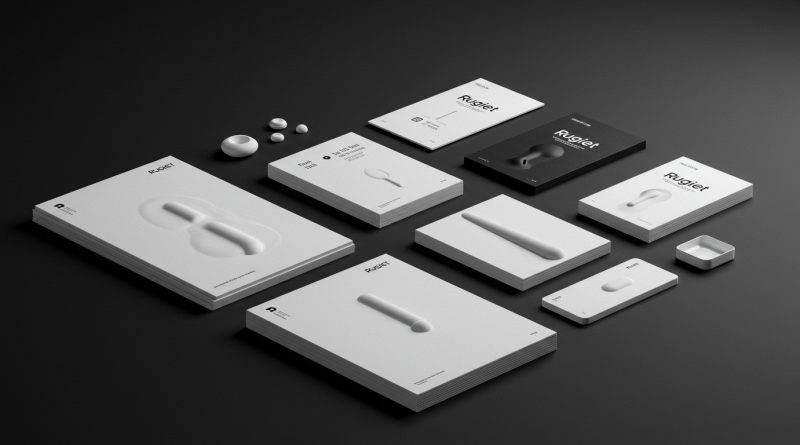
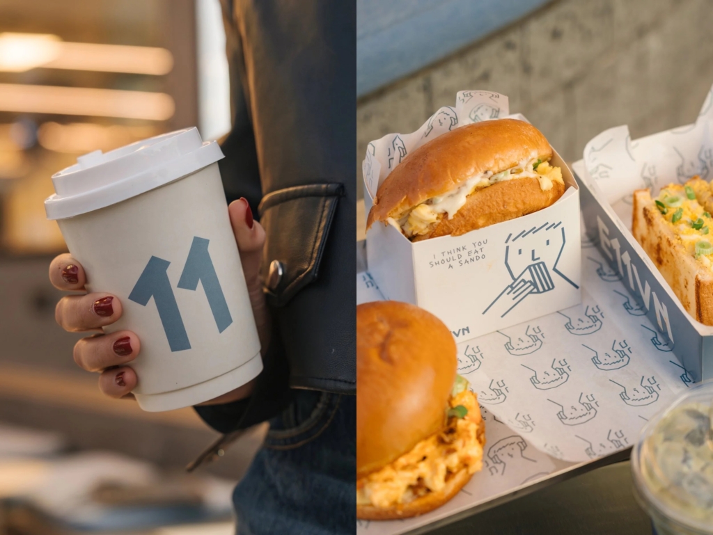
Pentagram New York’s work for Rugiet uses unabashedly phallic designs for the male health brand. This signals a strategic embrace of highly specific, even provocative, visual cues and conceptual positioning across disparate brand categories. Rather than seeking broad appeal through neutrality, these brands are doubling down on distinctive signals to carve out market space. The effectiveness of Makebardo’s charming illustrations for E11VN, or DutchScot’s industrial aesthetic for Fjord, demonstrates a growing conviction that brand equity is built through sharp differentiation, even when it challenges conventional notions of taste or category norms.
The prevailing industry opinion often suggests that overtly symbolic or challenging visual identities carry undue risk, potentially alienating broader consumer bases and hindering market acceptance. However, Rugiet’s branding actively contradicts this conservative view. Its direct, confident visual language, especially for a telehealth company founded in 2020, bypasses euphemism to establish immediate recognition and trust. This approach repositions the brand from a generic health solution to an unapologetic, effective one, speaking directly to an audience that values straightforwardness. The phallic imagery, far from being a liability, becomes a signal of transparency and confidence, fostering a strong, almost tribal, connection with its specific demographic.
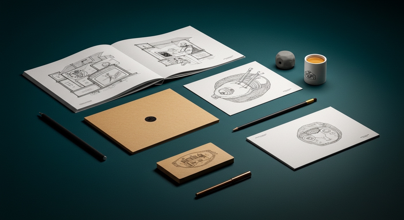
This strategic pivot towards explicit specificity in visual identity systems is a powerful driver of market positioning. For brands like Fjord, DutchScot’s deliberate placement between architecture, hospitality, and outdoor recreation, rather than solely within the “wellness” category, creates a richer, more defined brand equity. This precise positioning attracts a psychographic seeking a particular kind of experience, differentiating it sharply from the glut of generic wellness offerings. By mid-2027, more brands in categories historically characterized by cautious communication will adopt similarly direct and conviction-led visual identities, recognizing that focused authenticity can cultivate deeper engagement and loyalty than broad, diluted appeal.
The primary opposing force to this trend comes from established market gatekeepers and corporate brand strategy departments. These entities often prioritize risk aversion, fearing potential consumer backlash or regulatory scrutiny, leading them to favor universally acceptable, anodyne aesthetics. Their cautious approach aims to minimize negative reception, but in doing so, it frequently sacrifices distinctiveness and creates brands that struggle to achieve memorable cultural signals.
A working Branding professional should actively challenge internal and client assumptions about what constitutes “safe” or “acceptable” communication this week. Instead, focus on how specific, even provocative, visual cues directly reinforce the core brand promise and establish a resonant connection with a precisely defined target audience. This means evaluating a brand’s potential for equity growth through its unapologetic specificity, rather than its universal palatability.
TL;DR
Brands are gaining equity through deliberate, bold specificity in visual identity and market positioning.
Curated References

About this editorial — This piece was developed using AI-assisted research and curation across multiple industry sources. All analysis, opinions, and predictions represent the editorial perspective of JHDD. Sources are linked in the references section above.