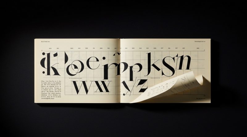
JHDD Typography Report — 2026.07.25
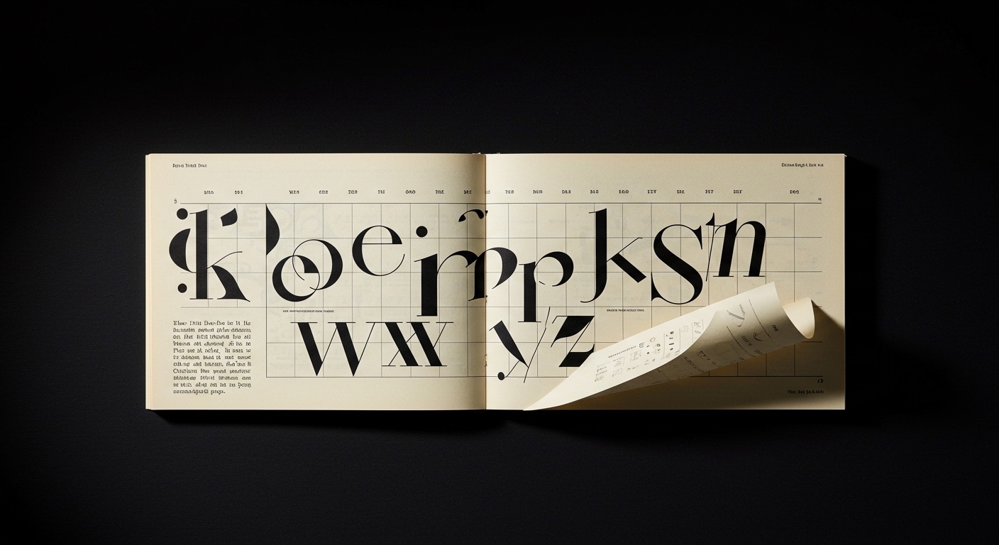
Milton Glaser’s 1957 menswear catalog cover demonstrates a clarity of purpose that transcends immediate trends.
The disparate accounts of historical design, contemporary creative leadership, and narrative illustration reveal a consistent pattern: effective communication in design, particularly in typography, arises from a deep consideration of context and human experience. Whether designing for a clothing brand, a children’s book, or collective political action, the underlying success stems from intentional decisions about how letterforms and their arrangement serve a specific communicative goal, rather than from a pursuit of novelty for its own sake.
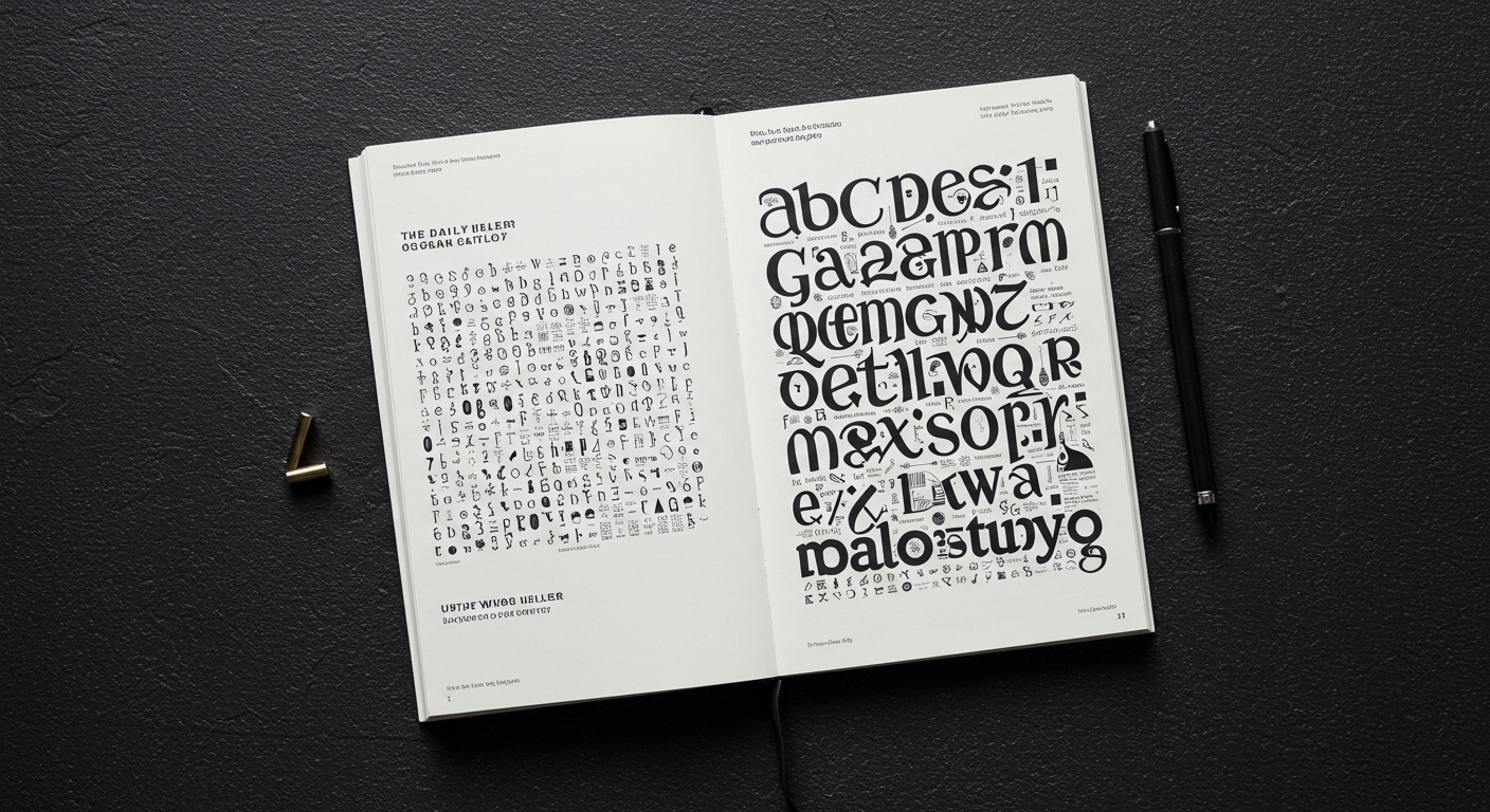
Mark Nichols, Creative Director at WMH&I, articulates a design philosophy rooted in “curiosity, nature, and the joy of making.” This perspective subtly challenges the prevalent industry narrative that prioritizes purely technological advancement or algorithmic generation in typographic design. While mainstream opinion often touts the efficiency and aesthetic variety of AI-driven font creation, Nichols’s emphasis on foundational creative processes suggests that the most impactful conceptual letterforms emerge from a designer’s empathetic understanding of human interaction with text. Superficial typographic experimentation, often celebrated for its visual flair, frequently compromises legibility when applied without rigorous contextual testing. This leads to designs that are visually striking but functionally deficient, particularly in micro-typography where subtle adjustments dictate reading comfort and comprehension.
A critical view, therefore, posits that an overreliance on automated font generation, even when producing visually “interesting” results, can degrade the nuanced interplay between form and function essential for sustained reader engagement. True innovation in legibility often resides in painstaking attention to detail within established grid systems. By mid-2027, forward-thinking brands will move beyond generic variable fonts and invest significantly in bespoke typographic systems where micro-typographic parameters are precisely tuned for specific digital environments and content types, prioritizing measurable cognitive load reduction over broad stylistic appeal. This will drive a re-evaluation of how grid systems are defined, moving from static frameworks to dynamic, responsive foundations that adapt typographic expression for optimal legibility across diverse platforms.
This return to foundational design principles faces resistance from the rapid-deployment culture fostered by template-driven design platforms and marketing strategies focused on immediate, often superficial, visual impact. The pressure to produce “on-trend” designs quickly, without the time for deep typographic exploration or user testing, often results in compromised legibility and a diluted conceptual voice.
Working Typography professionals should, this week, select a recurring content block within an existing digital product and conduct A/B testing on subtle micro-typographic adjustments—specifically, variations in tracking, leading, and character spacing for distinct language sets—within the current grid system. Document the impact on user engagement metrics, such as scroll depth or time on page, to quantify the practical value of precise typographic craft beyond aesthetic judgment.
TL;DR
Effective typography prioritizes context, craft, and measurable legibility over trend-driven novelty or automation.
Curated References
About this editorial — This piece was developed using AI-assisted research and curation across multiple industry sources. All analysis, opinions, and predictions represent the editorial perspective of JHDD. Sources are linked in the references section above.