JHDD Packaging Report — 2026.07.25
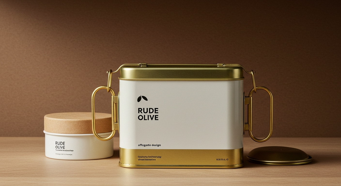
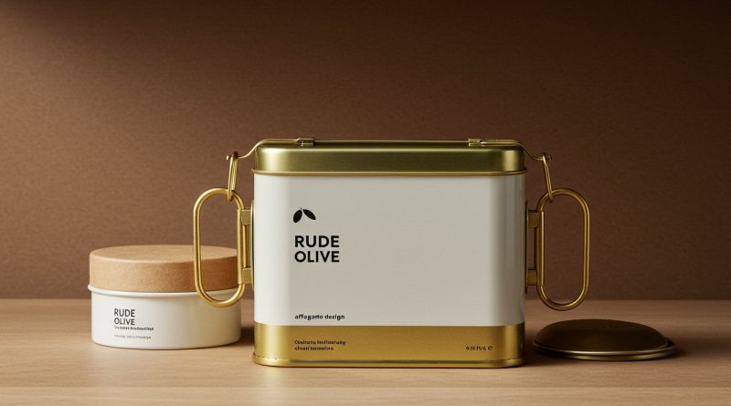
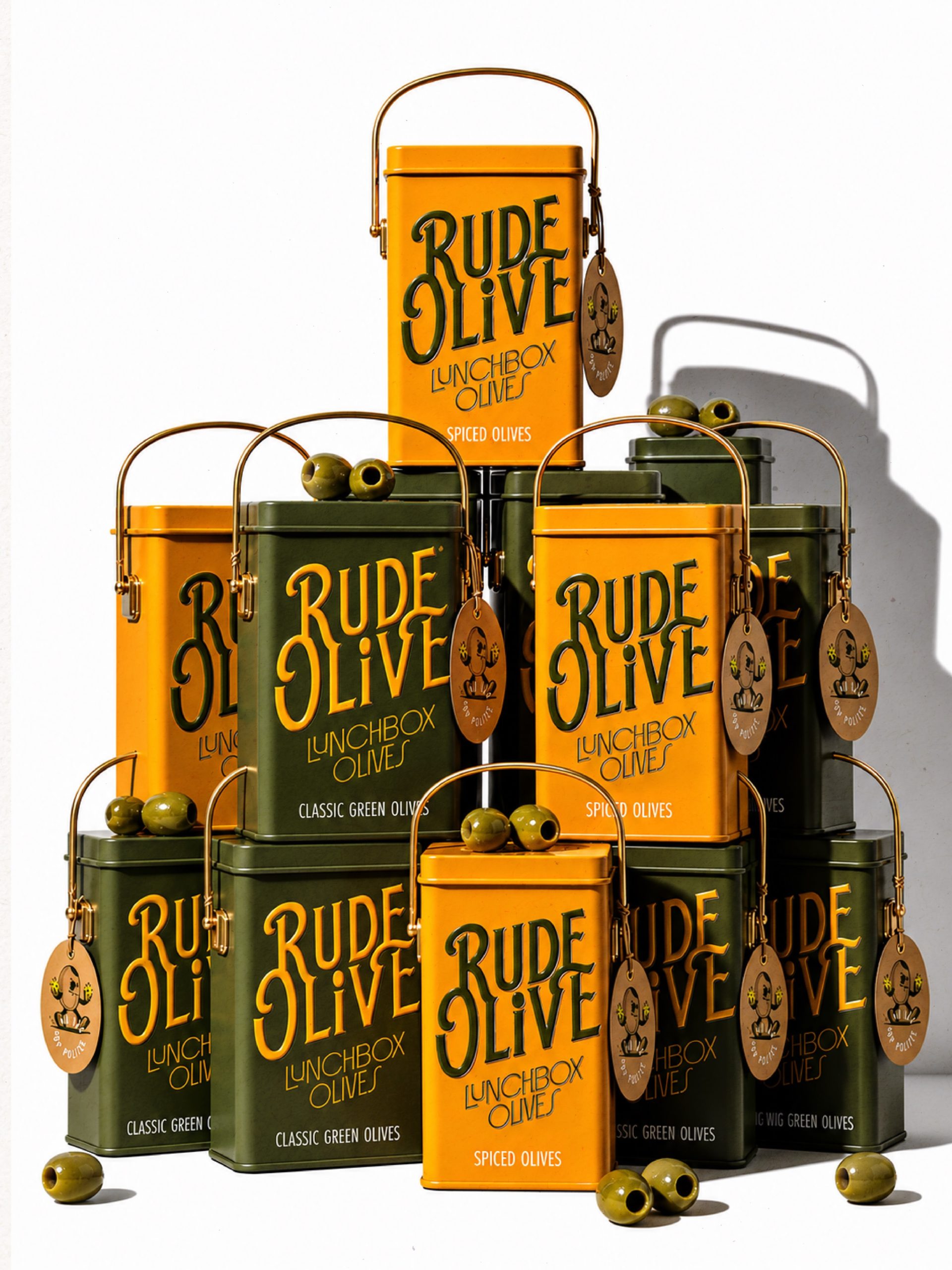
Rude Olive’s conceptual lunchbox tin, designed by Affogato Design, features brass swing handles, inviting interaction and establishing immediate character.
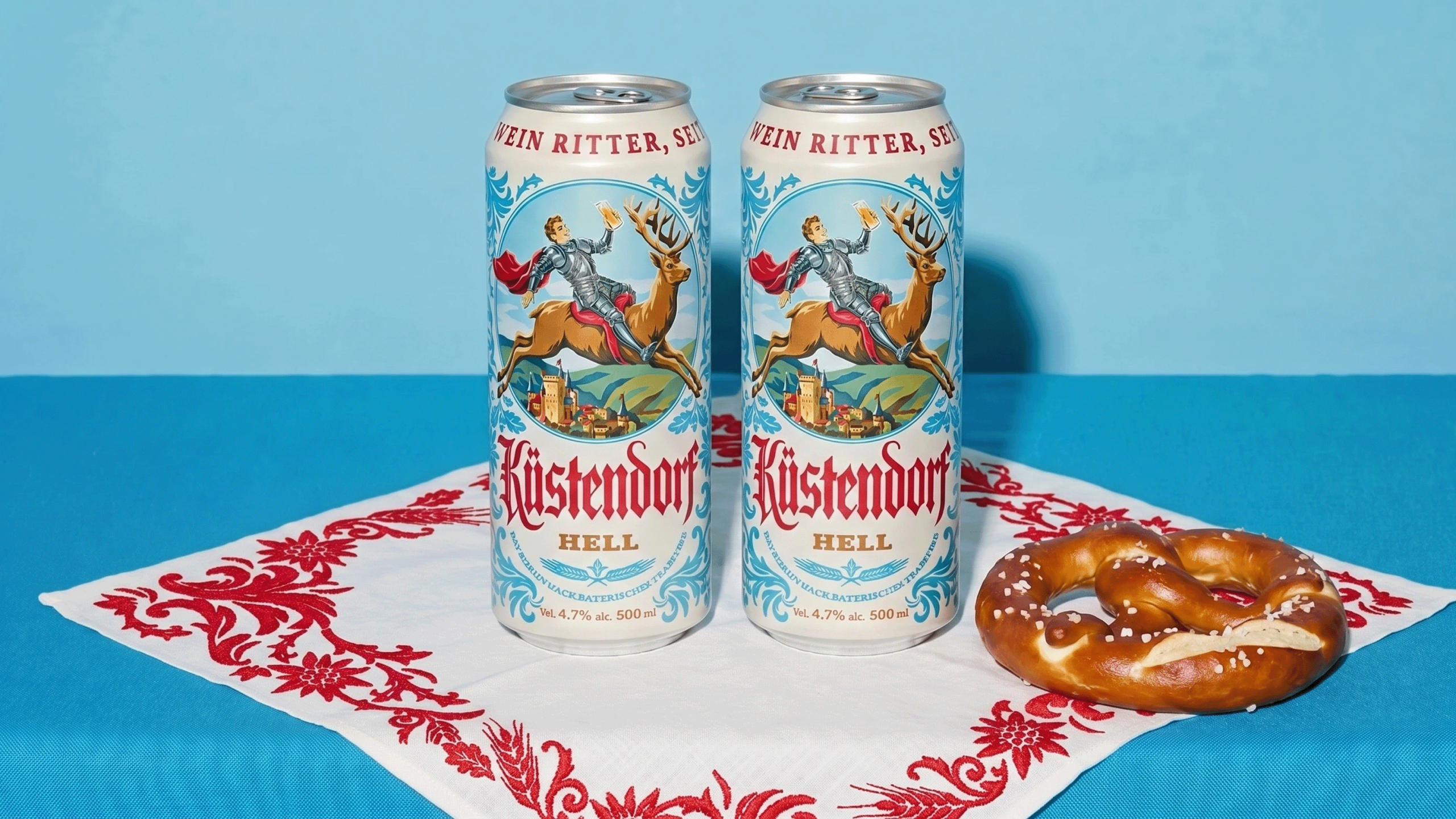
This detail, alongside Hi*Ball’s “whispering” energy drink design and Kustendorf’s “smirking knight,” reveals a specific trend: packaging is increasingly designed to articulate nuanced brand personality through physical touchpoints and understated visual cues. These examples move beyond simple product identification; they actively cultivate a relationship with the consumer, embedding brand identity within the material and form rather than relying solely on overt messaging. The very design of objects like the Rude Olive tin, which champions durability and a desirable aesthetic, implicitly contributes to sustainable practices by encouraging reuse and retention, a subtle form of material stewardship that extends beyond typical ‘recyclable’ or ‘compostable’ labels.
Elizabeth Goodspeed’s branding for Leaven, with its retro-inspired type and soft color palette for an instant sourdough, demonstrates this shift from overt messaging to nuanced character. Conventional wisdom dictates that packaging for a food product, particularly one aiming for speed like “instant sourdough,” should emphasize freshness, naturalness, or convenience with bright, straightforward graphics and clear call-outs. Goodspeed, however, leverages a sophisticated, understated aesthetic to evoke comfort and authenticity without resorting to stereotypical tropes. This approach contradicts the mainstream belief that direct visual appeals to category-specific attributes are always most effective. Instead, it proves that creating an emotional resonance through carefully considered typography, subtle color gradients, and evocative microbe illustrations by Cari Vander Yacht, can achieve stronger shelf impact and build deeper brand loyalty. This also implicitly addresses sustainability by designing for retention – if the package is beautiful and distinctive, it encourages a more thoughtful consumer relationship, reducing the impulse for immediate disposal. This move toward sophisticated understatement will likely become a dominant force, with many CPG brands pivoting to visually quieter, more character-driven designs that invite closer inspection by late 2027.
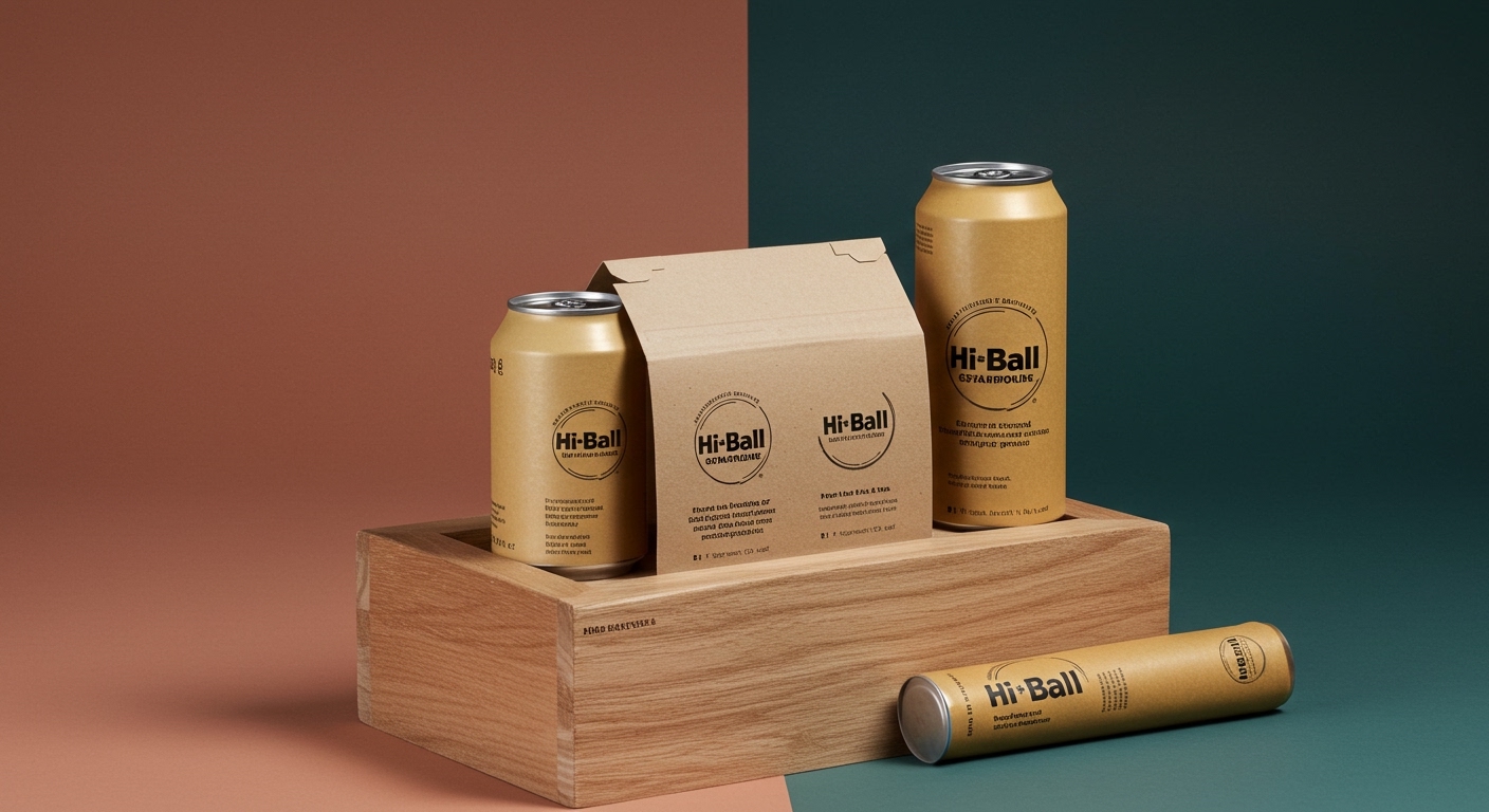
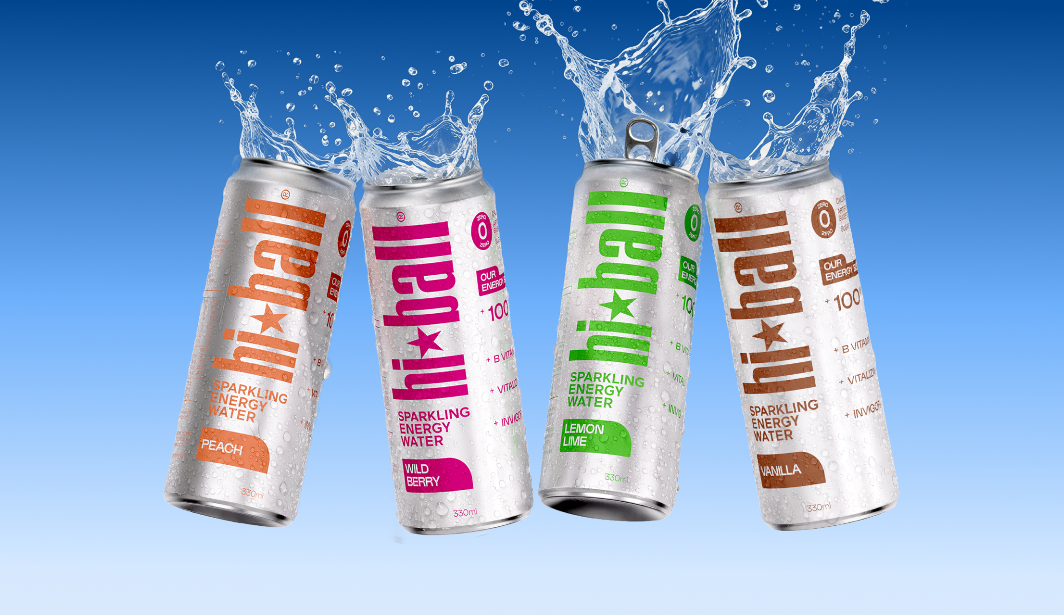
The HiBall redesign exemplifies a strategic embrace of this quiet authority, especially pertinent for shelf impact and unboxing. While many energy drink brands rely on aggressive graphics, bold colors, and an overall visual shout to signal potency and excitement, HiBall chose a stripped-down aesthetic. This challenges the industry’s ingrained assumption that high-energy products require high-energy visuals, particularly for first-time buyers. The resulting “whisper” on the shelf, with its simplified form and understated graphics, creates a distinct tactile and visual differentiation, making the product feel more considered and less frantic. This approach suggests that a deliberately restrained unboxing experience, focusing on the quality of the can or bottle and refined simplicity, can be more memorable and contribute to perceived product quality than a flashy, over-engineered one. From a tactile branding perspective, the absence of visual noise directs attention to the product’s form and material, subtly elevating its presence. By early 2028, tactile branding will frequently prioritize sensory integrity and quiet confidence over elaborate, transient “wow” factors, especially in premium and lifestyle categories where long-term engagement is key.
The primary opposing force to this design evolution remains entrenched production efficiencies and marketing departments fixated on maximizing billboard effect and instantaneous data-driven conversion metrics. These forces often prioritize cost-cutting in materials and printing, leading to generic visual language and a reluctance to invest in unique tactile finishes or bespoke structural forms that carry a higher per-unit cost. Large-scale retail environments, with their emphasis on rapid stock rotation and clear, unmissable communication, also often resist subtlety.
A working Packaging professional should, this week, audit one of their current product lines for overlooked sensory opportunities. Instead of focusing solely on visual branding, consider how the weight, texture, or even the sound of opening the package could reinforce the brand’s unique character. Explore material finishes or structural elements that invite deliberate interaction, moving beyond purely functional roles to build emotional connection.
TL;DR
Packaging is evolving to convey nuanced brand personality and build deeper connections through understated visuals and thoughtful tactile engagement.
Curated References


About this editorial — This piece was developed using AI-assisted research and curation across multiple industry sources. All analysis, opinions, and predictions represent the editorial perspective of JHDD. Sources are linked in the references section above.