JHDD Branding Report — 2026.07.22
Pentagram’s designs for the men’s health brand Rugiet feature unabashedly phallic visual elements.
These recent examples indicate a growing trend where brand strength is increasingly derived from highly specific, even provocative, visual identities and niche cultural positioning. This approach allows brands to carve out distinct market spaces, often overcoming other perceived weaknesses, by communicating with extreme clarity to a defined audience rather than aiming for generalized appeal. It marks a shift away from universal, sanitized aesthetics towards a more direct and often challenging visual language.
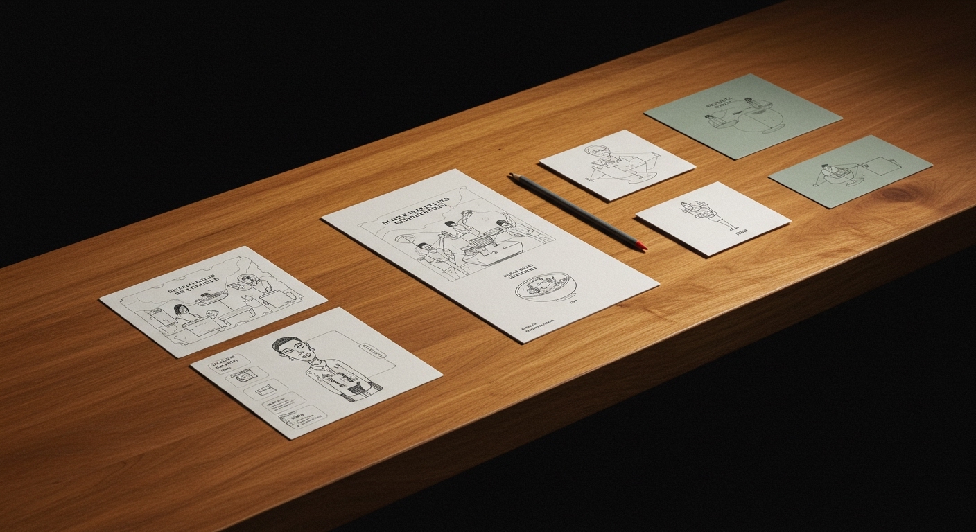
The conventional wisdom that brands must meticulously avoid any potential offense to build broad market acceptance is being actively disproven. Pentagram’s work for Rugiet, for instance, directly confronts this, deploying a visual identity that embraces its phallic nature. This strategy, applied to a men’s health product sold exclusively online, clearly targets a specific demographic willing to engage with direct visual language rather than euphemism. The success of such a bold, distinctive approach demonstrates that for certain market segments, brand equity is fortified through unflinching specificity and resonance with a particular cultural signal, even if it might alienate a broader, less relevant audience. This prioritizes deep connection over wide, shallow recognition. By early 2028, brand equity assessments will increasingly incorporate metrics for cultural specificity and resonance within defined sub-segments, rather than solely relying on mass-market familiarity and avoidance of controversy.
DutchScot’s branding for Fjord, a floating sauna and cold plunge experience, similarly avoids a generic “wellness” aesthetic. Instead, it employs an industrial, conceptual, and starkly beautiful visual identity that positions it deliberately between architecture, hospitality, and outdoor recreation. This strategic blurring of traditional categories, supported by a strong and distinct visual system, enables Fjord to attract an audience that values its unique offering beyond a typical health spa. The brand builds equity by signaling an elevated, curated experience that resonates with specific lifestyle aspirations. JKR’s overhaul of football club Sporting CP also exemplifies this trend, not through provocation, but by intensely plundering heritage to construct a robustly simple, contemporary brand identity. This approach strengthens cultural bonds and brand loyalty by evolving deeply familiar visual elements into a modern system, validating the existing community while attracting new followers through a clear, authentic aesthetic statement.
This shift towards specific, often daring, brand expressions will face resistance from established brand governance structures and legal departments within larger, risk-averse organizations. These entities typically prioritize the mitigation of any potential negative public perception, often resulting in bland visual guidelines and generic market positioning that dilute distinctiveness in favor of broad, unchallenging acceptance.
A branding professional should prioritize comprehensive ethnographic research and subculture analysis when defining a target audience, seeking out the nuanced visual codes and cultural signals that resonate deeply with specific communities. This insight should then directly inform the visual identity system, allowing for bold, direct, and non-generic design choices that build strong equity within that precise niche.
TL;DR
Effective brand equity is now built through culturally specific, bold visual identities that challenge broad appeal, rather than through generalized aesthetics.
Curated References


About this editorial — This piece was developed using AI-assisted research and curation across multiple industry sources. All analysis, opinions, and predictions represent the editorial perspective of JHDD. Sources are linked in the references section above.