JHDD Typography Report — 2026.07.20
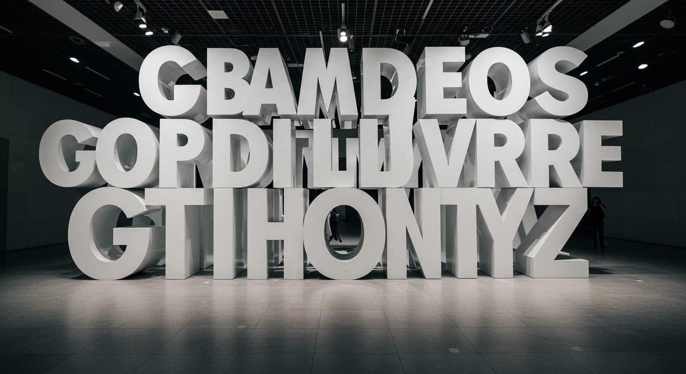
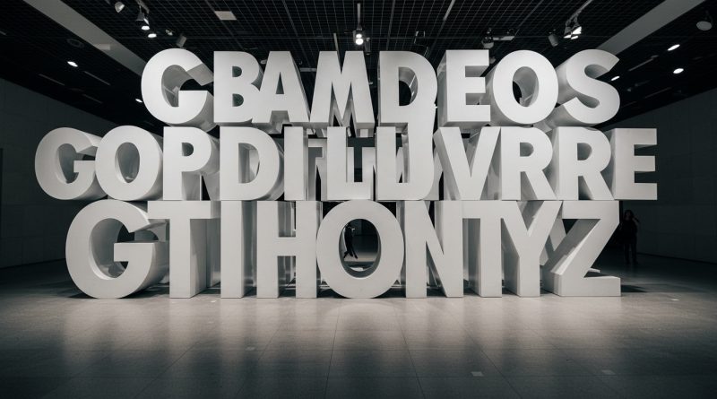
The Obama Presidential Center’s Words of Hope installation uses 458 oversized Gotham Bold letters, demonstrating a specific monumental application of typography.
This project, alongside Taschen’s dissection of brand components and the Sustainable Brands Conference’s focus on trust, reveals a growing tension between the visible manifestations of typography and its less tangible, yet foundational, roles in communication and perception. The physical scale of letterforms is expanding while the underlying mechanisms of meaning-making are being redefined by commercial and architectural demands. Historical perspectives, such as Pope Leo XIV’s exhibition of wood type at the Vatican Apostolic Library, highlight a long-standing dialogue between form, material, and conceptual weight that resonates in contemporary practice.
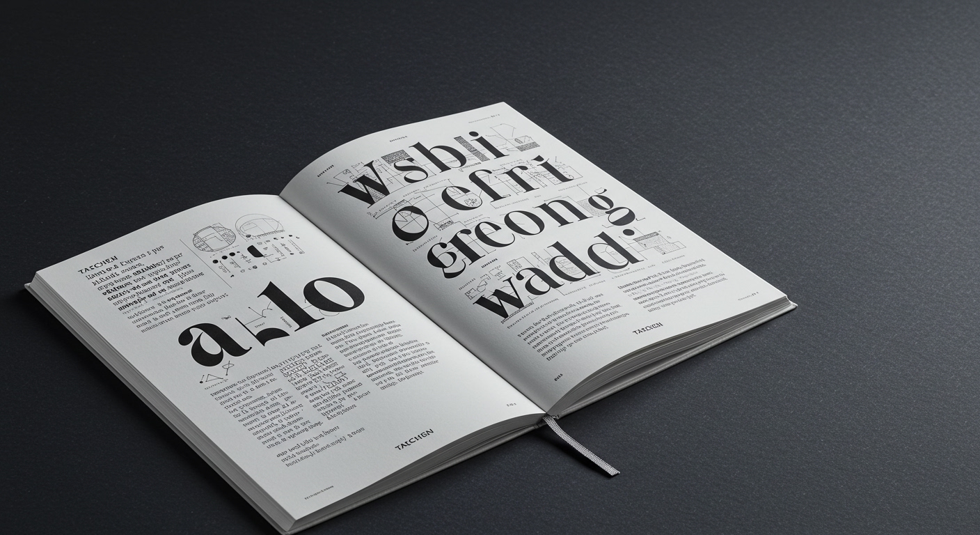
The mainstream industry often celebrates the sheer scale of projects like the Words of Hope installation as a peak achievement for typography, equating monumentality with impact. This perspective frequently oversimplifies legibility, reducing it to mere readability from a distance. However, true legibility, especially when letterforms transition into architectural elements, demands a sophisticated understanding of context, material interaction, and human experience beyond just the visual parsing of characters. The conceptual weight of such letters, detached from traditional textual flow, functions less as direct communication and more as symbolic declaration. This approach, while visually arresting, often overlooks the subtle micro-typography that truly builds comprehension and trust, a void hinted at by Taschen’s cataloging of visible brand design and the unspoken elements that actually construct a brand’s essence.
A view that contradicts mainstream industry opinion is that the emphasis on grand-scale, sculptural typography, while attracting media attention, often distracts from the core principles of legibility and the intricate grid systems that underpin coherent communication. Designers are increasingly pressured to create “iconic” typographic statements, often at the expense of how these elements integrate into a larger, functional information hierarchy. The Sustainable Brands Conference 2026 highlights trust and communication as critical for brands. True trust is built not just by imposing large letters, but by consistent, clear, and conceptually sound typographic choices at every scale, including the often-ignored micro-typography within legal disclaimers or user interfaces. Without this deeper engagement, these monumental efforts risk becoming purely decorative by mid-2028, lacking the functional depth required for sustained brand connection.
The primary opposing force is the persistent, short-term commercial demand for immediate visual impact and novelty. Brand managers, often influenced by metrics of “impressions” or “social media shareability,” prioritize striking conceptual letterforms that photograph well over the nuanced, systematic application of typography that prioritizes long-term legibility and subtle brand resonance. This often manifests in the proliferation of visually complex display faces or the decontextualization of classic typefaces like Gotham Bold into purely sculptural forms, where their original micro-typographic integrity is secondary to their monumental presence.
A working Typography professional should, this week, analyze a brand’s communication not only at its most prominent points (logos, headlines) but also intensely scrutinize its micro-typography within user agreements, product labels, or footnotes. Focus on how the grid system and letter spacing function in these often-overlooked areas to ensure clarity and convey credibility, applying the same rigor to these details as to major display type.
TL;DR
Monumental typography captures attention, but robust brand communication and true legibility demand a deep engagement with micro-typography and consistent grid systems.
Curated References
About this editorial — This piece was developed using AI-assisted research and curation across multiple industry sources. All analysis, opinions, and predictions represent the editorial perspective of JHDD. Sources are linked in the references section above.