JHDD Branding Report — 2026.07.18
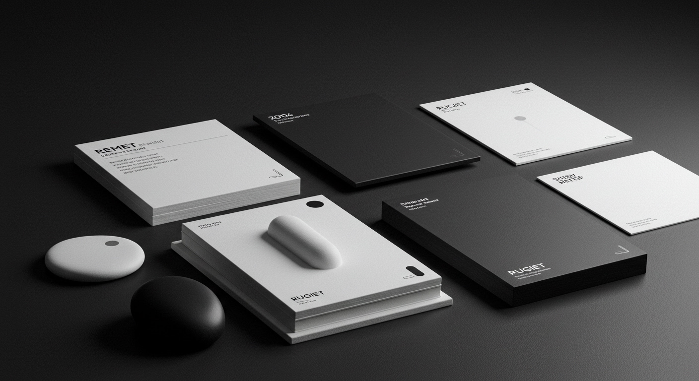
Pentagram New York’s unabashedly phallic designs for men’s health brand Rugiet illustrate a significant shift in how brand equity is built today.
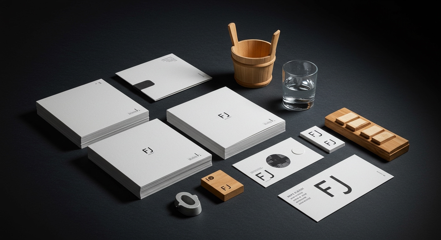
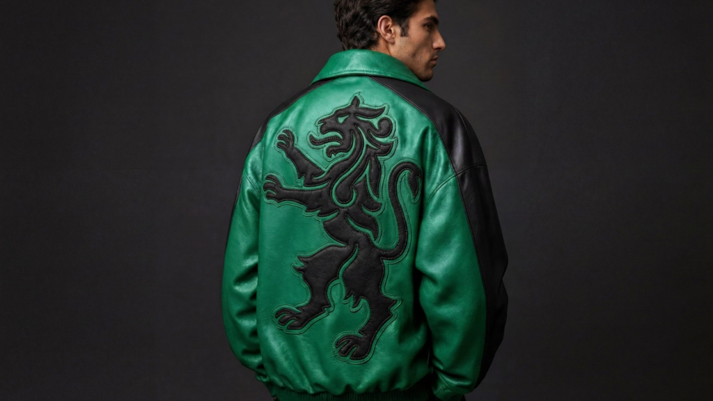
Across diverse sectors, brands are increasingly forging cultural signals through deliberate visual identity choices and market positioning that defy expected category conventions. This approach rejects the diluted appeal of broad consensus, instead cultivating deeply specific resonance by leaning into distinctive aesthetic and functional expressions. DutchScot’s branding for Fjord, a floating sauna, strategically positions the experience between architecture, hospitality, and outdoor recreation, deliberately avoiding a singular, expected “wellness” label. Similarly, JKR’s overhaul of Sporting CP plunders the football club’s heritage to build a robustly simple identity, rooting the brand in specific cultural history rather than generic modernity. This trend signifies a calculated move to own unique emotional and visual territory, fostering robust brand equity through unapologetic differentiation.
Pentagram New York’s work for Rugiet exemplifies this strategy with striking clarity. The men’s health brand embraces its product’s direct function with unabashedly phallic designs, a visual identity system that immediately stands apart. Rather than adopting the typical sterile, clinical visual language often associated with health and wellness products, Rugiet signals candor and confidence. This choice is not merely functional; it creates an immediate, memorable cultural signal that resonates with an audience seeking directness and efficacy. The visual identity system becomes a powerful differentiator, embedding a distinct personality into the brand’s market positioning and building a strong, clear equity among its target consumers.
Mainstream industry opinion often prioritizes universal appeal and risk aversion in branding, advising against visuals that could be perceived as niche or potentially confrontational. This perspective incorrectly equates broad acceptance with strong brand equity, suggesting that anything overtly specific risks alienating a wider market. In reality, a brand like Rugiet gains significantly more by being unforgettable and deeply resonant to its specific audience than by being mildly acceptable to everyone. Its unique visual identity system becomes a potent asset, cultivating recognition and loyalty among those who appreciate its candid approach and reject generic alternatives. This strategic courage generates a durable competitive advantage. By late 2028, a growing number of challenger brands across regulated categories like finance and healthcare will adopt similarly provocative or hyper-specific visual identities to forge distinct market positions and cut through established clutter.
The primary resistance to this specific, bold approach comes from an entrenched reliance on market research optimized for lowest common denominator appeal, combined with a pervasive fear of negative public reaction, often amplified by social media. This leads to what might be termed the “generic-good” aesthetic, characterized by safe, abstract, and interchangeable visual identities. These designs aim to offend no one but, consequently, inspire few, diluting brand equity into blandness. Established brands, in particular, often struggle to shed this conservative impulse, prioritizing perceived safety over genuine differentiation. The internal friction of diverse stakeholder opinions further solidifies this cautious, committee-driven approach.
Branding professionals should pivot their strategic research from analyzing category leaders for “best practices” to identifying the most pervasive visual and verbal clichés within a given market. The actionable step is to then map out how a brand’s visual identity system and market positioning can deliberately contravene these established norms. This means pushing for distinctive signals that challenge user expectations rather than merely confirming them, creating intentional friction that clarifies a brand’s unique value and cultural stance.
TL;DR
Brands gain equity by developing highly specific visual and market signals that boldly reject generic category conventions.
Curated References



About this editorial — This piece was developed using AI-assisted research and curation across multiple industry sources. All analysis, opinions, and predictions represent the editorial perspective of JHDD. Sources are linked in the references section above.