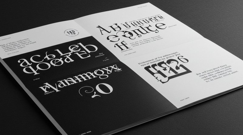
JHDD Typography Report — 2026.07.13
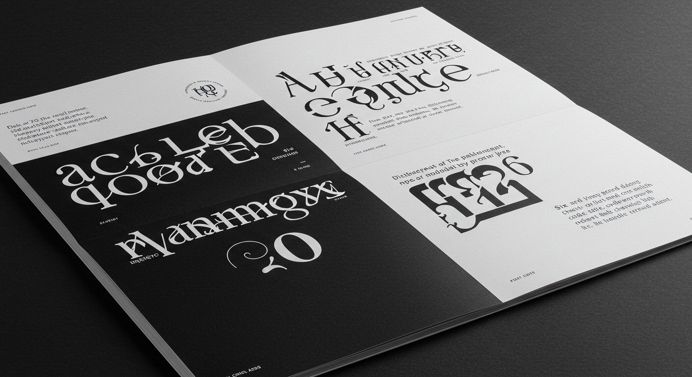
Six Cinquième’s recent work for the arts nonprofit 1001 Colors, where identity was drawn from history literally embedded in the fabric of a building, highlights a growing trend. This specific pattern involves the extraction of unique, often tactile historical elements as the basis for contemporary brand identities. While celebrated for their conceptual depth, these approaches often undersell the complex micro-typographic work required to translate such specificity into consistently legible and scalable visual systems.
Yard NYC’s rebrand for European Wax Center, featuring contrasting typography to balance various brand attributes, exemplifies a conventional industry approach. This strategy, while aiming for expressiveness and personality, frequently prioritizes the broad aesthetic “feel” over the rigorous, granular work of ensuring that conceptual letterforms maintain optimal legibility across all applications and contexts. The prevailing opinion often suggests that a “smoother” or more “balanced” typographic solution inherently translates to better communication, yet this can inadvertently smooth away the very details that contribute to distinctiveness and immediate comprehension. When designers translate a historical “scribble” into a font, the conceptual value is clear. However, the true challenge lies in its micro-typographic execution: the precise optical adjustments, kerning pairs, and baseline shifts necessary for that conceptual form to function flawlessly within a dynamic grid system without demanding undue effort from the reader. By mid-2027, clients will increasingly demand not just conceptual stories behind their typefaces, but demonstrably engineered micro-typographic systems that preserve those stories without compromising functional clarity.
The industry’s emphasis on achieving an overarching brand “personality” through typography often means that the critical interplay between individual letterforms, word spacing, and line breaks—the domain of micro-typography—is not given sufficient attention. This often results in type systems that are aesthetically pleasing but inefficient in transmitting information. True typographic mastery in such contexts comes from ensuring that the unique characteristics of a custom or historically-inspired typeface enhance legibility, rather than creating visual friction within the grid. It is not enough to simply contrast type styles; the designer must meticulously engineer how those contrasting elements cooperate at the smallest scale.
The primary opposing force to this detailed micro-typographic attention is the widespread demand for universal digital accessibility and rapid deployment. This pressure frequently encourages the adoption of generic, highly optimized sans-serif typefaces that, while broadly legible across devices, lack the nuanced historical or conceptual depth that bespoke letterforms can offer. The drive for technical consistency often overrides the opportunity for richer, more meaningful typographic expression.
A working Typography professional should, this week, take an existing brand identity project and, instead of simply selecting a typeface for its macro-level aesthetic, analyze its individual letterforms and their micro-typographic relationships. Focus specifically on how the spacing between characters and words, when integrated into the project’s grid system, either supports or detracts from both legibility and the intended conceptual message, identifying three specific adjustments to improve this balance.
TL;DR
Micro-typographic precision is essential for conceptual letterforms to achieve functional legibility and true scalability.
Curated References
About this editorial — This piece was developed using AI-assisted research and curation across multiple industry sources. All analysis, opinions, and predictions represent the editorial perspective of JHDD. Sources are linked in the references section above.