JHDD Typography Report — 2026.07.10
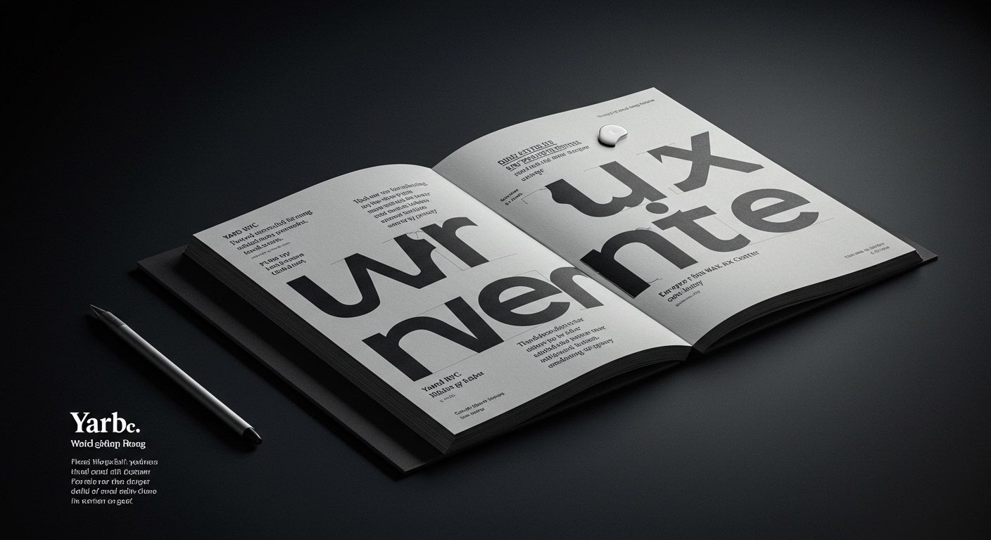
Yard NYC’s identity for European Wax Center employs contrasting typography to express brand personality.
A subtle but pervasive pattern emerges across recent design outputs: a deliberate engagement with historical or stylistic tension to forge contemporary brand identities. This is not simply about retro aesthetic, but about extracting and recontextualizing specific elements—whether contrasting typefaces, archival materials, or overlooked historical parallels—to create a distinctive, scalable visual language that carries inherent depth. The tension itself becomes the message, a departure from the singular, often reductive, visual narratives prevalent in the last decade.
The European Wax Center rebrand by Yard NYC exemplifies this by utilizing contrasting typography to balance “expertise, confidence, and personality.” Mainstream industry opinion often prioritizes universal legibility and functional clarity above all, advocating for homogenous type families or highly streamlined sans-serifs across diverse applications. This perspective, while ensuring basic readability, often overlooks how typographic contrast, when precisely managed at the micro-typographic level, can significantly enhance conceptual letterforms and overall brand memorability. The deliberate friction between distinct type styles, much like a carefully composed grid system that allows for calculated asymmetry, can convey nuance that a single, unified voice cannot. This isn’t about arbitrary type pairing, but about a considered juxtaposition where each font speaks to a different facet of the brand’s character, with their interplay forming the complete narrative.
A truly legible design communicates not just content, but also context and tone. For European Wax Center, the contrasting typefaces likely differentiate promotional messaging from informational text, or inject a human element into what might otherwise appear clinical. This strategic use of conceptual letterforms provides a richer user experience. By mid-2027, the design industry will see an increase in brands adopting multi-vocal typographic systems, prompting a shift in how variable font technology is applied, moving beyond simple axes of weight and width to offer more nuanced control over stylistic and historical contrast within a single font file. This will enable dynamic adjustments to typographic tension based on context, audience, and even real-time data.
This approach faces resistance from the prevailing emphasis on “clean” and “accessible” design often interpreted as monochromatic simplicity and algorithmic optimization. Large digital platforms and their standardized UI frameworks frequently impose rigid grid systems and typographic limitations that inadvertently discourage expressive contrast. The default settings within these environments often flatten typographic hierarchies, prioritizing quick scanning over deeper engagement or distinctive brand voice. This pressure to conform to a lowest common denominator of “legibility” can stifle innovation in how type communicates complex brand attributes.
This week, typography professionals should analyze existing brand guidelines not just for typefaces, but for how their interaction is defined across different content hierarchies. Specifically, experiment with using distinct, historically resonant typefaces within a client’s established grid system. Focus on micro-typographic adjustments—like slight variations in leading, tracking, and optical sizing—to maintain a cohesive typographic color and reading rhythm, even as the conceptual letterforms offer deliberate contrast. This practice refines the ability to deploy tension intentionally rather than haphazardly.
TL;DR
Strategic typographic contrast, carefully managed, can offer distinctive brand identity beyond pure functional legibility.
Curated References
About this editorial — This piece was developed using AI-assisted research and curation across multiple industry sources. All analysis, opinions, and predictions represent the editorial perspective of JHDD. Sources are linked in the references section above.