Julian’s Packaging Insight — 2026.06.02

The most compelling packaging experiences are now whispering, not shouting, through touch.
The contemporary design landscape, as evidenced by recent noteworthy releases, is witnessing a profound recalibration of what constitutes impactful packaging. This shift transcends mere visual appeal, delving into the realm of sensory engagement. For brands vying for attention in an increasingly saturated marketplace, the unboxing experience has evolved from a fleeting moment to a critical touchpoint, capable of forging lasting emotional connections. Sustainable materials are no longer a niche consideration but a fundamental expectation, influencing consumer choice and brand perception. Simultaneously, the shelf, that perennial battleground for consumer gaze, demands a distinct visual language that cuts through the noise. Crucially, tactile branding is emerging as the silent architect of desire, imbuing products with a tangible gravitas that digital interactions simply cannot replicate. These forces coalesce, signaling a move towards packaging that not only looks good but feels profoundly right.

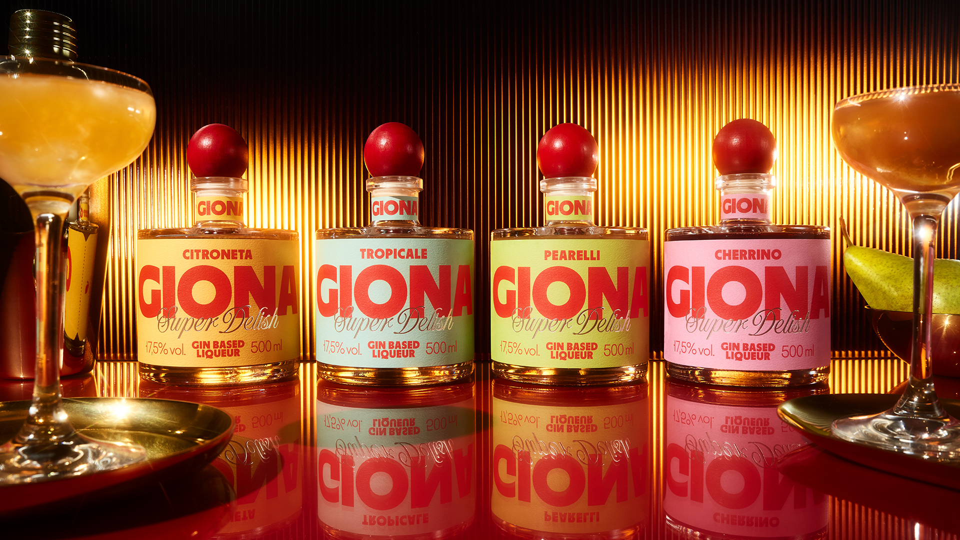
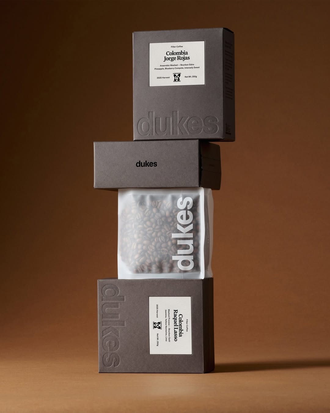
This evolving dialogue in packaging design highlights two distinct yet intertwined narratives. One thread celebrates bold, confident aesthetic choices, as seen with FLOV Studio’s Giona gin liqueur. The squat bottle, vibrant sphere stopper, and distinctive serif wordmark across pastel hues suggest a deliberate positioning of low-ABV spirits within the premium category, prioritizing visual statement and immediate brand recognition. This approach acknowledges that even less conventional spirit categories can command shelf presence through sheer design bravado. In parallel, a subtler, more introspective approach is gaining traction, exemplified by Dukes Coffee. Their use of blind debossing on a dark charcoal board stock for the “dukes” wordmark is a masterclass in understated luxury and tactile storytelling. It eschews overt branding for a subtle invitation to engage, relying on the texture and impression to convey quality and sophistication. The inclusion of these diverse yet equally potent strategies within broader redesign roundups, such as the “Best Redesigns of Spring 2026,” underscores the multifaceted nature of contemporary packaging strategy.
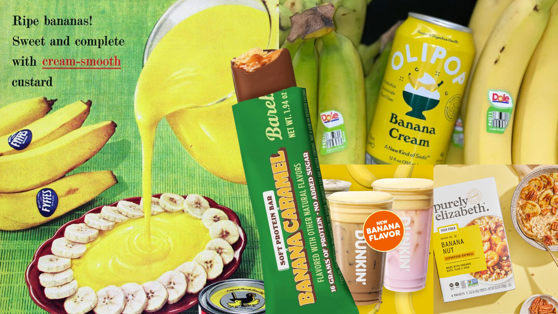
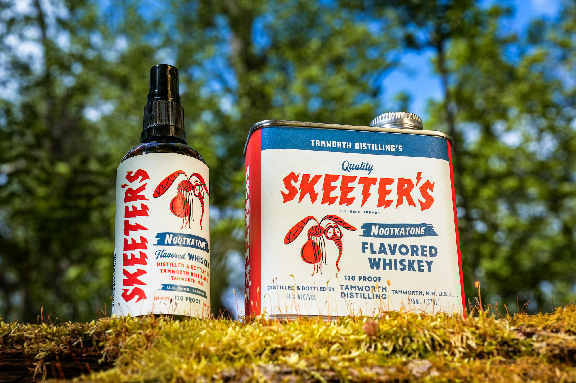
However, this period of innovation is not without its inherent contradictions, a tension best described as the “Paradox of Tactile Dominance.” While the pursuit of sensory engagement through texture and materiality is undeniably potent, its efficacy is intrinsically linked to accessibility and perceived value. For instance, the innovation of Skeeter’s Nootkatone Flavored Whiskey, with its unique atomizer and retro Americana design, offers a novel functional and conversational element. Yet, its success relies on the consumer understanding and appreciating its dual purpose. Similarly, the trending ingredient narrative, like the current fascination with bananas, often emphasizes novelty and desirability, but the underlying “going bananas over CPG’s new hottest ingredient” context, especially against a backdrop of global supply crises, highlights a potential disconnect. The very desirability that elevates a product might be built upon precarious foundations, creating a tension between aspirational packaging and the grounded reality of resource availability and equitable distribution. This paradox forces designers to balance exquisite tactile experiences with the practicalities of production and the broader societal implications of material choices.
Looking ahead, the next evolution in luxury beverage packaging will involve the integration of bio-responsive materials that subtly shift in texture or color based on ambient temperature, providing a dynamic, almost living tactile experience that reinforces the product’s freshness and quality, particularly for chilled beverages.
TL;DR
Packaging’s future lies in its ability to communicate through touch, balancing bold aesthetics with sophisticated materiality and the enduring challenge of sustainable sourcing.