JHDD Packaging Report — 2026.07.06
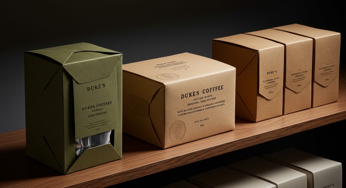
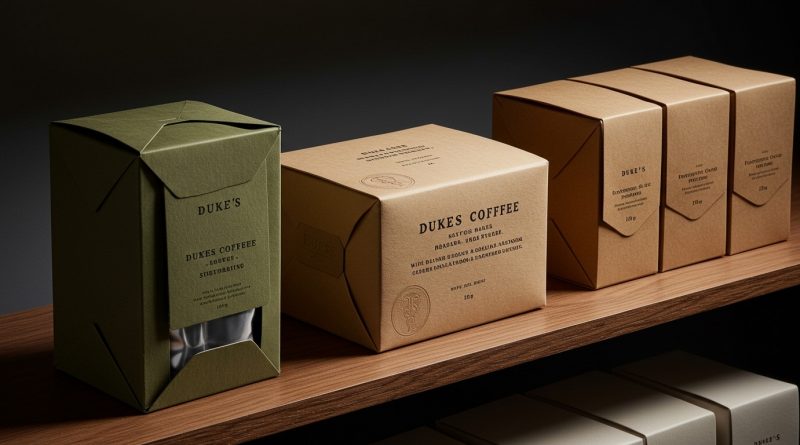
Dukes Coffee, with its blind debossed wordmark, offers a specific lesson in understated luxury.
A subtle but significant shift is occurring in packaging design, moving away from conventional category signals towards a more deeply felt brand personality, often expressed through deliberate tactile and material choices. This pattern of defying established visual codes, whether through artisanal charm or unexpected elegance, enables brands to stand out by inviting a more intimate, sensory engagement rather than just shouting for attention on the shelf.
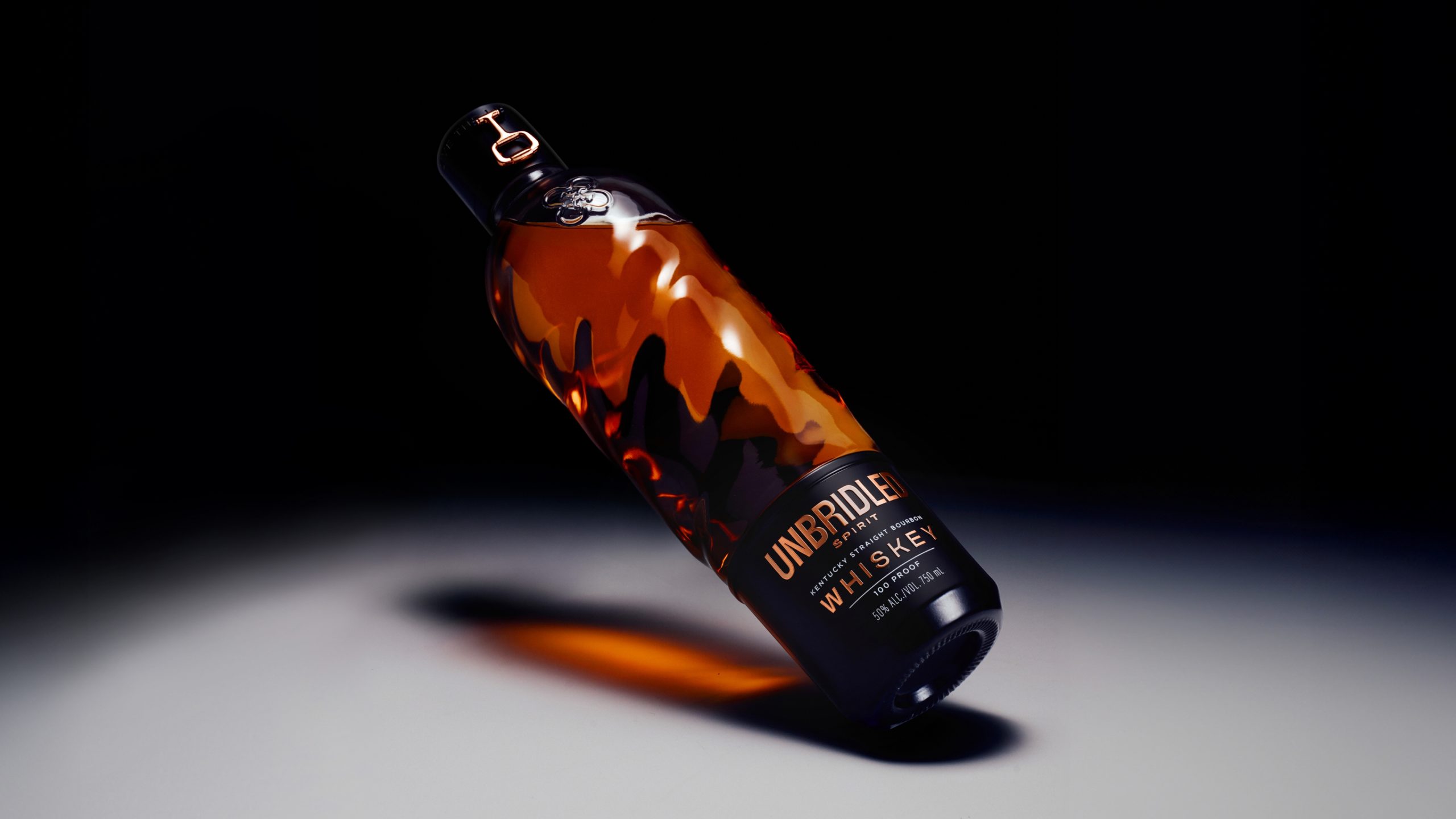
Holy Studio’s work for Unbridled Spirit exemplifies this departure. By replacing typical bourbon iconography with a sculptural glass bottle and a rose gold snaffle bit hardware piece, Holy Studio transforms the unboxing experience into a moment of discovery that feels more akin to opening a luxury accessory than a bottle of liquor. This approach directly challenges the mainstream industry opinion that effective shelf impact relies solely on overt brand messaging or adherence to established category visual cues. Instead, Unbridled Spirit’s design leverages tactile branding and material luxury to create an emotional resonance that transcends mere product identification.
This shift acknowledges that consumers are increasingly sophisticated, capable of discerning value and authenticity through nuanced physical attributes. The perceived sustainability of a package will increasingly derive not just from its material composition, but from its desirability as an object to be kept or reused. By mid-2027, brands will invest more heavily in bespoke packaging hardware and intricate debossing techniques, recognizing these elements as critical differentiators that extend the product’s lifecycle in the consumer’s home, thereby implicitly reducing waste by increasing perceived value and reusability.
The primary opposing force to this trend remains the relentless pursuit of cost efficiency in mass production, where custom molds, unique hardware, and complex tactile finishes often represent higher unit costs and slower production cycles. Brands with deeply entrenched legacy systems and those operating on razor-thin margins often resist such design innovations due to perceived financial and logistical hurdles, opting instead for easily scalable, standardized packaging solutions that prioritize speed to market over sensory depth.
A working packaging professional should this week initiate a physical prototyping phase earlier in the design process, focusing specifically on how different material finishes, debossing depths, and unconventional closures feel in hand, rather than relying solely on 2D renders or digital mock-ups.
TL;DR
Packaging increasingly uses subtle tactility and design restraint to build brand identity and encourage product longevity beyond purchase.
Curated References


About this editorial — This piece was developed using AI-assisted research and curation across multiple industry sources. All analysis, opinions, and predictions represent the editorial perspective of JHDD. Sources are linked in the references section above.