JHDD Packaging Report — 2026.07.05
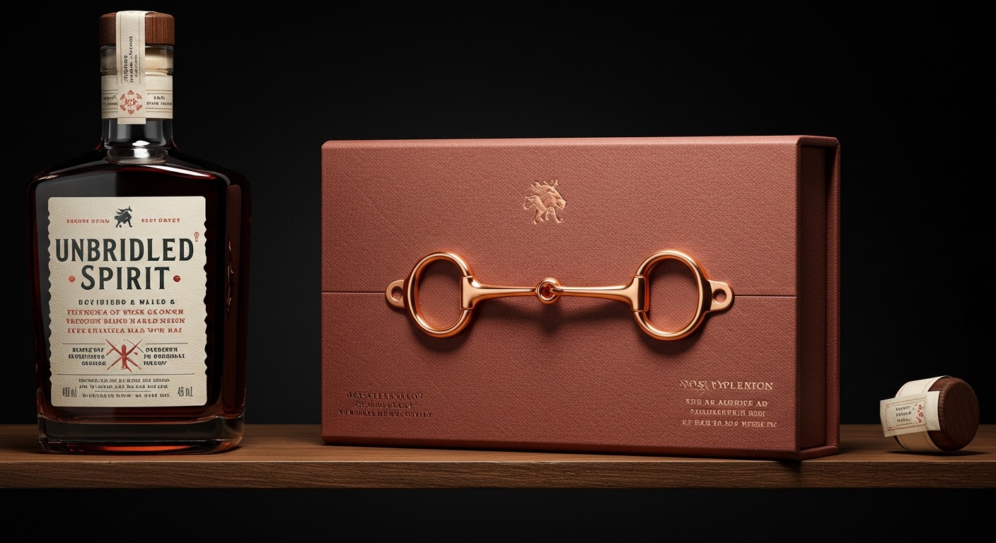
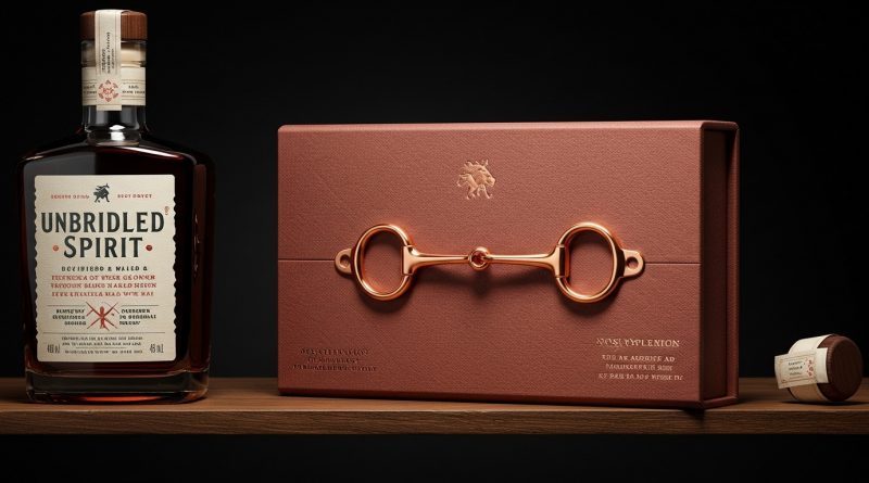
Unbridled Spirit’s bourbon features a rose gold snaffle bit hardware piece.
Recent designs demonstrate a deliberate shift away from established category codes, using unexpected tactile and visual elements to forge unique brand identities. This constitutes a strategic adoption of unconventional materiality and sensory cues to build lasting brand equity. Packaging is moving beyond mere containment to become an integral, distinctive part of the product experience, from shelf impact to unboxing.
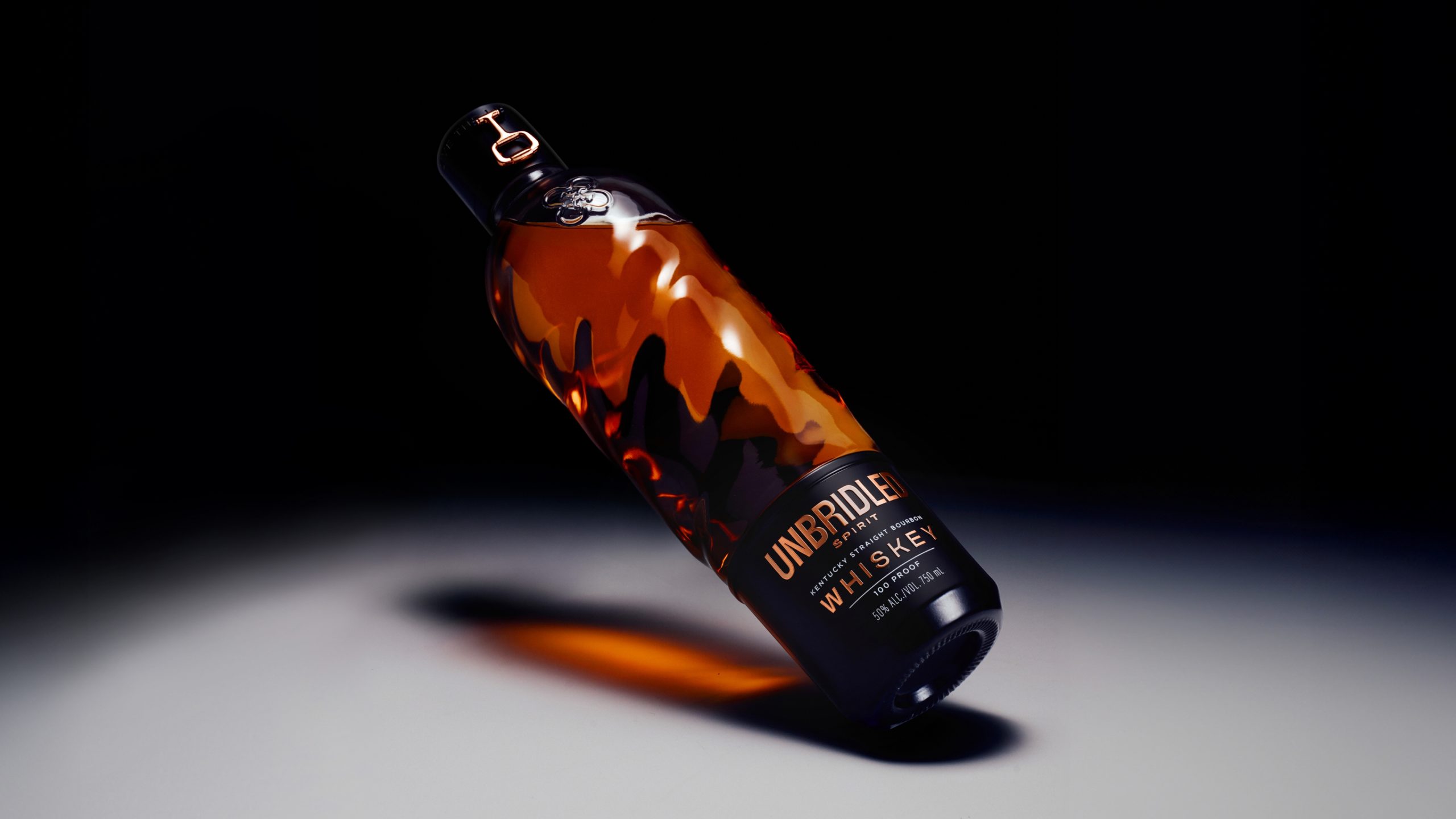
SODAA’s redesign for Dukes Coffee, employing a subtle, blind debossed wordmark, offers insight into current branding strategies. Mainstream industry opinion frequently pushes for maximalist visual cues to grab attention on a crowded shelf. This restrained approach, however, when executed with precision, cultivates a perception of premium quality and encourages a more considered consumer interaction. It counters the assumption that all brands must shout to be heard. This specific tactile detail adds a quiet form of sustainability. Packaging that feels intrinsically valuable, less generic, or even sculptural, like Unbridled Spirit’s bourbon bottle, is less likely to be discarded thoughtlessly. This extends the perceived life and utility of the packaging beyond its initial consumption, transforming it from a mere container into a brand asset or a keepsake.
This emphasis on considered, high-quality tactile experiences also redefines unboxing expectations. The rose gold snaffle bit hardware piece on Unbridled Spirit’s bottle, for instance, transforms a functional element into a distinctive, memorable touchpoint. By mid-2027, packaging that integrates significant tactile elements will increasingly replace purely visual “wow” factors as the primary driver of positive unboxing sentiment for many product categories. This shift will require brands to invest in material choices and finishing processes that prioritize sensory feedback and durability, directly impacting shelf presence through distinct haptic appeal rather than relying solely on color or graphic boldness. This approach creates emotional connections, which are inherently more sustainable than disposability.
The primary opposing force comes from cost-driven production models and established supply chain practices. These often prioritize volume and speed over material specificity, custom tooling, and complex finishing techniques required for elements like blind debossing or sculptural glass bottles. Procurement teams and manufacturers frequently resist the perceived economic inefficiencies and complexities associated with such specialized runs, favoring standardized, readily available solutions.
Packaging professionals should audit their existing product lines for opportunities to introduce subtle, uncoated textures or debossed details on current substrates. This does not always require entirely new, expensive materials, but rather a re-evaluation of finishing techniques that add sensory depth and perceived value. Prioritizing designs that inherently signal quality and longevity through touch, rather than just through visual noise, can shift consumer behavior towards appreciating and reusing packaging.
TL;DR
Packaging design is increasingly using subtle tactile and unconventional visual cues to create distinct, lasting brand experiences.
Curated References


About this editorial — This piece was developed using AI-assisted research and curation across multiple industry sources. All analysis, opinions, and predictions represent the editorial perspective of JHDD. Sources are linked in the references section above.