JHDD Typography Report — 2026.07.07
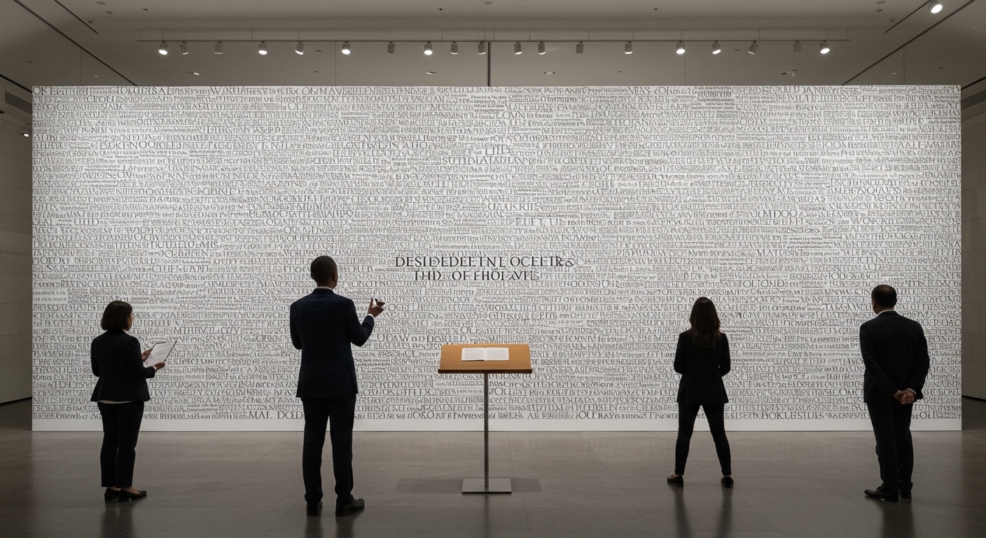
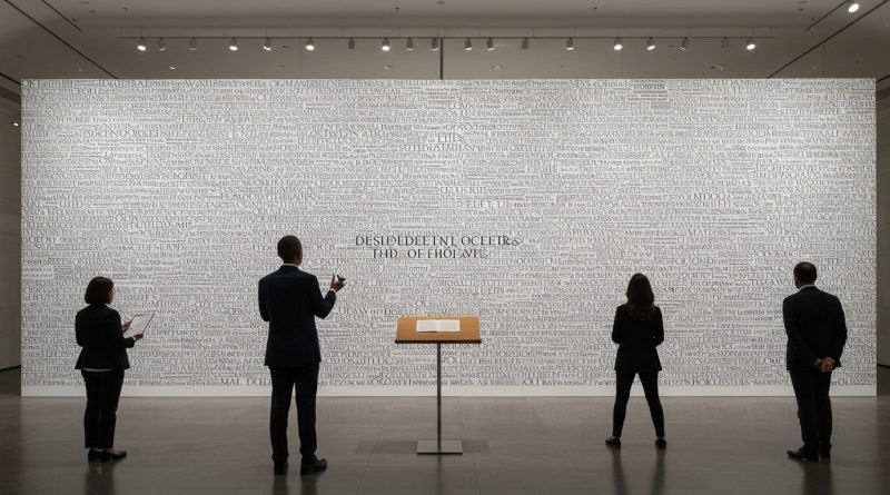
The Obama Presidential Center’s “Words of Hope” installation transforms President Obama’s speech into a permanent architectural experience using 458 oversized Gotham Bold letters.
This collection of design efforts reveals a prevailing trend towards the physical manifestation and reinterpretation of foundational texts and historical narratives. Designers are increasingly challenged to imbue abstract ideas, from political speeches to civic documents, with tangible, spatial, or sequential presence. The focus shifts from merely conveying information to constructing an experience of text that often merges with architecture or illustrative storytelling.
The Obama Presidential Center’s “Words of Hope” installation exemplifies this trend, utilizing 458 oversized Gotham Bold letters to create a monumental typographic landscape. While widely lauded for its ambition and visual impact, this scale of typographic application often bypasses the subtle micro-typographic considerations crucial for conventional reading legibility. The prevailing industry praise for such large-scale, declarative typography sometimes overlooks its inherent limitations in fostering deep, sustained textual engagement, favoring instead a singular, immediate awe. This approach, though powerful in its symbolic gesture, can paradoxically flatten the nuanced interaction typography is capable of enabling at smaller scales, where letterforms facilitate fluid thought rather than demand static contemplation. The architectural scale often prioritizes the image of type over its function as a conveyor of complex meaning.
The widespread adoption of large-scale environmental typography, while providing public spectacle, demands a re-evaluation of its pedagogical efficacy. Traditional legibility metrics, typically applied to text blocks meant for sustained reading, are rendered largely irrelevant when type becomes a structural element. Within two years, studios specializing in spatial design will begin integrating dynamic, ambient legibility studies into their workflows, moving beyond static mock-ups to analyze how giant letterforms are perceived and contextualized by moving bodies through architectural spaces, particularly how they interact with variable light and environmental conditions.
The resistance to this experiential and architectural approach to typography often emanates from sectors where functional legibility remains paramount, such as regulated information design or traditional editorial layouts found in publications like PRINT Magazine. These domains prioritize the clear, efficient transmission of content, demanding grid systems that facilitate rapid comprehension and micro-typographic details that prevent visual fatigue. Their resistance is not against innovation but against the dilution of clarity for the sake of monumentality or conceptual abstraction.
A working typography professional should, this week, select a short piece of text and experiment with rendering it in an extreme, non-standard physical form—perhaps fabricating individual letterforms from unusual materials or projecting them onto an irregular surface, specifically observing how legibility and perceived meaning shift. This exercise should push beyond two-dimensional screen or print paradigms to consider how scale, material, and spatial context fundamentally alter the communicative properties of letterforms.
TL;DR
Typography is becoming an architectural and experiential element, challenging traditional legibility and demanding new design approaches.
Curated References
About this editorial — This piece was developed using AI-assisted research and curation across multiple industry sources. All analysis, opinions, and predictions represent the editorial perspective of JHDD. Sources are linked in the references section above.