JHDD Packaging Report — 2026.09.18
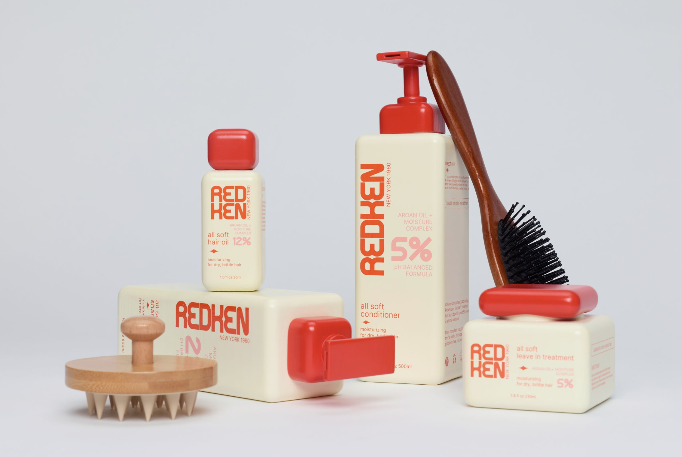
Redken’s concept rebrand, designed by Dahyun Kang, revisits the brand’s scientific roots through vintage laboratory cues and squared forms.
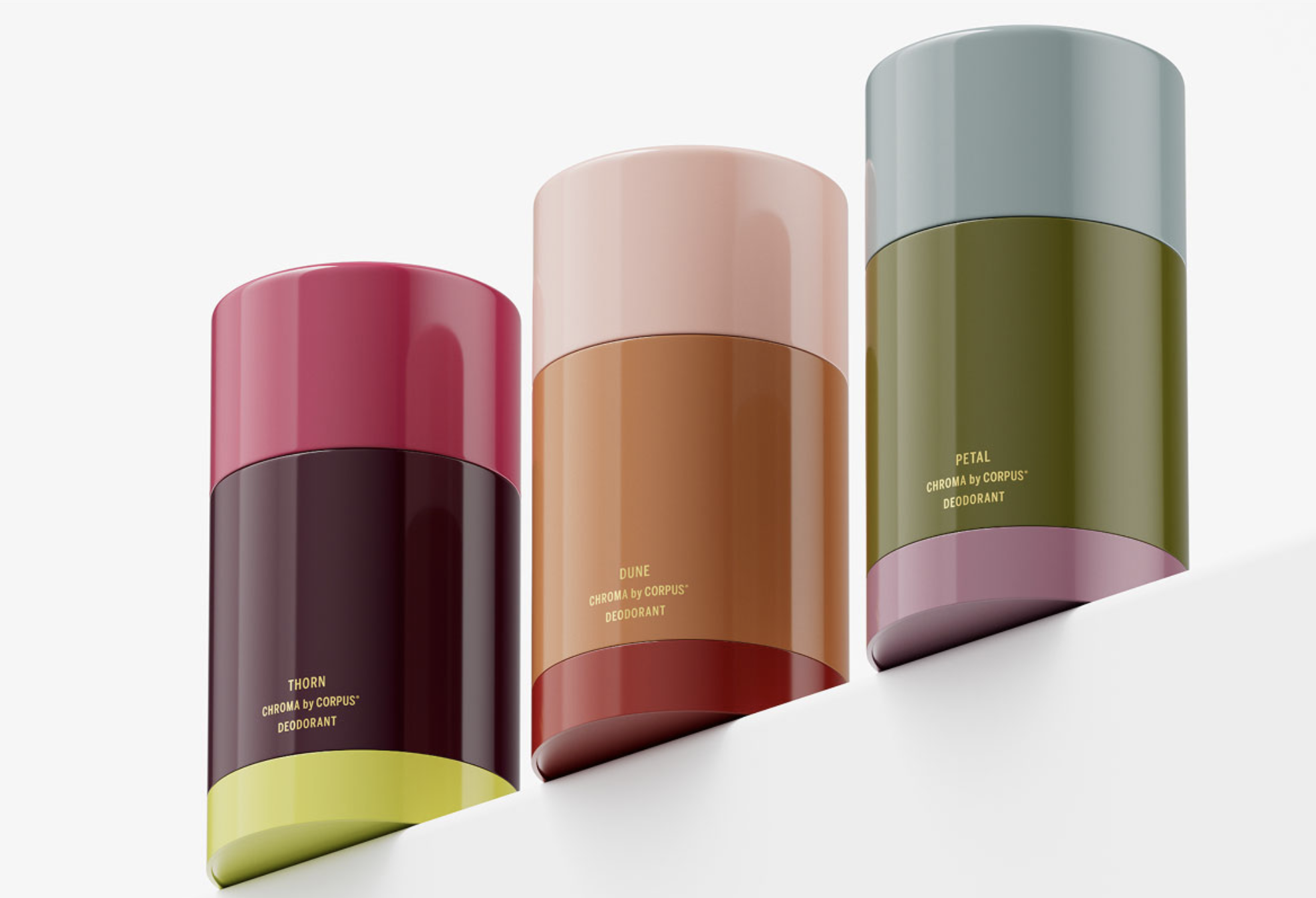
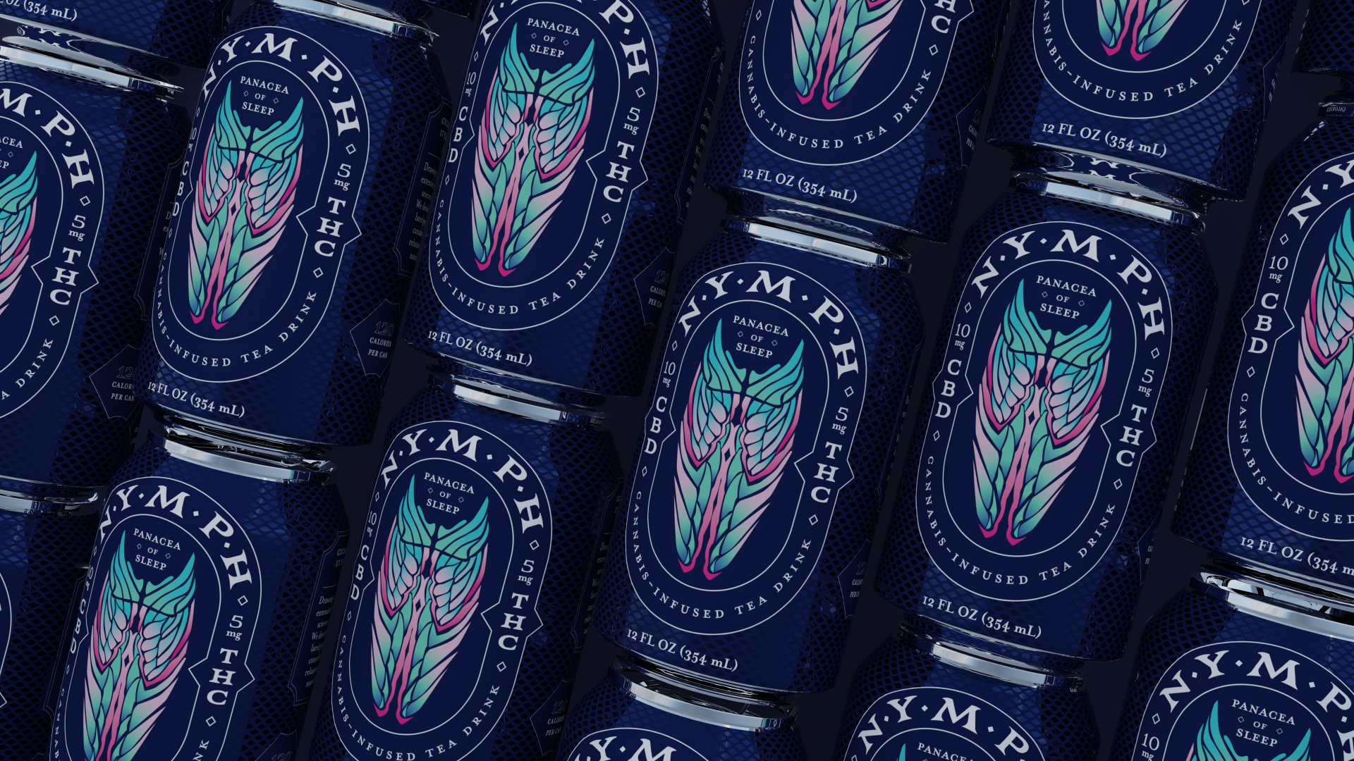
These recent projects, from Corpus Naturals’ Chroma line for Target to Nymph’s cannabis sleep drinks, reveal a consistent pattern: brands are moving beyond superficial storytelling to embed specific cultural, historical, or natural references directly into packaging’s tactile and visual language. This approach aims to create unique shelf impact and a distinct unboxing experience, contrasting sharply with generic or trend-driven aesthetics. The common thread is a deliberate, highly specific materialization of brand essence through chosen visual and tactile elements, often favoring materials that naturally convey texture, such as uncoated paperboards or subtly textured bioplastics. This fosters a deeper resonance with consumers by making the packaging itself an integral part of the brand narrative, rather than just a container.
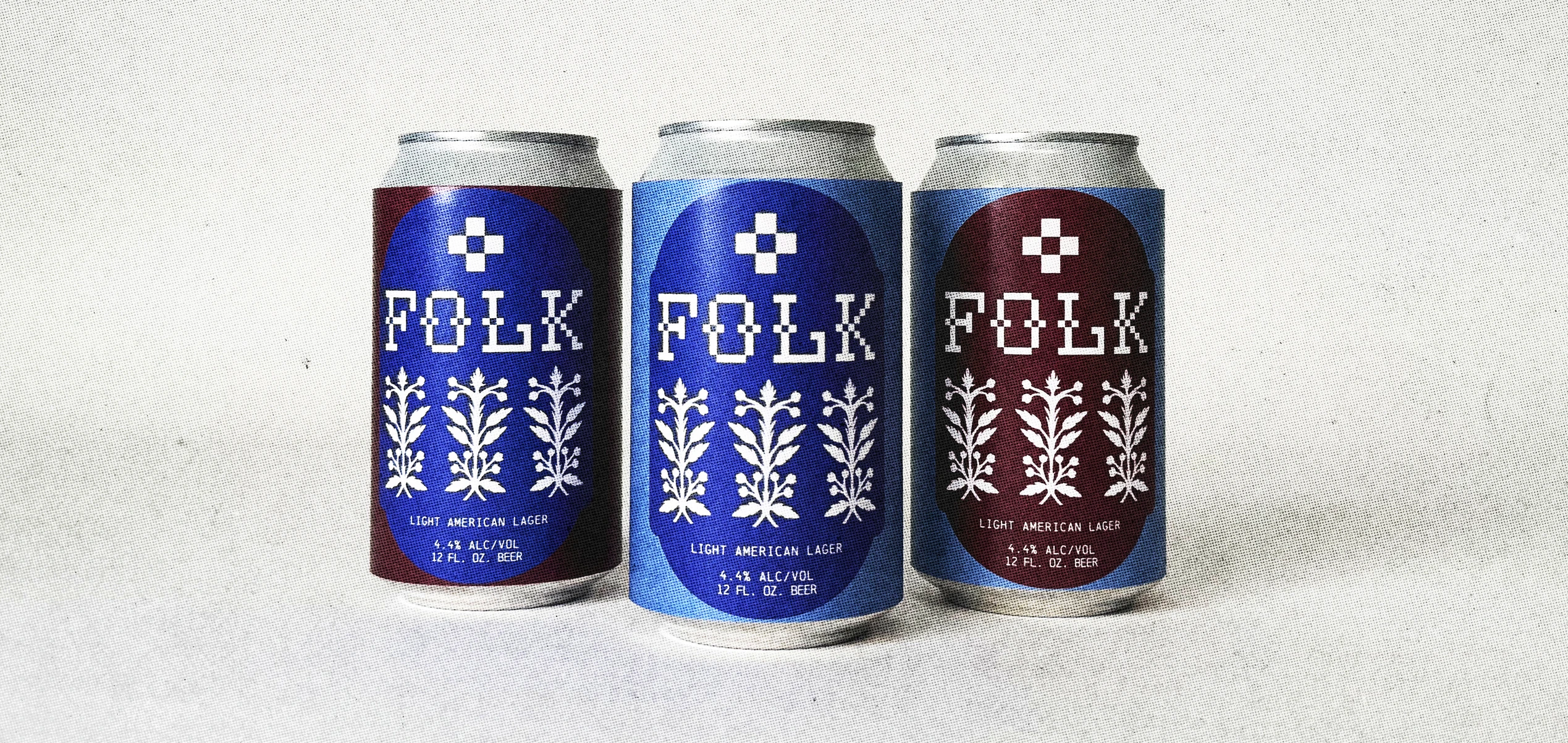
Folk’s design for light beer exemplifies this trend by integrating hand-cut Polish Wycinanki motifs and cross-stitch inspired lettering, making the packaging a tactile artifact rich in cultural meaning. This departure from conventional light beer branding, which often favors minimalist, active, or generic “refreshing” imagery, positions the product as one that celebrates craft and community. Mainstream industry opinion frequently advises broad, immediately recognizable visuals for mass-market appeal, fearing that overly specific cultural references might alienate segments of the audience. However, this strategy misunderstands the modern consumer’s growing demand for authenticity and connection, especially when considering the unboxing experience. The initial encounter with packaging that is rich in texture and cultural depth transcends mere product identification; it creates an immediate emotional and sensory engagement, making the act of holding the package part of the product’s story. The tactile nature of these motifs, implying texture and handcrafted care, enhances this connection, moving beyond smooth, often plasticized surfaces to evoke a sense of heritage and artisan production.
The true value lies not in universal legibility across all demographics but in profound resonance with a discerning audience seeking products that reflect a sense of place or purpose. Such distinctiveness cuts through market noise more effectively than simplified, homogenized designs, especially in an increasingly fragmented and digitally saturated market. Brands embracing this deep specificity, perhaps even through the judicious use of sustainable materials that offer inherent textural qualities, such as recycled pulp or uncoated papers with visible fibers, can achieve premium positioning and long-term equity. This is precisely because they offer something unique and deeply considered, where the packaging itself communicates sustainability and authenticity through its material presence. This approach inherently supports more conscious material choices, furthering the narrative of integrity from source to consumer. By mid-2027, the design industry will observe a significant increase in mid-tier CPG brands adopting localized craft techniques and historically informed material textures directly into primary packaging, moving beyond abstract graphics to physical embodiment of heritage or regional identity, often facilitated by advancements in recycled and bio-based polymers that offer unique tactile characteristics.
This push for nuanced, specific design is continually challenged by the industrial forces of cost reduction, manufacturing efficiency, and material availability. Standardized material specifications, driven by global supply chains, often disincentivize bespoke or culturally unique tactile finishes, particularly when mass production relies on readily available virgin plastics or highly processed substrates. The imperative for rapid product cycles and simplified visual assets for e-commerce platforms can overshadow the investment required for intricate physical design and the exploration of novel sustainable material applications that might be harder to scale or have a higher unit cost. Retailers often favor uniform packaging dimensions and materials for efficient shelving and scanning, overlooking the potential for differentiated tactile experiences and unique material stories to drive consumer engagement and brand loyalty beyond mere price point.
A packaging professional should this week insist on physical mock-ups and prototypes at every stage of the design process, especially when evaluating new sustainable material choices or textural finishes. Focus on how the packaging feels in hand, how light interacts with its specific surface and any embossed or debossed elements, and how proposed recycled content or bio-based materials translate intended tactile branding and impact the unboxing experience. Critically assess whether the chosen materials and their inherent qualities authentically convey the brand’s unique narrative or cultural reference, rather than merely representing it graphically on a generic substrate. Engage material science teams and manufacturers early to understand the full spectrum of possibilities for expressive, sustainable textures and how they can be scaled responsibly.
TL;DR
Packaging increasingly uses specific cultural and tactile details for deeper brand connection, countering generic mass appeal.
Curated References
About this editorial — This piece was developed using AI-assisted research and curation across multiple industry sources. All analysis, opinions, and predictions represent the editorial perspective of JHDD. Sources are linked in the references section above.