JHDD Branding Report — 2026.09.19
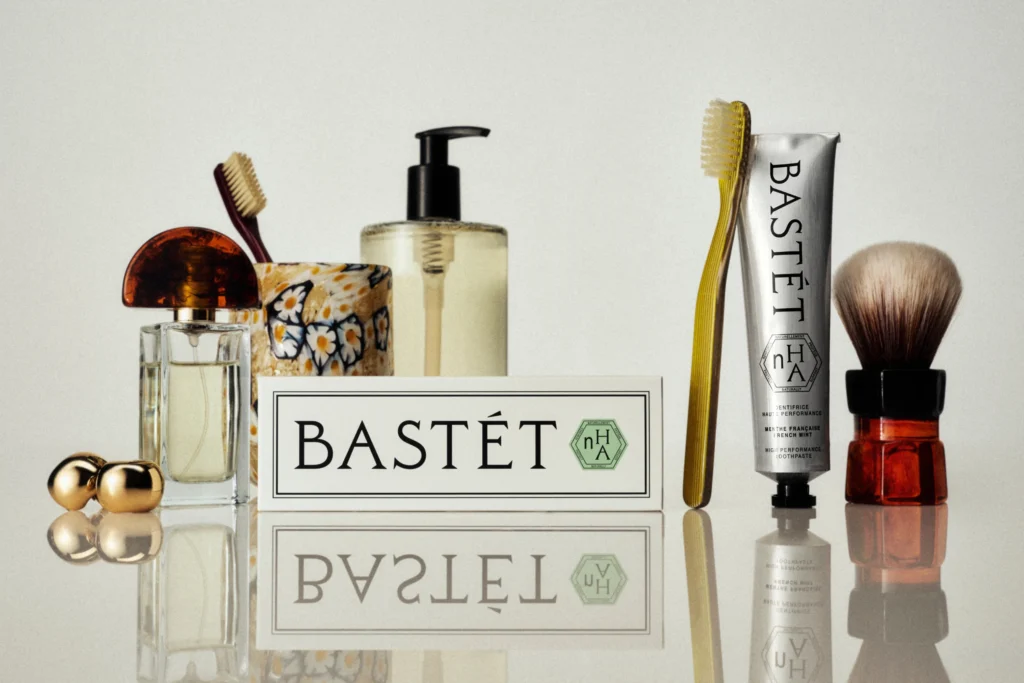
Wedge’s Bastét toothpaste identity prioritizes emotional resonance over functional explanation.
Across disparate categories, a consistent pattern emerges: brands are deliberately adopting visual identities that defy conventional category cues, often to the point of appearing nonsensical to an uninformed observer. This is not accidental disruption, but a calculated strategy to leverage unexpected cultural signals for market positioning and to carve out distinct brand equity through deliberate aesthetic subversion.
Consider Mother Design’s identity for the psychic platform Keen, which explicitly references a ’90s New Age sensibility’. This approach deviates sharply from the prevailing trend of clinical, minimalist aesthetics often found across the digital wellness and self-help sectors. The decision to embrace a visual language often dismissed as ‘woo-woo’ is a powerful act of cultural re-contextualization, intentionally rejecting the sanitized, aspirational imagery that dominates much of contemporary branding.
Conventional industry wisdom often dictates that brands, especially those in emergent or sensitive categories like psychic services, must project seriousness and modern sophistication to gain trust. This view misunderstands the cultural zeitgeist. For a brand like Keen, a clean, hyper-modern aesthetic would dilute its unique proposition, blending it into a sea of indistinguishable platforms. The ’90s New Age aesthetic, far from being a kitschy throwback, signals a knowing authenticity and a comfort with counter-cultural roots, fostering a deeper, more relatable connection with an audience increasingly wary of corporate-sanitized spiritual offerings. Brands that are too polished risk appearing inauthentic. By mid-2027, more established wellness brands will attempt to replicate this nuanced cultural reclamation, often failing because their efforts lack the inherent conviction of first-movers.
The primary opposing force resisting this shift comprises established market leaders and their entrenched brand managers, alongside risk-averse corporate structures. These entities often operate under outdated metrics of ‘brand safety’ and ‘mass appeal,’ equating broad acceptance with bland conformity. Their internal processes and legacy agency relationships reinforce a conservative adherence to category codes, fearing that any deviation will alienate the broadest possible consumer base rather than attract a deeply engaged segment.
Branding professionals should spend an hour this week conducting a ‘category code inversion’ exercise. For a client’s specific product or service, identify its top three visual identity tropes. Then, brainstorm and sketch out three distinct concepts that deliberately invert or subvert these codes, drawing inspiration from entirely unrelated cultural touchstones or historical aesthetics. This exercise is not about immediate implementation, but about expanding the perceived boundaries of what a brand’s visual identity can be, encouraging a more fearless approach to market differentiation.
TL;DR
Brands are gaining market positioning by strategically subverting category visual norms, rather than adhering to them.
Curated References


About this editorial — This piece was developed using AI-assisted research and curation across multiple industry sources. All analysis, opinions, and predictions represent the editorial perspective of JHDD. Sources are linked in the references section above.