JHDD Branding Report — 2026.10.14
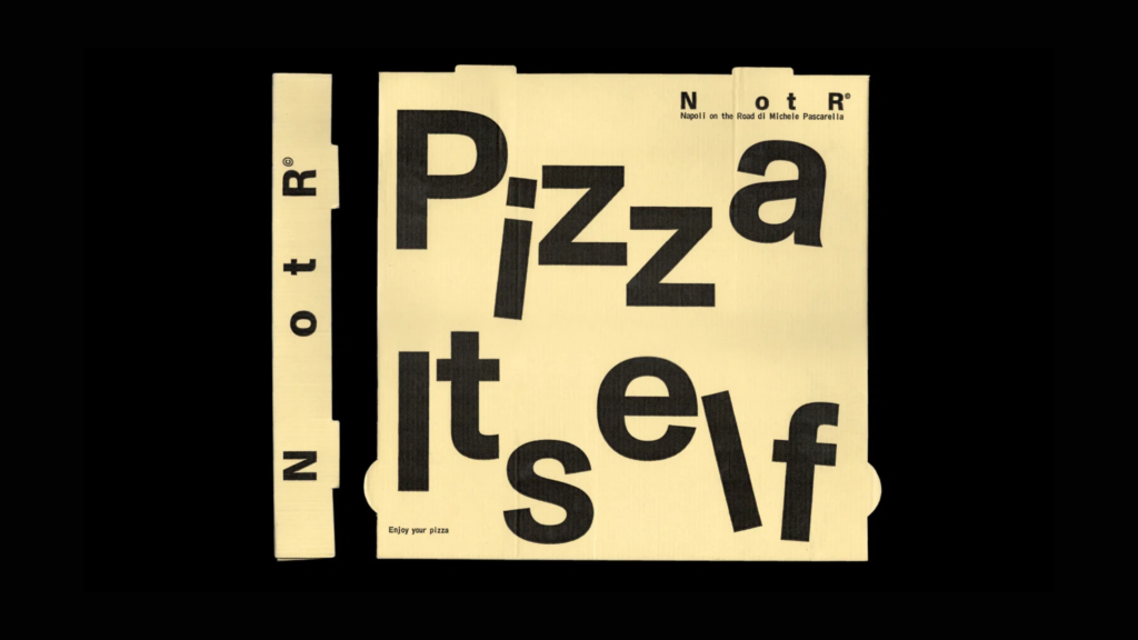
Vrints-Kolsteren’s identity for Napoli on the Road introduces a deliberate mischief to minimalism.
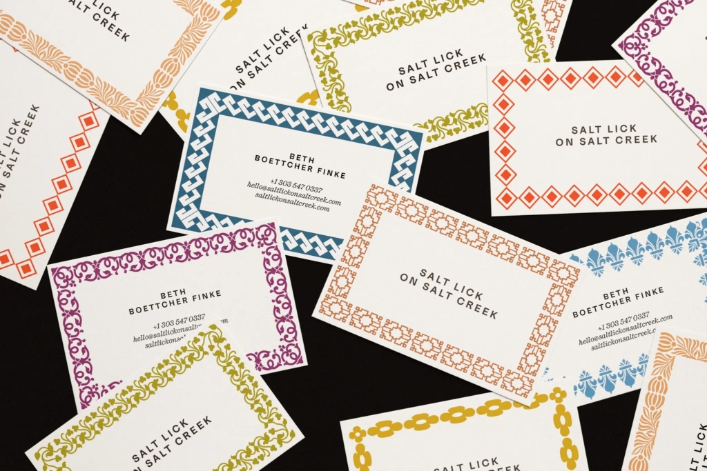
This particular approach, where brand identities present themselves with an intentional ambiguity or a knowing subversion of category norms, signals a shift in how designers and strategists perceive immediate brand recognition. These projects often assume a level of cultural literacy from their audience, expecting them to appreciate an identity that either requires decoding (Salt Lick on Salt Creek), plays against established visual conventions (Two Tribes Brewing), or adds an unexpected emotional layer to a functional offering (Parla, Franki). The common thread is a strategic pivot from overt communication to a more curated, often playful, interpretation of brand purpose and aesthetic.
The work by All Purpose for Two Tribes Brewing exemplifies this pattern by being “resolutely ‘craft'” while simultaneously “turning its back on all which that signifies.” Conventional wisdom often praises such approaches as innovative, celebrating their ability to break free from visual clichés and create a distinctive voice. However, this strategy, while visually compelling to a design-aware audience, can inadvertently construct a fragile form of brand equity. It prioritizes insider recognition and aesthetic cleverness over broad market legibility. For a consumer making a quick decision in a crowded retail environment, the subversion of familiar category signals can introduce friction, slowing down identification and hindering immediate trust. This reliance on subtle cues and contextual understanding risks segmenting the audience to those already attuned to such nuances, potentially limiting wider market penetration. By mid-2027, many brands that have pursued highly deconstructed or highly ambiguous identities, particularly in competitive CPG categories, will begin to reintroduce more overt category markers to address stalled growth and consumer confusion.
The primary opposing force to this trend comes from the fundamental human need for cognitive efficiency. In a marketplace saturated with choice, consumers consistently favor brands that communicate their value proposition and category affiliation clearly and instantly. Retail environments, whether physical shelves or digital feeds, demand immediate comprehension. Brands that require a prolonged “getting it” phase burden the consumer, especially those outside of design-enthusiast demographics. This is not a call for generic branding but an acknowledgment that market effectiveness often correlates with a certain level of directness, where distinctive visual identity supports rather than obscures the brand’s core offering.
Branding professionals should conduct regular “recognition friction audits” on their visual identity systems. This involves testing how quickly an average, non-industry consumer can identify a brand’s category, purpose, and key differentiator based solely on its logo, packaging, or primary digital asset, without any accompanying text or brand story. The audit should simulate real-world conditions, such as viewing a product on a busy shelf or as a small thumbnail on a mobile device.
TL;DR
Ambiguous brand identities can alienate broad consumer bases by creating unnecessary recognition friction.
Curated References
About this editorial — This piece was developed using AI-assisted research and curation across multiple industry sources. All analysis, opinions, and predictions represent the editorial perspective of JHDD. Sources are linked in the references section above.