JHDD Branding Report — 2026.09.17
Oodles, the noodle joint identity by Studio South, deliberately evokes the aesthetic of a hip skate brand.
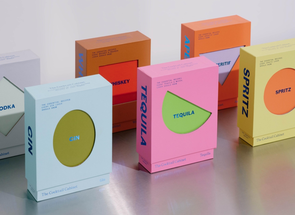
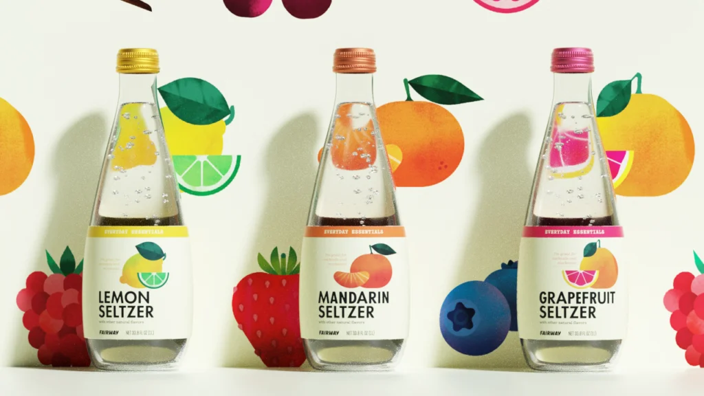
This approach is not an isolated incident. Across several recent projects, studios are strategically deploying visual identity systems that borrow heavily from cultural domains entirely distinct from the product or service category. Mother Design infused psychic platform Keen with a 90s New Age sensibility. Mucca made everyday essentials for Fairway Market anything but basic. A Friend Of Mine elevated The Cocktail Cabinet’s recipe cards beyond functional utility. These instances demonstrate a clear, emergent pattern: brands are actively seeking to establish market positioning and build equity by importing specific cultural signals from ‘outsider’ or adjacent contexts, rather than merely refining existing category codes.
The redesign for Keen by Mother Design serves as a compelling case study for this trend. Traditional branding wisdom for a psychic platform might counsel an identity conveying spiritual profundity or serene trustworthiness. Instead, Mother Design embraced a 90s New Age sensibility, complete with its inherent quirk and retro charm. This contradicts the conventional belief that brands must adhere closely to established category visual language to build credibility. By leaning into an aesthetic that might be seen as slightly ironic or even “post-woo-woo,” Keen differentiates itself significantly. It positions the platform not as a solemn oracle, but as a contemporary cultural touchstone, accessible and aware of its own historical context.
This strategy of culturally adjacent rather than category-aligned visual identity represents a significant evolution in market positioning. It prioritizes cultural resonance over direct functional representation. Mainstream industry opinion often prioritizes broad appeal through generic “clean” or “timeless” design, assuming specificity limits audience. However, these examples suggest the opposite: specificity of cultural signal creates stronger, more identifiable brand equity. This method of borrowing from distinct cultural archives to redefine a brand’s standing will expand considerably. Within two years, more brands in traditionally conservative sectors, such as professional services or pharmaceutical accessories, will adopt visual languages previously associated with subcultures, fashion, or independent art projects, aiming to capture niche cultural loyalties.
The primary resistance to this strategic reorientation comes from internal stakeholders within larger organizations who prioritize category safety and established best practices. These stakeholders, often including risk management teams and long-standing marketing executives, tend to favor design solutions that minimize potential disruption or perceived alienating factors. Their focus remains on maximizing universal acceptance and adhering to easily recognizable industry benchmarks, rather than on fostering distinct cultural signals that might resonate deeply with a specific, yet powerful, segment.
Working branding professionals should integrate this perspective into their strategic toolkit immediately. When approaching a new brief, specifically identify three distinct cultural aesthetics or sub-genres that, while seemingly unrelated to the client’s core offering, embody a desired brand attitude or value. Develop visual identity concepts that explicitly translate these external cultural signals into brand assets. This forces a departure from conventional category thinking and can uncover unique avenues for market positioning and brand equity development.
TL;DR
Brands are building stronger equity by strategically adopting cultural signals from unrelated categories.
Curated References


About this editorial — This piece was developed using AI-assisted research and curation across multiple industry sources. All analysis, opinions, and predictions represent the editorial perspective of JHDD. Sources are linked in the references section above.