JHDD Branding Report — 2026.09.05
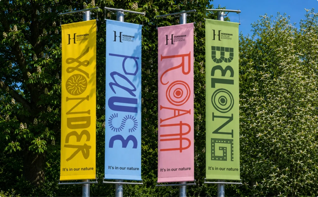
Anatomy’s recent identity for the Horniman Museum embraces the aesthetic of steampunk, a subculture described by some as visually “hideous.”
Across various recent projects, a distinct pattern emerges where successful brand identities intentionally embrace elements of aesthetic dissonance or historical inaccuracy. This is not about accidental incoherence, but a deliberate strategy to leverage perceived “confusion” or “ugliness” as a core component of brand distinctiveness. These brands often operate with a layered complexity that resists immediate, simple interpretation, moving beyond the industry’s traditional pursuit of universal clarity.
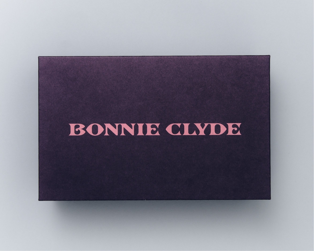
Mouthwash Studio’s identity for Bonnie Clyde eyewear serves as a compelling case study. The branding is noted for being “infuriatingly historically inaccurate” and “confusing,” oscillating between an “antiquey” feel and a “girly girly” aesthetic, yet it is ultimately described as “rather lovely.” Mainstream branding theory often dictates that such inherent contradictions weaken brand equity and dilute market positioning by creating mixed signals. However, this perspective overlooks how strategic dissonance can generate far deeper engagement than bland consistency. The perceived “confusion” acts as an invitation for closer inspection, fostering a more active and memorable relationship with the brand. It provokes thought and discussion, which in turn builds cultural capital around the brand’s unique point of view.
The industry’s conventional wisdom prioritizes seamless, easily digestible visual identity systems designed for immediate consumption. This often leads to uniform brand expression, where every element must conform to a singular, often simplified narrative. What the Bonnie Clyde identity demonstrates is that a brand’s visual system can thrive on productive tension. It is not about abandoning coherence entirely, but about cultivating a coherence of character that allows for stylistic shifts and even historical anachronisms. This approach fosters a more resilient brand equity, one less susceptible to fleeting trends because its core appeal lies in its distinct and sometimes challenging personality. Within two years, more brands will explore intentional stylistic clashes in their visual identity systems, moving beyond purely functional design to cultivate brands that are compellingly complex.
The primary opposing force to this nuanced approach comes from risk-averse marketing departments and clients who demand immediate, quantifiable positive reception from consumer feedback groups. Their focus on reducing all potential friction often prevents the adoption of identities that require users to lean in, to question, or to appreciate a less straightforward narrative.
Branding professionals should actively challenge briefs that demand absolute visual uniformity or historical fidelity where the brand story might benefit from a more provocative approach. Identify areas of inherent tension within a client’s product or legacy, then explore how these contradictions can be amplified and expressed within the visual identity system, rather than smoothed over.
TL;DR
Strategic aesthetic dissonance can build stronger brand equity than relentless pursuit of clarity.
Curated References
About this editorial — This piece was developed using AI-assisted research and curation across multiple industry sources. All analysis, opinions, and predictions represent the editorial perspective of JHDD. Sources are linked in the references section above.