JHDD Packaging Report — 2026.08.29
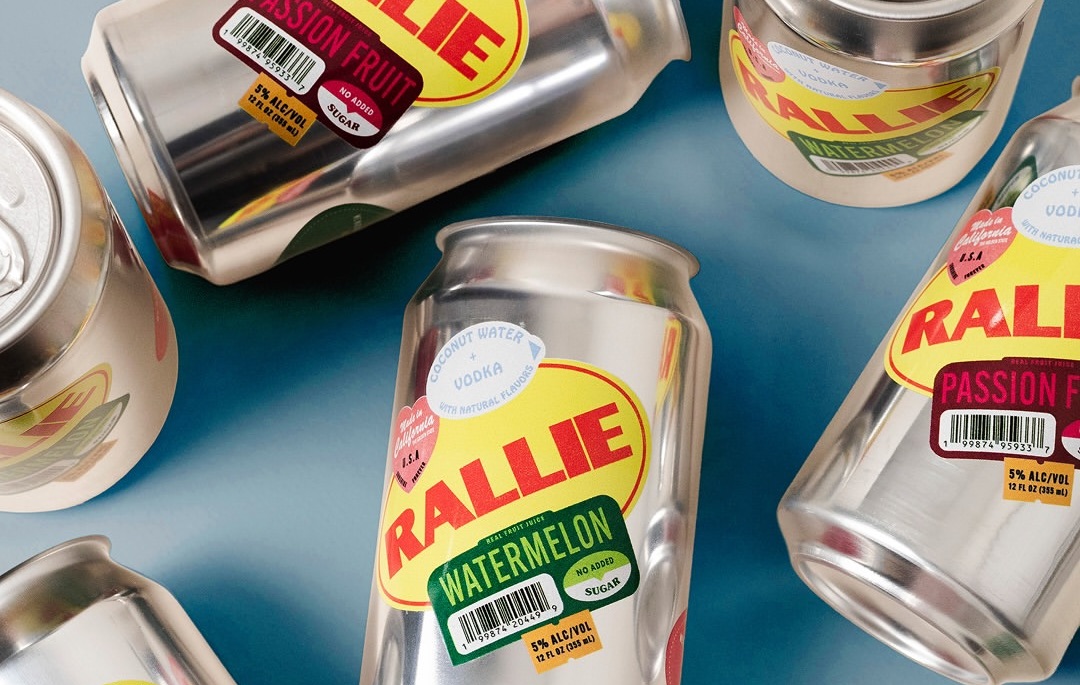
Odds Studio’s design for the canned cocktail Rallie directly confronts the expectation of sleek simplicity by wrapping its product in what appears to be a collage of produce stickers.
This approach exemplifies a growing trend where packaging intentionally adopts unexpected visual and tactile narratives, moving beyond conventional branding cues. Brands increasingly integrate familiar cultural touchstones and everyday aesthetics into premium or novel product presentations, creating immediate recognition and an element of discovery for consumers. These designs transform packaging from a mere container into an engaging point of interaction and storytelling.
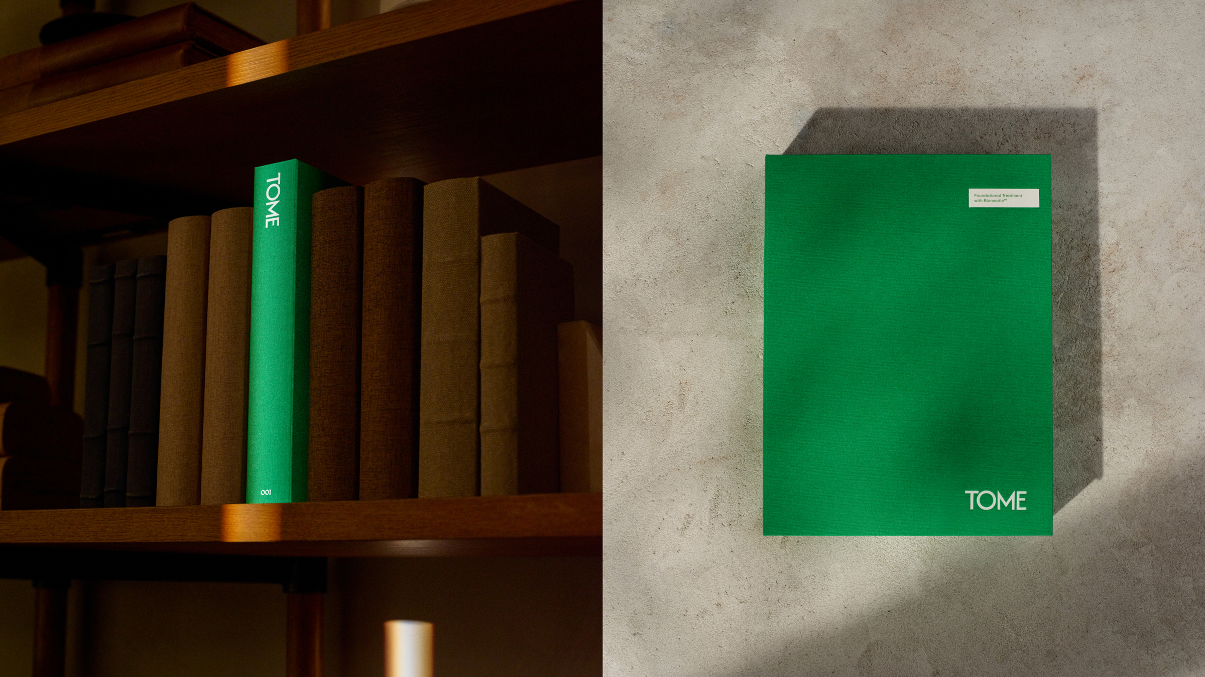
REUNION’s work for Tome Skincare offers a compelling case study for this evolution, specifically in the unboxing experience and tactile branding. The design transforms the skincare packaging into a “book inspired ritual,” employing scientific illustration and reference typography. This concrete detail elevates the act of opening a product into a more deliberate, sequential experience, akin to reading. The perceived tactility of a book, with its pages and binding, informs the user’s interaction before the product is even used. Mainstream industry opinion often dictates that luxury skincare packaging should prioritize minimalist forms and pristine, often glossy, surfaces to convey purity and sophistication. However, Tome Skincare’s approach contradicts this by embracing a richer, more complex narrative structure and a reusable design ethos. This challenges the notion that premium goods must arrive in single-use, often elaborate, disposable containers. This shift in perception will likely drive packaging manufacturers to invest significantly in multi-use structural designs and durable, re-fillable material systems by mid-2027, moving beyond simple recyclability to true circularity in luxury segments.
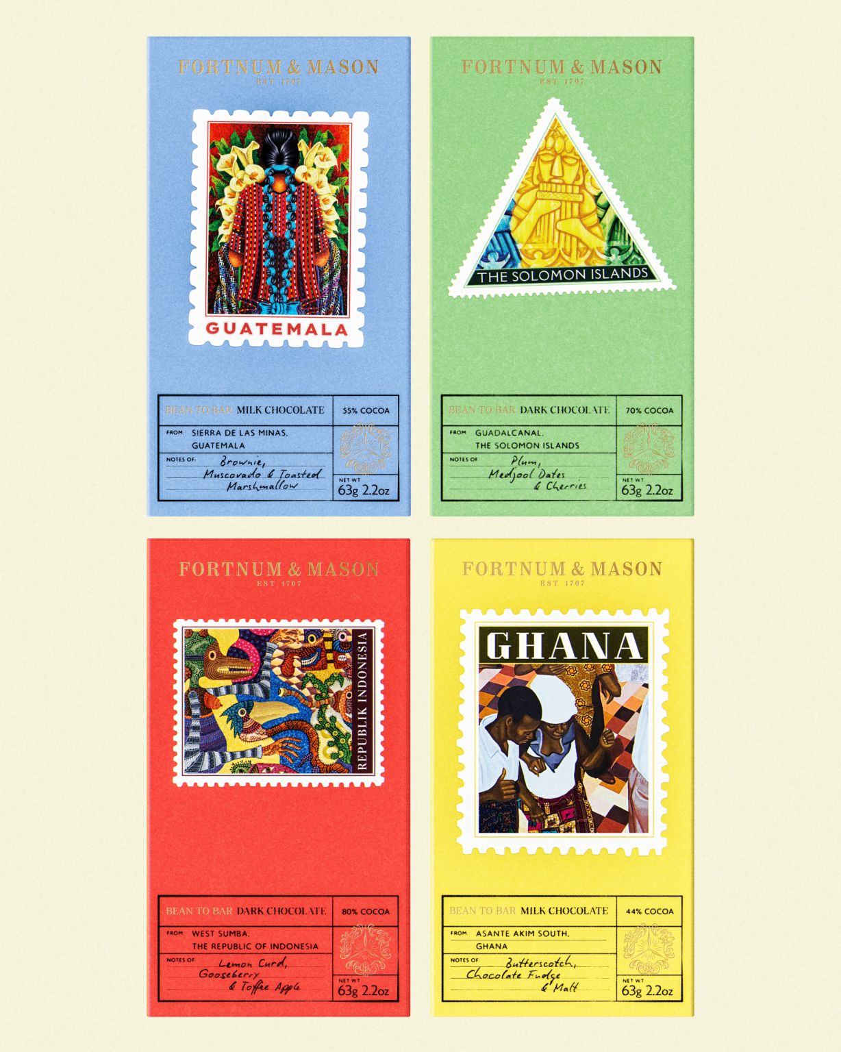
The premium chocolate packaging from Fortnum & Mason, reimagined by Otherway, further illustrates this move towards layered, narrative-rich design. Its “stamp inspired graphics” evoke a sense of global origin and curated craft, directly communicating provenance through a tangible visual language. This tactile suggestion, even if the surface is smooth, guides the consumer’s perception of the product’s journey and quality. The focus moves from simply displaying a product to curating an experience that invites closer inspection and deeper engagement. Predictions indicate that by early 2028, leading brands will integrate haptic feedback technologies or micro-embossing techniques more widely into packaging surfaces, offering genuine tactile surprises beyond visual metaphors, further enhancing shelf impact and unboxing rituals.
Opposing forces persist against this trend. The relentless pressure for cost optimization across supply chains frequently pushes manufacturers towards standardized packaging formats and cheaper, less differentiated materials. This often results in uniform designs that prioritize ease of production and logistical efficiency over unique tactile or narrative elements. Additionally, many established brands remain risk-averse, preferring proven, simplistic aesthetics that rely on brand recognition rather than innovative sensory engagement. Retailers’ demands for maximum shelf density also limit the adoption of packaging forms that might be less efficient for stacking or display.
A packaging professional seeking to innovate should this week identify one overlooked cultural motif or everyday object relevant to their brand’s product category. They should then brainstorm how its characteristic texture, sound, or physical interaction could be directly translated into a packaging component or structural feature, rather than merely represented graphically. For example, if designing for a baked good, consider a paper texture that mimics the crinkled sound of old parchment, or a closure that evokes the snap of a fresh crust, rather than just showing a picture of a baker.
TL;DR
Packaging increasingly tells a physical story through unexpected textures and visual cues to foster deeper consumer connection.
Curated References
About this editorial — This piece was developed using AI-assisted research and curation across multiple industry sources. All analysis, opinions, and predictions represent the editorial perspective of JHDD. Sources are linked in the references section above.