JHDD Branding Report — 2026.08.25
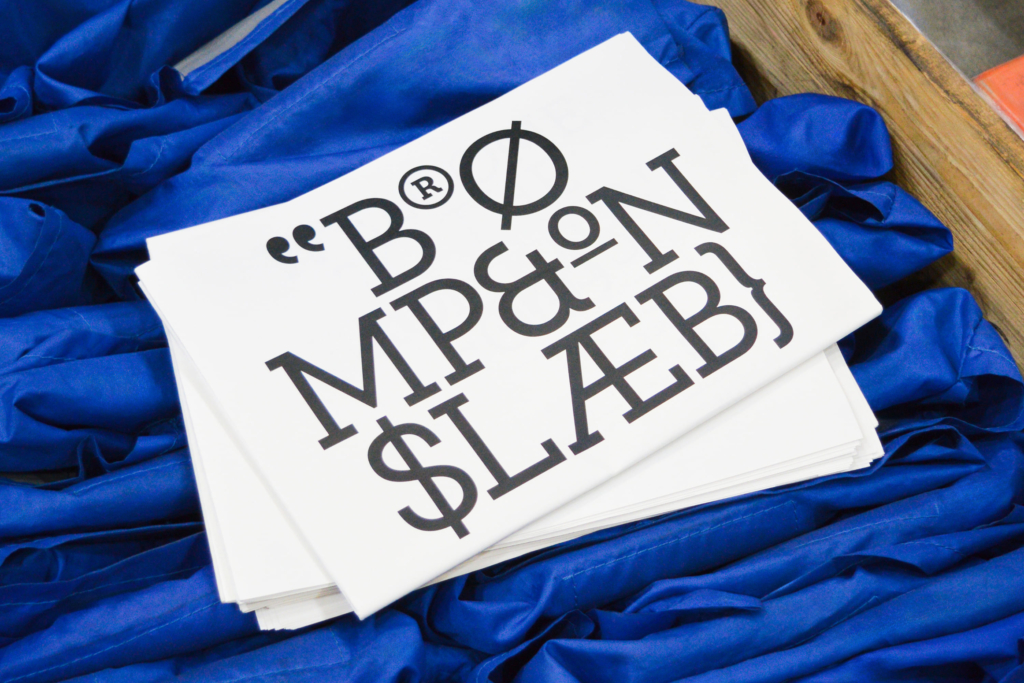
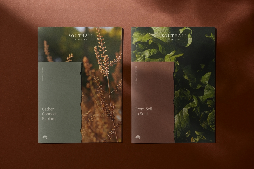
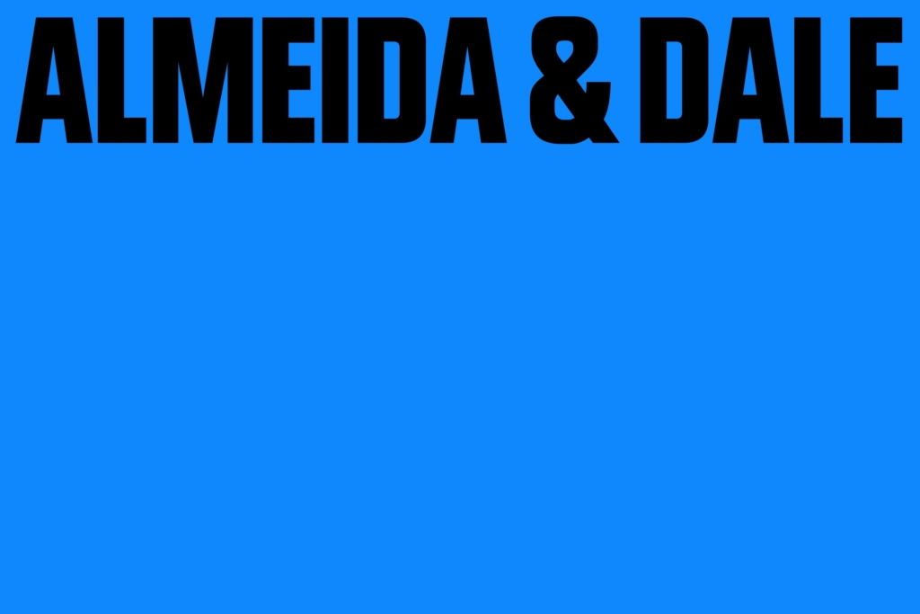
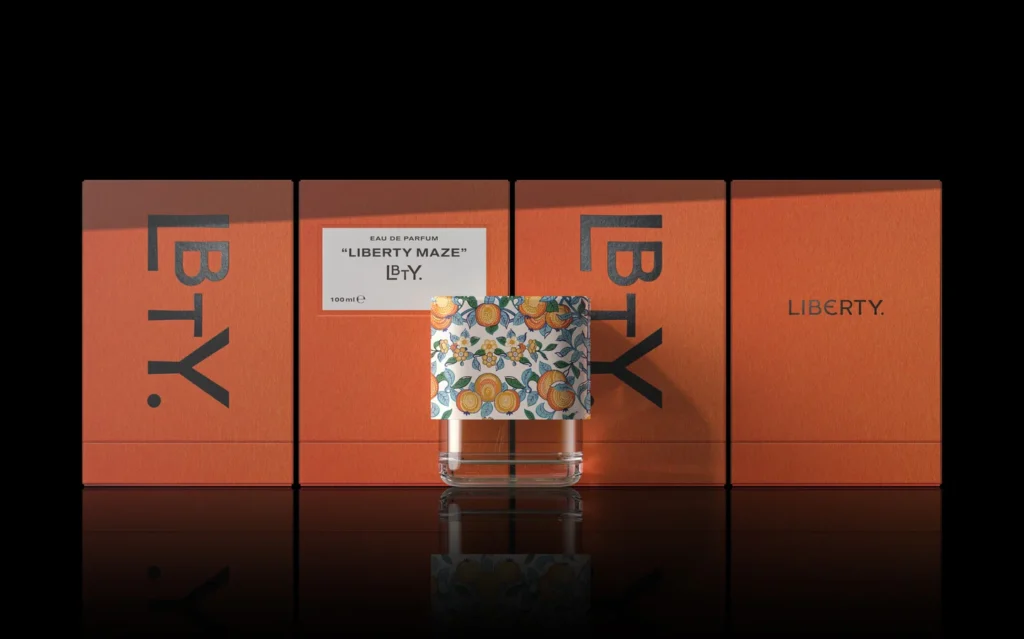
Studio Blackburn’s new identity for folding bike icon Brompton cements the brand’s place in British engineering heritage. This specific approach to visual identity, focused on established roots, reflects a broader, understated shift in how brands are building and expressing equity. The work for Brompton, alongside Perky Bros’ restrained identity for Southall, Porto Rocha’s sensitive design for Almeida & Dale, and Pentagram’s packaging for LBTY, indicates a collective movement away from generic calls for “boldness” and “disruption.” These projects prioritize identities that articulate inherent brand value through specific, often nuanced, emotional registers. This pattern reveals a deliberate focus on resonance over immediate impact, carefully aligning visual systems with deeper, pre-existing brand narratives rather than chasing fleeting trends.
The industry’s mainstream opinion often deifies qualities like ‘bravery’ and ‘zigging when others zag’ in branding. However, Perky Bros’ identity for the Tennessee resort Southall directly challenges this convention by prioritizing “restrained Southern hospitality.” This contradicts the prevalent belief that brands must aggressively assert themselves to capture attention. For Southall, a quiet, sophisticated visual language conveys confidence and an authentic experiential promise more effectively than a “shouty” approach. This strategy builds brand equity not through overt display, but through fostering a sense of belonging and considered appreciation, demonstrating that a brand’s presence can be felt deeply without being loud.
This nuanced approach to visual identity, which values a brand’s intrinsic character over competitive aggression, suggests a maturing understanding of how consumers engage with brands. It positions the brand as a self-assured entity inviting discovery rather than a desperate plea for recognition. By early 2028, leading brands in hospitality, luxury goods, and artisanal products will increasingly commission “anti-bold” visual identities that emphasize legacy, authenticity, and understated quality, consciously detaching from the default expectation of visual loudness.
The primary force resisting this shift is the prevailing metric-driven culture of digitally native direct-to-consumer brands. These brands often operate within frameworks that prioritize immediate scroll-stopping visuals and rapid customer acquisition on platforms like social media. Their brand equity is frequently tied to viral engagement and quick conversion rather than long-term cultural embedding, favoring easily digestible visual identities designed for instant, high-impact visibility in competitive digital feeds.
A working branding professional should conduct an internal review of ongoing projects this week. Identify any client briefs or internal discussions where “modern,” “innovative,” or “competitive” are implicitly or explicitly equated with “bold” or “disruptive” visual outcomes. Present examples such as Perky Bros’ strategic restraint for Southall, advocating for visual identity systems that precisely mirror the brand’s true emotional promise and market positioning, even if that promise is quiet, considered, or deeply rooted in heritage.
TL;DR
Brand identities are increasingly leveraging restrained, nuanced visual systems to build deep cultural equity, countering the industry’s default to aggressive boldness.
Curated References

About this editorial — This piece was developed using AI-assisted research and curation across multiple industry sources. All analysis, opinions, and predictions represent the editorial perspective of JHDD. Sources are linked in the references section above.