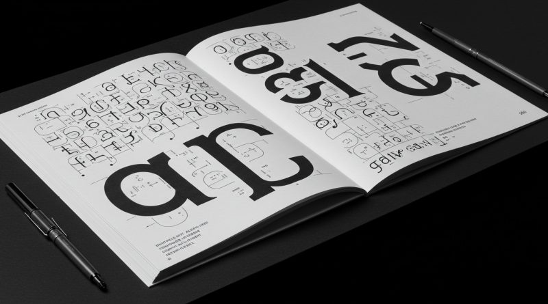
JHDD Typography Report — 2026.08.11
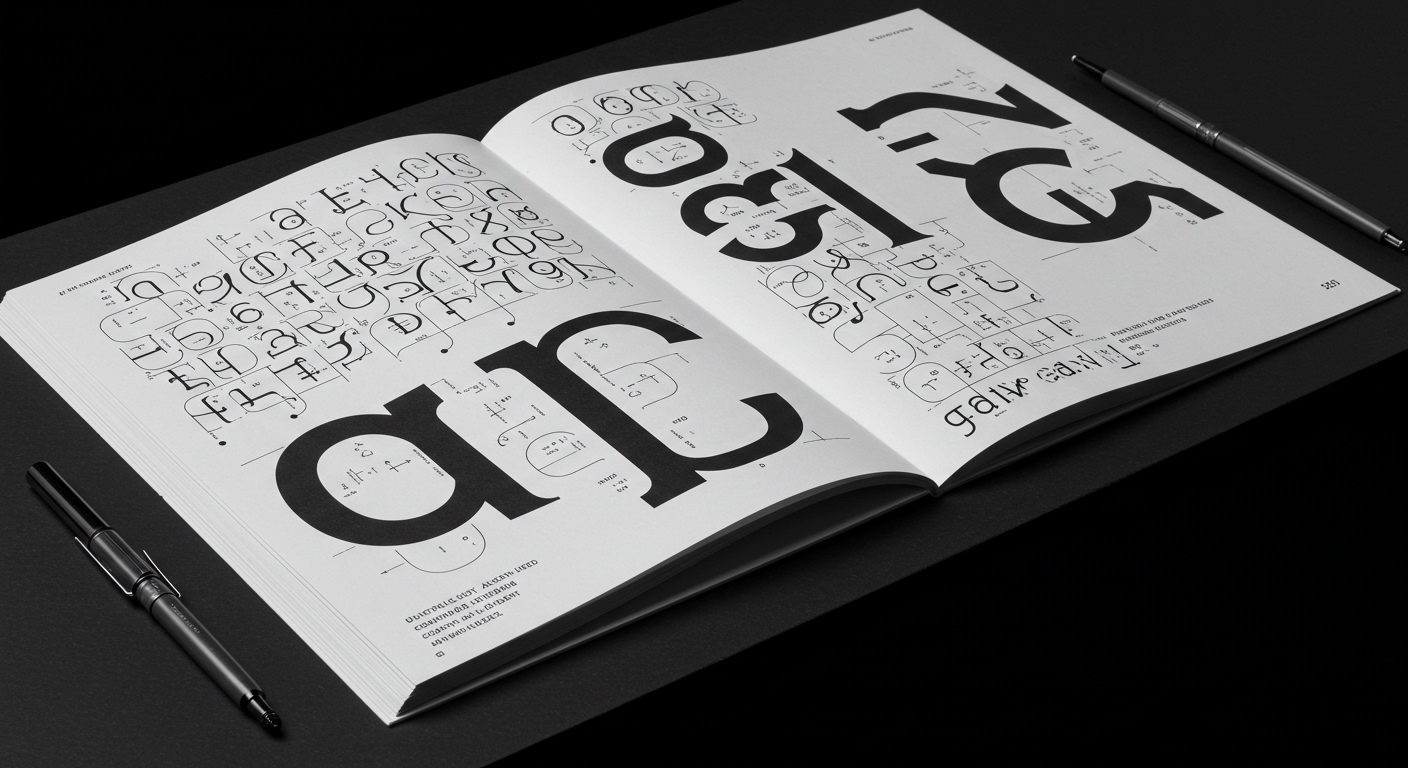
Karlssonwilker’s identity for Calder Gardens demonstrates a meticulous commitment to design process over raw output speed. This approach, explicitly highlighted as emerging from slow, collaborative exploration rather than AI-driven efficiency, reveals a specific pattern in recent design discourse.
The prevailing trend across these seemingly disparate reports points to a re-evaluation of design speed and its impact on the nuanced craft of typography. Whether it is the dedicated, human-led creative partnerships of Craig Cutler and Craig Frazier, or the conscious effort to “refresh a counter-culture classic,” there is an underlying current favoring thoughtful iteration and historically informed engagement over rapid, generic production. This pattern suggests a quiet resistance to the pervasive demand for immediate visual solutions, instead advocating for design that matures through careful consideration.
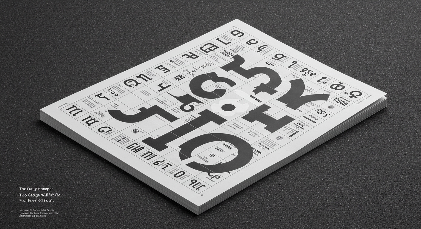
The work by Karlssonwilker for Calder Gardens serves as a critical case study in this context. Their process, which prioritizes “exploration and discovery,” directly implicates the development of bespoke conceptual letterforms and the meticulous application of micro-typography. Rather than aiming for immediate, broad legibility in a purely utilitarian sense, such an approach allows for the creation of unique typographic identities that convey deeper meaning and character. A view contradicting mainstream industry opinion is that the current push for AI-generated type solutions, while often achieving basic readability metrics quickly, fundamentally misunderstands legibility as an experiential quality rather than merely a functional one. True legibility extends beyond mere character recognition; it encompasses how well type resonates with a brand’s narrative, aids comprehension over time, and creates memorable visual experiences. The rapid, template-driven deployment of AI tools frequently bypasses the granular refinement of kerning, tracking, and optical adjustments that define superior micro-typography, resulting in forms that are readable but lack conceptual depth and nuanced expression. By mid-2027, design practices that demonstrably integrate a “slow design” ethos, especially in their typographic output, will command a premium, signaling a conscious rejection of generic, AI-assisted visual language.
This emphasis on crafted detail directly counters the prevailing pressure for efficiency and scalability in design production. The primary opposing force is the proliferation of generative AI platforms and their default type libraries, which offer ostensibly perfect grid systems and balanced letterforms with minimal manual intervention. These tools, while accessible, often standardize letter-spacing, line-height, and conceptual forms, inadvertently flattening visual distinctiveness in pursuit of universal “readability” and rapid deployment. This algorithmic homogenization sacrifices the subtle, human-centric adjustments essential for true micro-typographic refinement and the unique expressiveness of considered conceptual letterforms.
A working Typography professional should, this week, select a current project and meticulously audit its primary typographic applications. Focus specifically on one paragraph block, one heading, and one call-to-action button, manually adjusting kerning pairs, tracking, line breaks, and baseline shifts beyond software defaults to enhance optical balance and semantic emphasis, thereby prioritizing human perceptual nuance over algorithmic uniformity.
TL;DR
The value of slow, human-centric typographic craft is re-emerging against the pressure of AI-driven design speed.
Curated References
About this editorial — This piece was developed using AI-assisted research and curation across multiple industry sources. All analysis, opinions, and predictions represent the editorial perspective of JHDD. Sources are linked in the references section above.