JHDD Branding Report — 2026.08.11
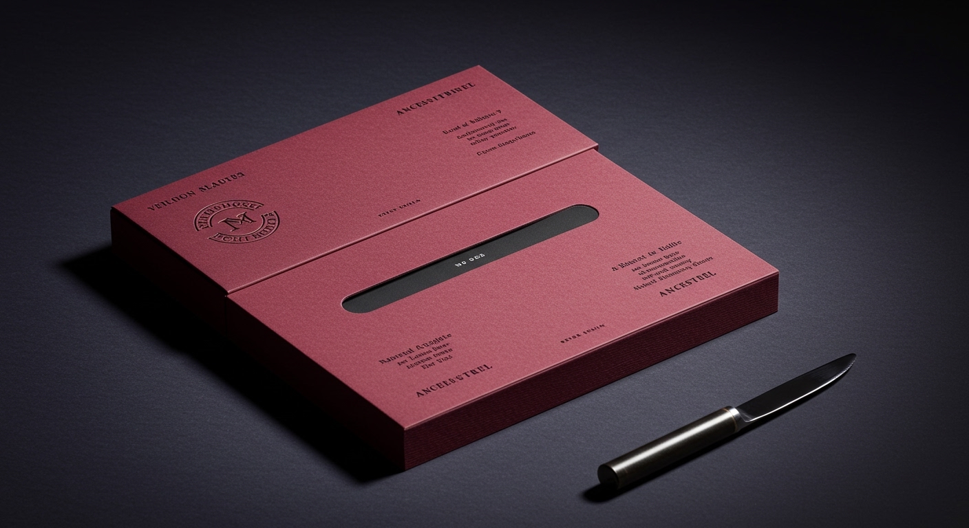
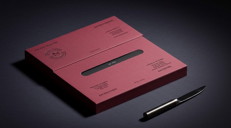
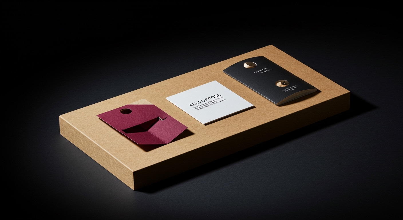
All Purpose ditched wine clichés in its “lurid” new identity for natural wine importer Ancestrel.
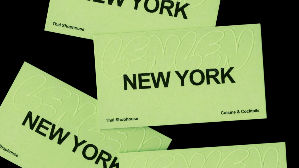
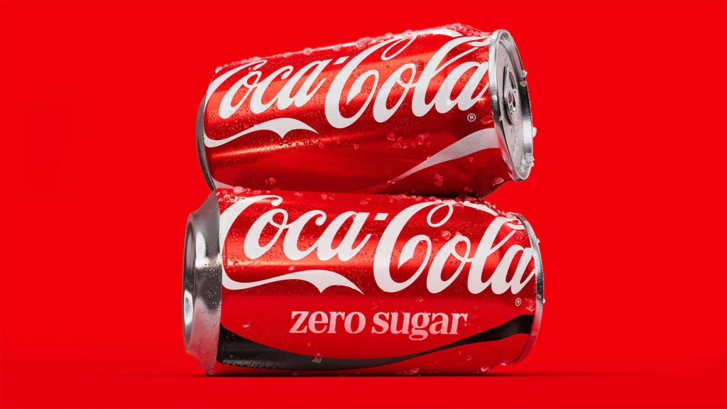
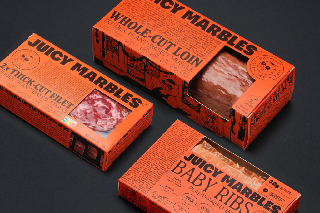
This push towards deliberate aesthetic friction, whether “lurid” for Ancestrel or “controlled chaos” for LenLen, signals a growing divergence in how brands build equity. On one end, new market entrants like vegan meat brand Juicy Marbles use assertive visual identities to carve out specific cultural territory. On the other, established giants like Coca-Cola demonstrate strategic restraint, proving sometimes the smartest rebrand is barely a rebrand at all.
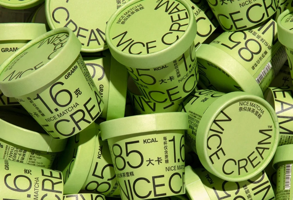
The conventional wisdom often posits that a brand’s visual identity must strive for universal legibility and broad appeal to maximize market penetration. This perspective, however, misses a critical development in brand equity. Pentagram New York, through its work for LenLen, demonstrates how an identity achieving “controlled chaos” can be genuinely effortless, resonating deeply with a specific cultural subset rather than attempting to please everyone. This approach contradicts the mainstream belief that visual systems must be inherently tidy or overtly ‘friendly’ to be effective. For challenger brands, embracing a distinctive, even challenging, aesthetic can be a more potent strategy for cultural positioning than attempting to blend in or broaden appeal prematurely. The ‘less screams more’ approach Lisa Cain observed for ‘Nice Cream’ packaging further underscores this power of deliberate visual restraint or friction. Within two years, more established brands will begin to selectively license visual styles from these ‘controlled chaos’ or ‘lurid’ subculture identities to create limited-edition products, testing the boundaries of their core equity.
This doesn’t mean brand identity should always be jarring. Coca-Cola’s identity update by JKR serves as a counterpoint, proving that preserving core visual assets like its distinctive red, white, and script serif type can be a superior strategic move. Mainstream industry chatter often champions dramatic overhauls as proof of innovation or relevance. Yet, for brands with deeply embedded cultural memory, a “barely a rebrand” strategy safeguards decades of accrued brand equity, leveraging familiarity rather than risking it for performative newness. The market has begun to reward visual consistency and subtle evolution for brands that own significant cultural territory. By mid-2027, the perceived ‘boldness’ of a rebrand will shift from outright visual transformation to the strategic intelligence of when to evolve, and how little change is truly necessary to maintain relevance and protect equity.
The primary opposing force to this trend comes from marketing departments under pressure to demonstrate rapid, measurable ROI, often mistaking visual novelty for market impact. Design agencies focused on billable hours for large-scale rebrands also inadvertently perpetuate the idea that significant visual changes are always optimal. This pressure often leads to a ‘safe, middle-ground’ visual approach that fails to resonate deeply with any specific cultural group, ultimately diluting brand equity through an attempt at universal palatability.
A branding professional should audit client briefs for assumptions about ‘broad appeal’ or ‘modernization.’ Instead, define the specific cultural niche a brand seeks to own, then assess whether its visual identity system, including its use of color, typography, and imagery, is sufficiently distinctive or even polarizing enough to resonate deeply within that niche. For challenger brands, actively test visual concepts that push against category norms, embracing ‘lurid’ or ‘controlled chaos’ where appropriate, rather than defaulting to generic ‘clean’ aesthetics. For established brands, advocate for evolutionary rather than revolutionary changes, emphasizing the safeguarding of existing equity.
TL;DR
Brand equity now strengthens through precise cultural resonance via distinct visual identities, or through strategic preservation of iconic elements.
Curated References

About this editorial — This piece was developed using AI-assisted research and curation across multiple industry sources. All analysis, opinions, and predictions represent the editorial perspective of JHDD. Sources are linked in the references section above.