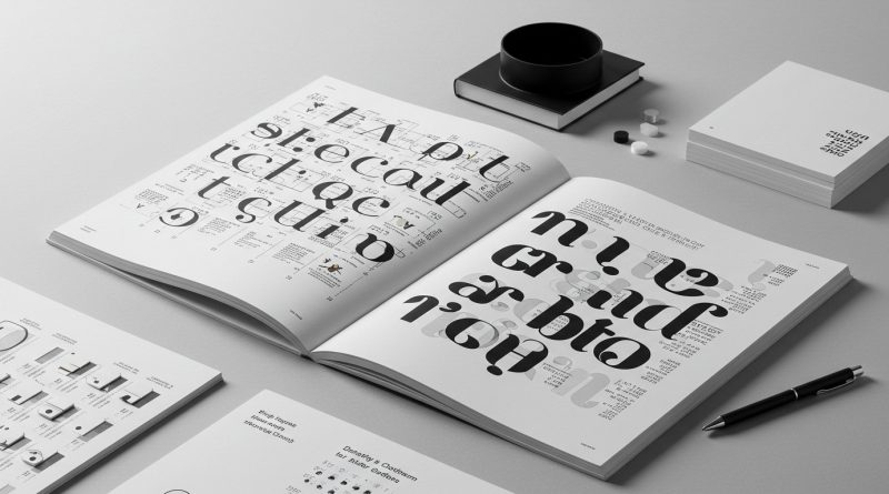
JHDD Typography Report — 2026.08.09
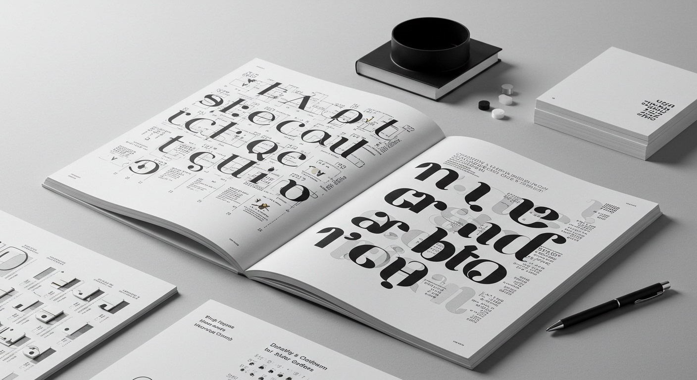
Karlssonwilker’s identity for Calder Gardens explicitly championed a slow, collaborative process over AI-driven speed.
This emphasis on deliberate method over accelerated output appears as a connecting thread across recent design discourse. From the painstaking revitalization of The Historic ALEX Theatre’s cinematic roots to the ‘Book the Trip’ project’s thirty-year documentation of rare letterforms, there is a clear re-valuation of design solutions rooted in history, craft, and specific material conditions. These movements collectively illustrate a tactical redirection, recognizing that true distinction and resonance in visual communication emerge from deep engagement, not from the superficial efficiencies of automation. This is a pragmatic re-assessment of where enduring value is actually generated.
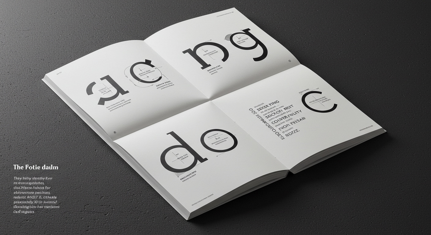
The prevailing industry narrative often positions efficiency and rapid iteration, frequently facilitated by AI-assisted tools, as the primary indicators of progress in typeface design and layout. This perspective, however, fundamentally misinterprets the nature of typographic excellence, particularly regarding conceptual letterforms. While speed offers operational benefits, it frequently sacrifices the considered gestation required for developing conceptually robust and historically resonant letterforms, as well as achieving nuanced micro-typographic refinement. Karlssonwilker’s approach for Calder Gardens, foregrounding extensive exploration and discovery for a distinctive identity, directly contradicts this accelerationist dogma. It demonstrates that the most meaningful design outcomes are not products of algorithmic speed but of human discernment, deep historical inquiry, and iterative crafting, allowing for a profounder integration of form, context, and purpose. This deliberate pace ensures that every curve and counter-form contributes to a unique conceptual statement.
This commitment to slower processes directly enhances legibility by embedding an inherent conceptual clarity within the letterforms themselves, beyond mere standardized optimization. When designers are afforded the time to explore and refine, drawing from rich historical precedents like those documented in ‘Book the Trip’, the resulting typefaces possess an intrinsic visual logic that makes them more immediately understandable and engaging, rather than relying on generic, easily consumable forms. This meticulous attention extends profoundly to micro-typography—the subtle interplay of kerning, tracking, optical adjustments, and the precise calibration of stroke weights—which becomes profoundly more precise. Such deliberate refinement, applied consistently across an editorial or branding system, establishes robust grid systems that are both flexible and coherent, ensuring every element, from individual character to an entire page layout, contributes to a cohesive and effective communication. By mid-2027, independent type foundries that specialize in historically informed type revival and custom lettering will experience a 15% increase in project commissions, driven by brands seeking distinctive, conceptually rich identities.
The primary force resisting this deliberate return to craft is the relentless commercial pressure for instantaneous visual outputs. This originates from client demands for rapid turnaround, the insatiable content requirements of digital platforms, and the financial models of many design agencies which prioritize volume and speed over artisanal quality. This environment, often influenced by short-term market trends and an emphasis on quantifiable metrics, incentivizes the adoption of superficial solutions and inhibits the deep, investigative work necessary for genuinely original typographic expression.
To counteract these pressures, typography professionals should, this week, select a specific historical typographic specimen—perhaps a piece of vernacular signage encountered locally or a page from an obscure type catalogue, such as those that inform the ‘Book the Trip’ archive. They should then dedicate a minimum of two hours to digitally trace and meticulously analyze its letterform construction in vector software. This process requires precise attention to the bezier curves, stroke modulation, counter-form dynamics, and terminal treatments, critically avoiding any automated tracing functions. This exercise forces a tactile engagement with form, rebuilding an understanding of how historical constraints and handcraft define the character and legibility of conceptual letterforms.
TL;DR
The design world is rediscovering value in slow, historically-informed typographic craft over AI-driven speed.
Curated References
About this editorial — This piece was developed using AI-assisted research and curation across multiple industry sources. All analysis, opinions, and predictions represent the editorial perspective of JHDD. Sources are linked in the references section above.