JHDD Branding Report — 2026.08.08
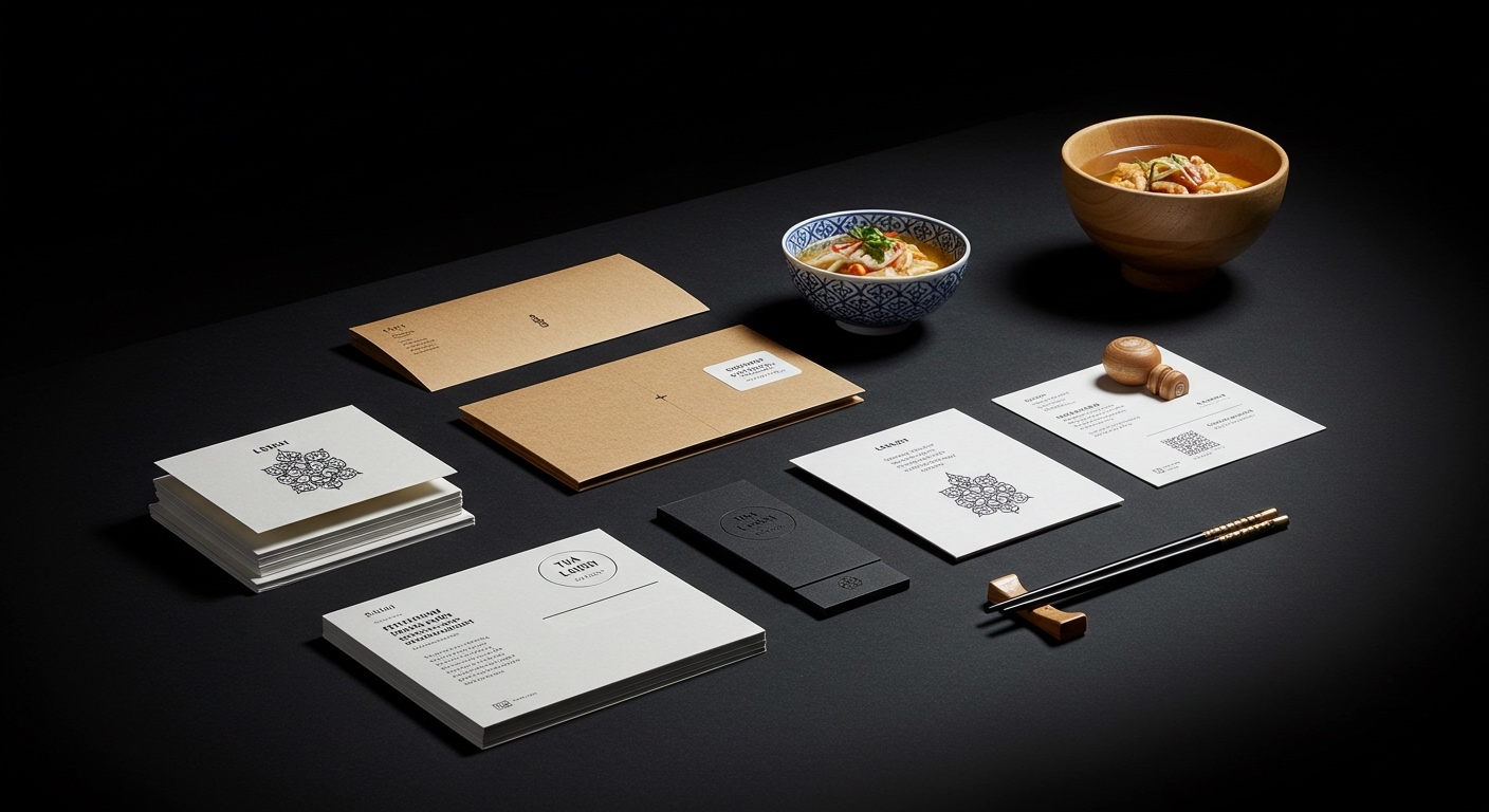
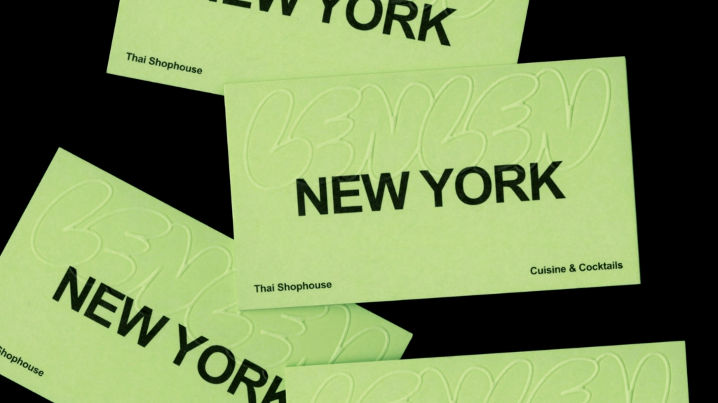
Pentagram New York’s identity for the Thai restaurant LenLen achieves a specific “controlled chaos” that appears genuinely effortless.
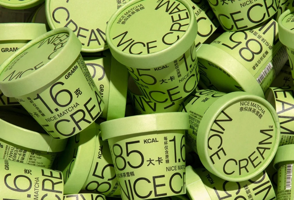
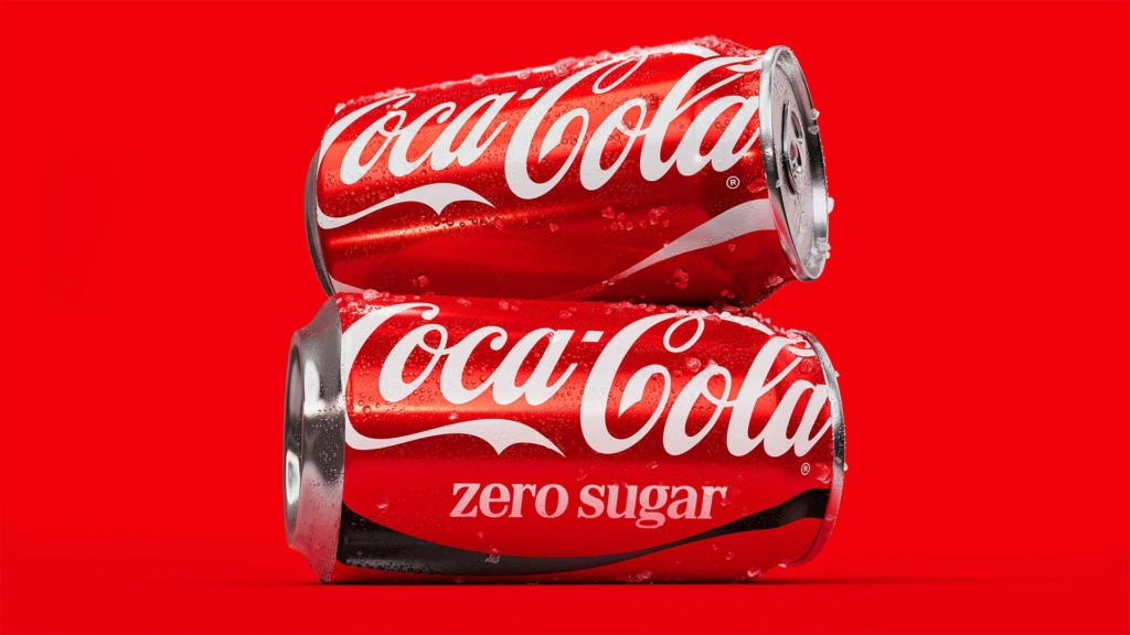
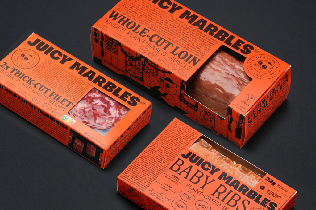
This deliberate approach, whether towards subtle reinforcement or bold category defiance, reflects a sophisticated understanding of cultural signals in contemporary brand building. It is not about simply disrupting existing norms or slavishly adhering to heritage, but about a deliberate, often intricate, deployment of visual identity to communicate a precise brand stance. From Ancestrel’s lurid anti-clichés by All Purpose to Coca-Cola’s near-imperceptible evolution by JKR, the common thread is a profound strategic intentionality behind the chosen visual language, whether maximalist or minimalist.
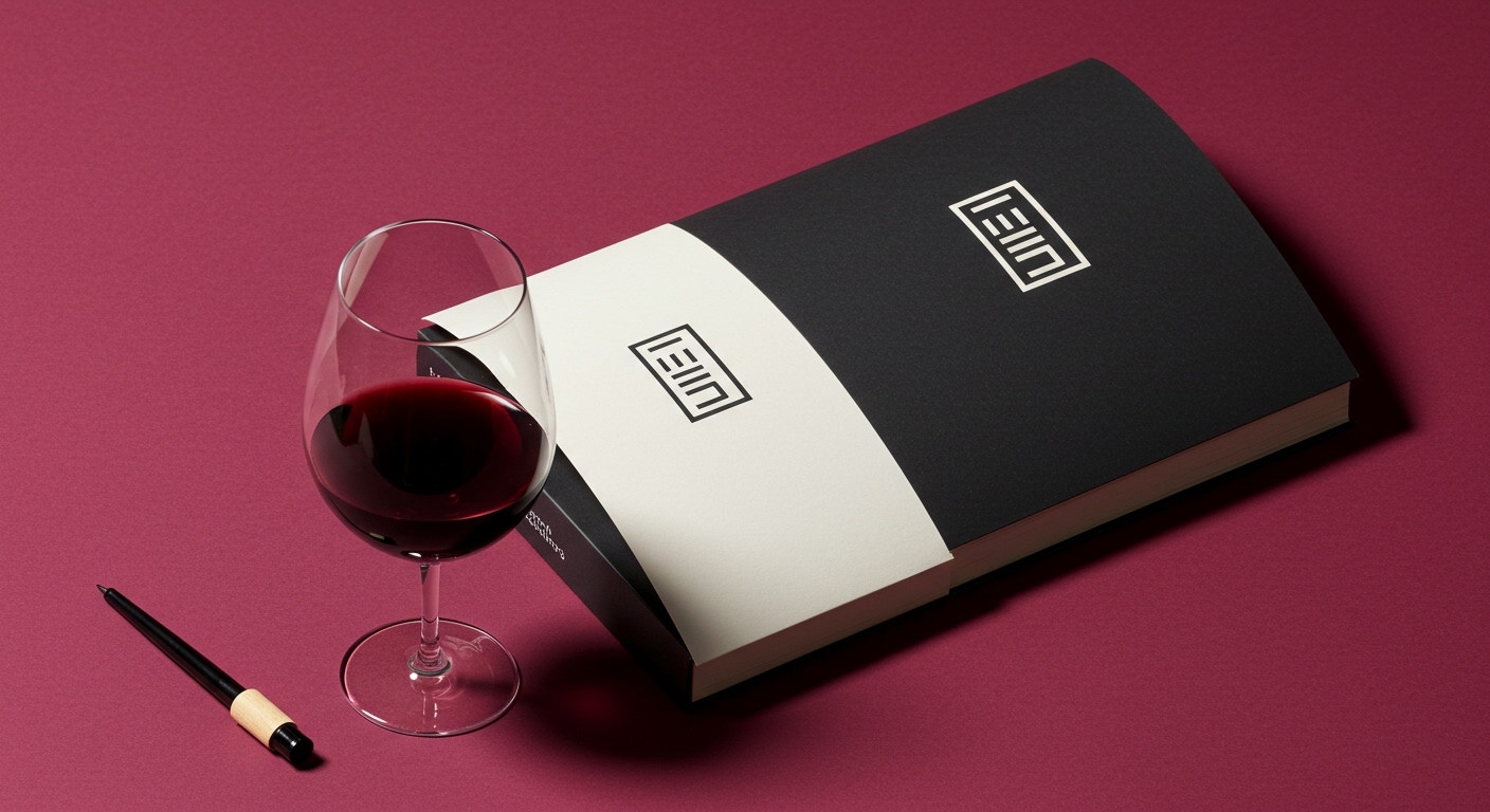
Pentagram’s identity for LenLen, achieving “controlled chaos” without appearing to try too hard, offers a strong case study. Mainstream industry opinion often champions reductive minimalism as the primary route to an “effortless” aesthetic, believing that less visual information equates to more refined perception and distinctiveness. This is a limited view. Pentagram’s work for LenLen contradicts this by demonstrating that sophisticated, layered complexity, when meticulously designed, can convey a deeper, more authentic sense of unforced style. The genius lies not in the inherent simplicity of individual visual elements, but in the highly intelligent system that governs their dynamic interplay, resulting in an identity that feels curated rather than overtly constructed.
This sophisticated balancing act moves beyond binary choices between radical disruption and static tradition. Instead, it positions a brand like LenLen with a distinctive cultural signal that is both rich and accessible, resonating with an audience that values authenticity over mere clarity. This nuanced approach will become increasingly vital. By mid-2028, more independent brands will explicitly commission identity systems that integrate elements of “controlled chaos” or “curated maximalism” to achieve distinctiveness, challenging the default towards generic clean aesthetics.
The primary resistance to this strategic complexity often comes from traditional brand governance structures and risk-averse marketing departments. These entities frequently prioritize standardized, easily quantifiable visual systems, fearing that anything deviating from established norms could dilute brand safety or impede mass recognition. Their adherence to predictable design formulas, often codified in rigid brand guidelines, actively discourages the very nuanced and dynamic visual expression that now defines leading-edge brand equity and cultural relevance.
Branding professionals should shift their focus from merely designing static logos or guideline documents to conceptualizing entire visual identity systems that possess inherent flexibility and adaptability. When presenting identity solutions, emphasize how a structured approach to visual dynamism – incorporating elements of controlled variation, curated eclecticism, or even intentional “noise” – can strategically build cultural relevance and distinctiveness for a client, rather than just ensuring superficial consistency across touchpoints.
TL;DR
Strategic brand identity now hinges on deliberate intentionality, whether amplifying heritage or crafting complex, distinctive visual systems.
Curated References

About this editorial — This piece was developed using AI-assisted research and curation across multiple industry sources. All analysis, opinions, and predictions represent the editorial perspective of JHDD. Sources are linked in the references section above.