JHDD Packaging Report — 2026.08.03
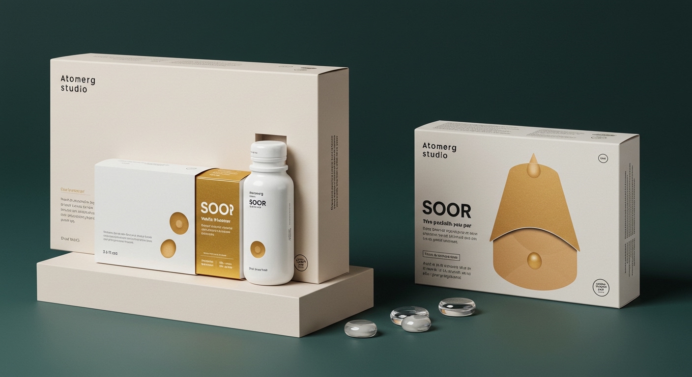
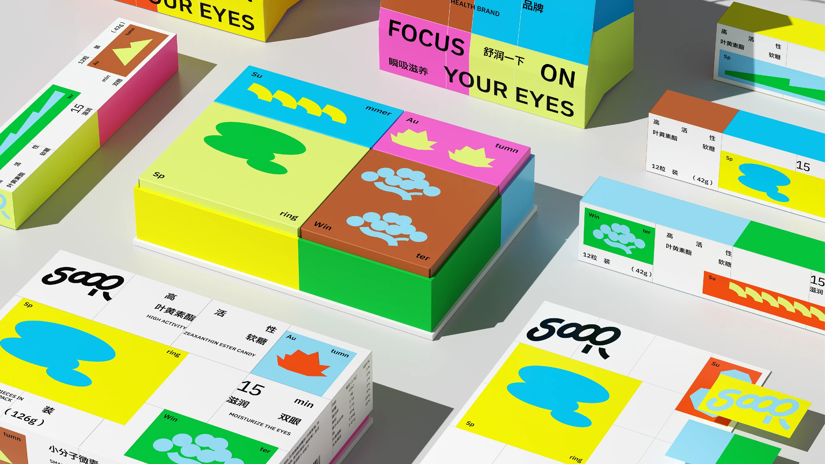
Atomerg Studio’s SOOR eye health supplement packaging eschews the usual clinical whites for a design that visually resembles stacked building blocks.
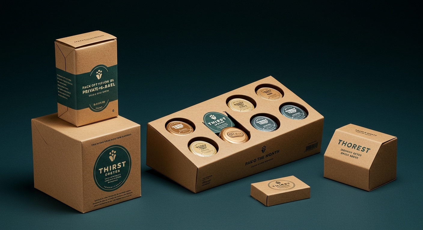
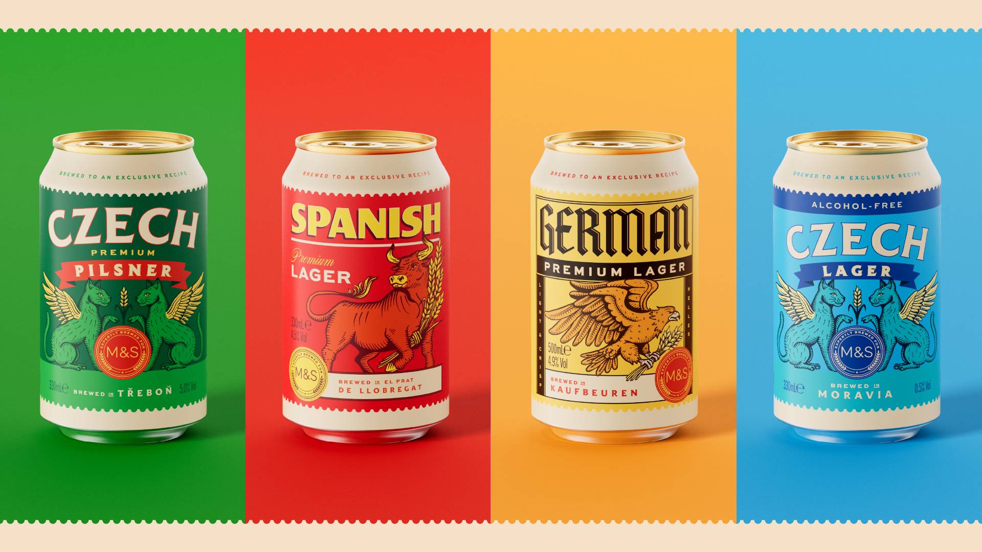
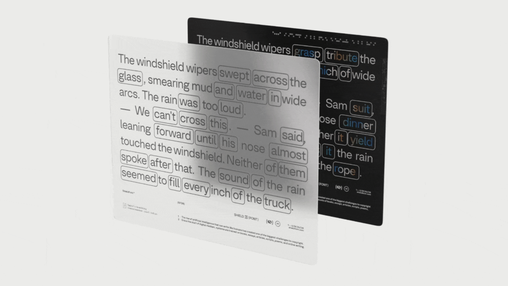
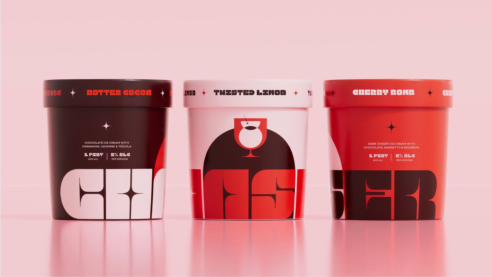
This shift by Atomerg Studio, much like Thirst’s elevation of Marks & Spencer’s private-label beer and SO Dsgn’s distinct branding for Chaser’s Boozy Ice Cream, reveals a sophisticated trend: brands are now redefining product categories by subtly subverting long-held visual and tactile expectations. This transformation of perceived value happens through design that makes packaging an object of interest. The consistent impulse across these examples is a move toward making products feel intrinsically more valuable, often by making the packaging itself an active part of the product experience. Concurrently, tools like ShieldFont, developed by S&A and Playtype, highlight a growing necessity for safeguarding brand identity, extending protection from the digital realm to the increasingly elevated physical packaging.
Atomerg Studio’s approach for SOOR challenges the industry’s ingrained belief that health supplements must signal clinical sterility. By splitting the carton into four color-blocked panels, each with distinct icons and hues, it creates a visual rhythm and potential tactile modularity that contradicts the expected subdued aesthetic. This design strategy suggests an unboxing experience that encourages interaction, perhaps even collection, making the packaging an active part of the product’s lifecycle on a shelf or dresser, not just a disposable barrier. The mainstream often equates perceived value with premium materials; however, this design proves that sophisticated aesthetic choices and clever conceptual framing can elevate even standard cartonboard.
This re-contextualization of packaging, moving it from mere protection to an engaging object, impacts perceived sustainability. When packaging is designed to be aesthetically pleasing and multi-functional, consumers are more likely to retain it, extending its functional and emotional lifespan beyond the product’s consumption. This redefines sustainability as design longevity, rather than merely material choice. Within two years, brands will widely integrate these multi-faceted design approaches, where packaging actively resists discard by offering secondary aesthetic or functional use. This will be coupled with a rise in digital authentication measures, mirroring ShieldFont’s innovative approach, embedded discreetly into physical packaging to ensure consumer trust and brand integrity in a highly visually driven market.
This movement towards elevated, interactive packaging faces significant resistance from established supply chain efficiencies and cost-optimization models. Manufacturers and brand managers often prioritize minimal unit cost and rapid production, making unconventional structures, specialized printing techniques, or tactile finishes seem like unnecessary expenses. The conservatism inherent in category-specific design guidelines, particularly in regulated sectors like pharmaceuticals or food, also limits experimentation, favoring familiar visual cues over disruptive innovation, even when the market is clearly shifting.
A working packaging professional should immediately initiate a “tactile audit” of their brand’s primary and secondary packaging, along with key competitors. This involves blind testing packaging by touch alone to assess perceived quality, material honesty, and differentiation, informing future design briefs with data beyond purely visual metrics.
TL;DR
Brands are elevating packaging beyond containment, using clever design and tactile appeal to redefine product categories and encourage retention.
Curated References
About this editorial — This piece was developed using AI-assisted research and curation across multiple industry sources. All analysis, opinions, and predictions represent the editorial perspective of JHDD. Sources are linked in the references section above.