JHDD Typography Report — 2026.07.19
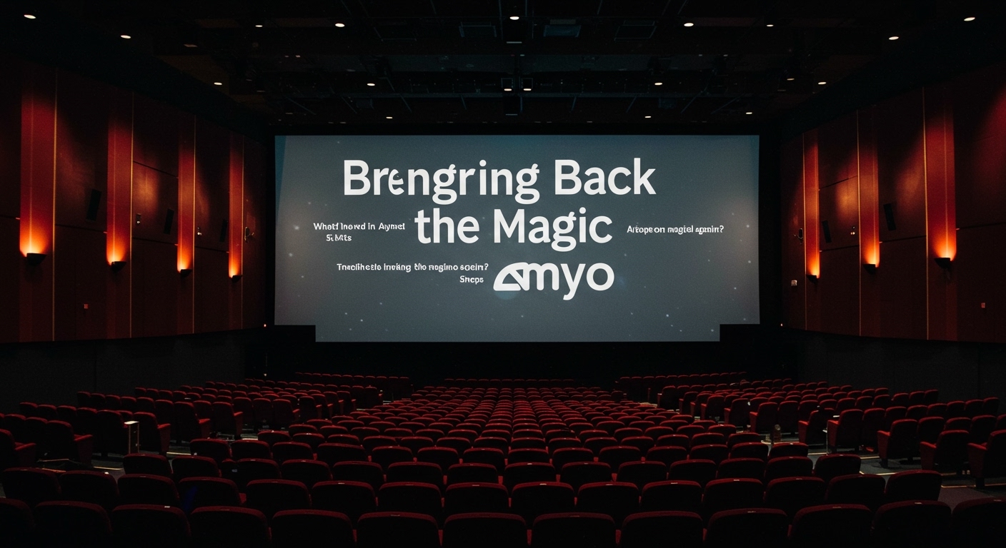
Sheps’ design strategy for AMC re-evokes wonder by revisiting its 1979 identity rather than simply replicating it.
The recent design discussions, from Sheps’ AMC rebranding approach to the collection habits of Max Karagöz, reveal a pattern where historical typographic forms are being re-examined through a lens of conceptual application rather than mere imitation. This is not a simple return to past aesthetics, but an analytical extraction of principles for new contexts. The emphasis falls on understanding the original intent behind classic letterforms and grid systems, then applying those insights to forge contemporary identities that resonate beyond surface-level nostalgia.
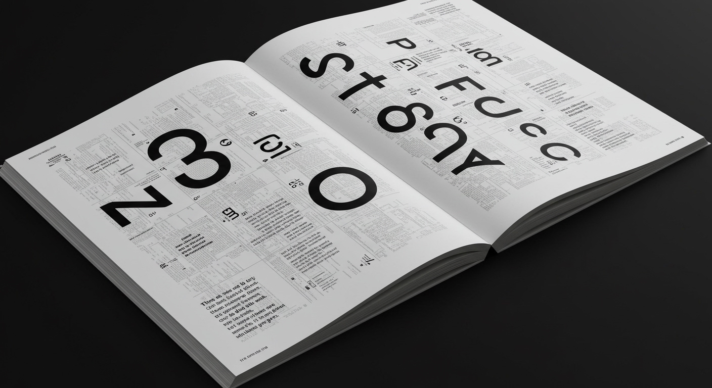
Roy Kuhlman’s influential book covers, known for their narrative abstraction and mid-century style, exemplify this critical re-evaluation. Kuhlman’s approach was not about decorative flourish but about conveying complex literary themes through concise visual language, often employing minimal letterforms and tightly structured grids. The mainstream industry often defaults to legibility as the ultimate arbiter of typographic success, especially in information-dense contexts like book covers. However, Kuhlman deliberately challenged this by abstracting letterforms, sometimes pushing them to the edge of recognition, to create a conceptual resonance that amplified the book’s content. This contravenes the common belief that immediate, effortless readability always serves the user best. His work suggests that a carefully managed degree of visual tension or intellectual engagement, achieved through conceptual letterforms and unorthodox micro-typographic arrangements, can deepen a reader’s connection to the material.
Kuhlman understood that the perceived meaning of a letterform extends beyond its phonetic function. His abstract letterforms were integral to his grid systems, dictating rhythm and hierarchy through their shape and placement, rather than solely through their semantic value. This deliberate use of type as an active visual component, capable of carrying narrative weight without being purely illustrative, offers a model for contemporary branding. Within two years, more brand identities for cultural institutions and publishing houses will adopt a Kuhlmanesque principle, integrating slightly deconstructed or conceptually weighted letterforms within their logotypes and editorial layouts. This will manifest not as a retro wave, but as a sophisticated exploration of how typographic form can embody brand values more abstractly, creating visual intrigue that demands a second look, without sacrificing core identity recognition.
The primary opposing force to this conceptual shift is the ingrained industry expectation of immediate user recognition and quantifiable click-through rates, which often prioritizes highly accessible, often generic, sans-serifs and conventional grid structures. These forces are reinforced by template-driven design tools and platforms that standardize typographic choices for maximum perceived “ease of use” and “conversion.” The drive for universal accessibility, while important, can sometimes inadvertently stifle innovative conceptual approaches to letterforms and grid systems, particularly when strict legibility metrics are applied without nuance to expressive contexts.
Typography professionals should, this week, select a passage of text from a complex subject matter, then design a conceptual letterform or a micro-typographic element that visually represents an abstract concept within that text, deliberately challenging default legibility while maintaining a discernible connection to its meaning. Experiment with different grid systems to integrate this conceptual element, observing how its placement and surrounding whitespace affect its perceived clarity and narrative impact, rather than optimizing purely for speed of reading.
TL;DR
Contemporary design is re-evaluating historical conceptual letterforms and grid systems to create deeper brand narratives, challenging an exclusive focus on immediate legibility.
Curated References
About this editorial — This piece was developed using AI-assisted research and curation across multiple industry sources. All analysis, opinions, and predictions represent the editorial perspective of JHDD. Sources are linked in the references section above.