JHDD Packaging Report — 2026.07.19
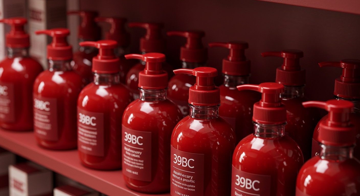
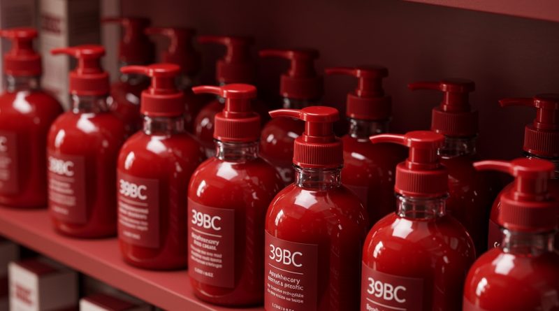
39BC’s glossy cherry red caps on apothecary-style glass bottles signal a specific intent to elevate everyday body care products.
A distinct pattern emerges across recent packaging initiatives, where brands increasingly leverage tactile and visual design elements to imbue products with narrative depth and experiential value, moving beyond mere functional containment. This trend connects high-end aesthetics, as seen with 39BC and Shwung, with consumer desire for sustainability and enriched brand interaction, exemplified by Ho‘i and JKR’s work for Budweiser. The packaging itself becomes a primary storyteller, shaping perceptions of luxury, heritage, or environmental responsibility.
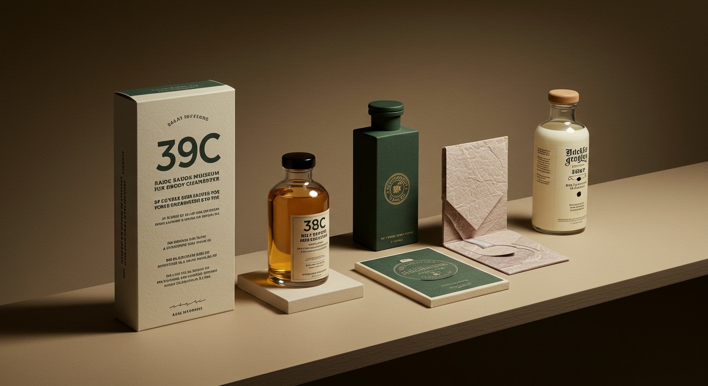
Consider Fcklck’s brand system for Shwung, which skillfully balances high-end wine heritage with a phonetic naming convention. The striking die-cut labels and thoughtful bottle curation do not just hold a non-alcoholic product; they invite a sophisticated tactile engagement that mirrors the experience of traditional premium wine. Mainstream industry opinion often prioritizes visual shelf impact above all else, seeing tactile elements as secondary or cost-prohibitive. However, Shwung demonstrates that integrated tactile and structural design, like the specific feel of a die-cut label or the weight of a curated bottle, directly contributes to perceived value and distinguishes a product in a crowded category. This approach understands that consumers interact with packaging through multiple senses long before purchase.
This integration of sensory detail with brand narrative will become a baseline expectation for aspirational CPG. By mid-2028, at least 40% of new product launches in the premium beverage and personal care sectors will incorporate custom structural packaging or bespoke tactile finishes as a core element of their branding, moving away from stock components. This signals a re-evaluation of how material and form contribute to brand equity. The Ho‘i program in Hilo, Hawaii, further underlines this, transforming reusable takeout serveware into a community-centric experience, where the act of “return” is designed to be seamless and implicitly valued.
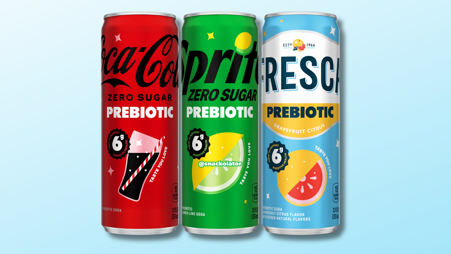
The primary resistance to this shift comes from entrenched supply chain economics and legacy manufacturing processes that favor standardization and cost-per-unit above all else. Large-scale CPG operations, particularly those with complex distribution networks like Coca-Cola, face significant hurdles when attempting to pivot from established, high-volume material sourcing to more specialized, experiential, or circularly designed packaging systems. Their focus on incremental efficiency gains often overshadows the potential for holistic brand elevation through sophisticated packaging design.
A working packaging professional should immediately audit current packaging specifications for opportunities to introduce a specific, non-functional tactile or structural detail. This could involve exploring embossed paperboard, a unique closure material, or even a subtle perforation that enhances the unboxing moment, aligning it directly with the brand’s core values.
TL;DR
Packaging design now demands deep sensory engagement and brand storytelling through material choice and structural forms.
Curated References


About this editorial — This piece was developed using AI-assisted research and curation across multiple industry sources. All analysis, opinions, and predictions represent the editorial perspective of JHDD. Sources are linked in the references section above.