JHDD Branding Report — 2026.07.19
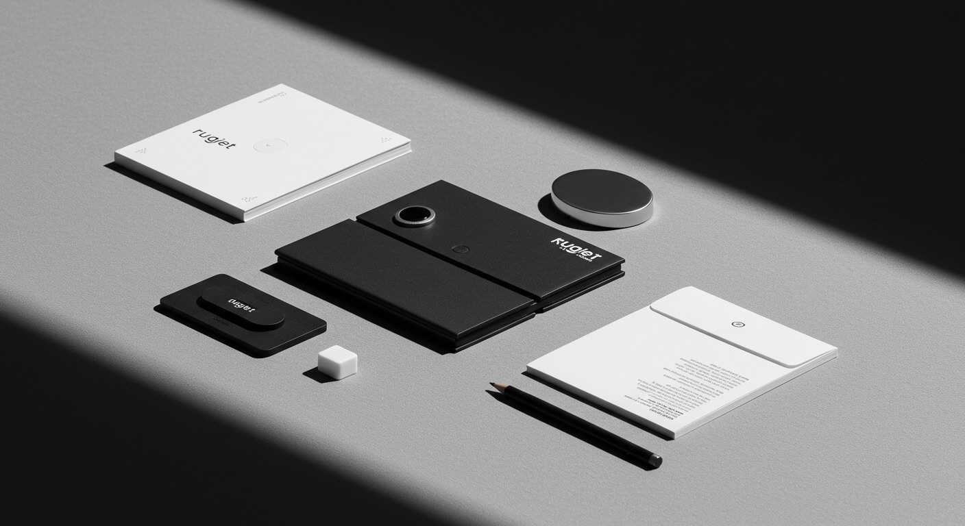
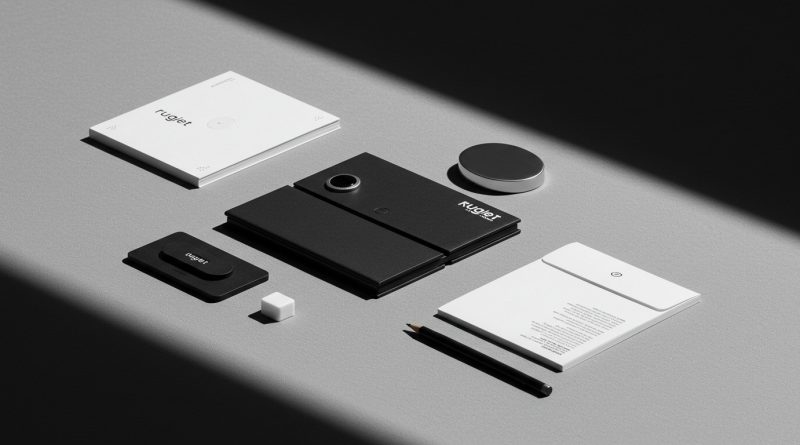
Pentagram New York’s work for Rugiet showcases an identity embracing direct, unabashedly phallic visual language for a male health brand.
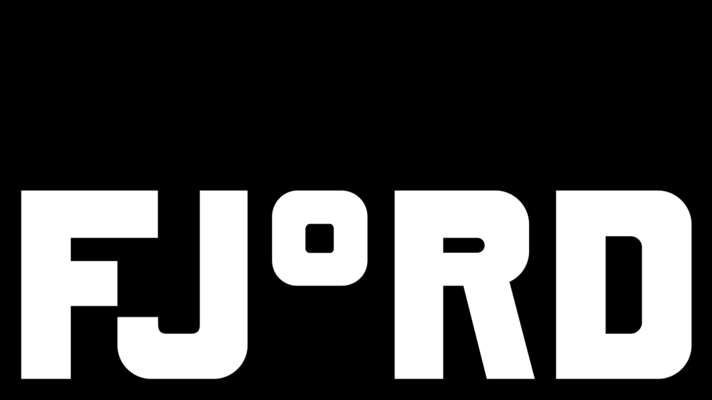
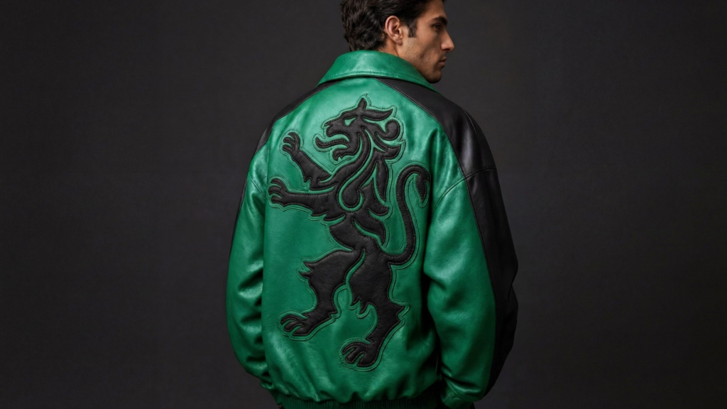
This approach, far from being an outlier, reflects a broader pattern across diverse sectors where brands establish strong market positioning by confidently diverging from category norms. DutchScot’s branding for Fjord positions a sauna experience not merely as wellness but at the intersection of architecture, hospitality, and outdoor recreation, demonstrating a deliberate refusal to conform to a single established category. Similarly, JKR’s overhaul of Sporting CP leverages historical elements to forge a robustly simple, contemporary identity, moving beyond generic sports aesthetics. What unites these efforts is a strategic pivot towards distinctiveness through unapologetic specificity in visual identity and market positioning.

The industry frequently advises brands, especially those navigating sensitive categories or seeking broad market penetration, to adopt understated visual identities that prioritize universal appeal and avoid any potential for offense. Pentagram’s design for Rugiet directly contradicts this conventional wisdom, demonstrating a strategic preference for pointed communication over cautious generality. The brand, offering personalized, clinically-backed treatments exclusively online, benefits from a visual system that is explicitly direct and unambiguous. This unabashedly phallic iconography communicates immediate relevance and a distinct confidence to its target male audience, fostering a sense of understanding and trust that more subtle or abstract branding might fail to achieve. By being so specific and bold, the visual identity itself becomes a clear cultural signal, establishing an assertive authority and a no-nonsense stance that significantly enhances brand equity with its intended user base, rather than diminishing it through a pursuit of broader, diluted acceptance.
This strategic embrace of specificity acknowledges that profound authenticity and deep resonance with a defined niche audience often outweigh the pursuit of universal acceptance. Brands that are overly cautious in their visual identity and market positioning risk appearing generic, indistinct, and ultimately forgettable, diluting their crucial cultural signals within an increasingly saturated landscape. The contemporary market increasingly rewards clarity, boldness, and a distinct point of view, particularly when these are genuinely aligned with profound user needs or an authentic brand narrative. By mid-2027, this trend is set to accelerate significantly. At least two major brands operating within highly regulated, historically conservative sectors – such as personal insurance, wealth management, or even medical devices – will unveil visual identity systems that overtly challenge established category clichés. These new identities will employ similarly direct, even provocative, graphic forms, seeking to disrupt stagnant markets by being unmistakably themselves and forging stronger, more loyal connections with specific consumer segments.
This emergent shift towards visual directness and highly specific brand language faces considerable resistance, predominantly from large, established corporate entities. These organizations are often burdened by extensive internal approval processes, complex stakeholder matrices, and a deep-seated, justifiable fear of alienating their existing broad consumer bases, which represent significant revenue streams. Consequently, such companies, with their cautious legal and compliance departments, frequently default to generic, ‘safe’ visual identities. This preference prioritizes incremental adjustments and superficial refreshes over transformative expressions of brand purpose or market positioning. While their existing brand equity remains a valuable asset, it often becomes a self-imposed constraint, serving as a justification for avoiding the bold, decisive visual changes that could resonate more deeply and effectively with rapidly evolving contemporary audiences.
Branding professionals should conduct a critical audit of their client’s current and desired market positioning, specifically identifying opportunities where explicit visual differentiation could strengthen brand equity. Instead of seeking universal appeal, pinpoint one core, perhaps understated, aspect of the brand’s heritage, purpose, or product benefit, then develop a visual identity system that overtly expresses this truth. This requires challenging internal assumptions about ‘safe’ design and advocating for specificity over generalized aesthetics.
TL;DR
Bold, specific visual identities are building strong brand equity by rejecting generic category norms.
Curated References



About this editorial — This piece was developed using AI-assisted research and curation across multiple industry sources. All analysis, opinions, and predictions represent the editorial perspective of JHDD. Sources are linked in the references section above.