JHDD Branding Report — 2026.09.26
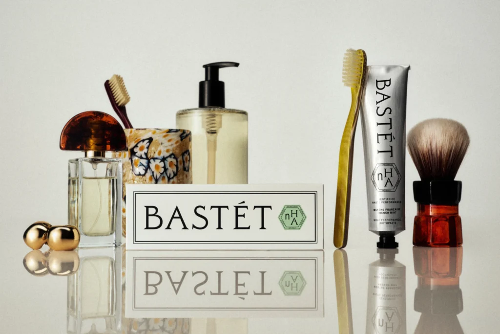
Wedge’s brand identity for Bastét toothpaste prioritizes an utterly gorgeous visual experience over literal category sense. This approach, where a brand’s visual identity and positioning deliberately diverge from immediate category cues, is becoming a primary mechanism for building distinctiveness. Whether it is Granola’s “not for breakfast” messaging for an AI notepad, or Pentagram New York crafting a surprisingly joyful identity for Mozilla’s Nothing Personal, brands are increasingly leveraging calculated incongruity to capture attention and signal unique value.
This pattern suggests a strategic shift in how brand equity is built. Mainstream industry opinion often insists that a brand’s visual identity and naming must offer immediate, unambiguous clarity about its function or category for effective market positioning. However, this conventional wisdom overlooks the homogenization it frequently produces. In crowded digital and physical markets, directness often results in indistinguishable brands. The true value now lies in generating cultural signals through unexpectedness, fostering memorability precisely because the brand identity doesn’t conform to expectations. This approach, exemplified by Bastét’s defiance of typical oral care aesthetics, creates a more potent and lasting impression than any straightforward depiction of “nano-hydroxyapatite” could achieve.
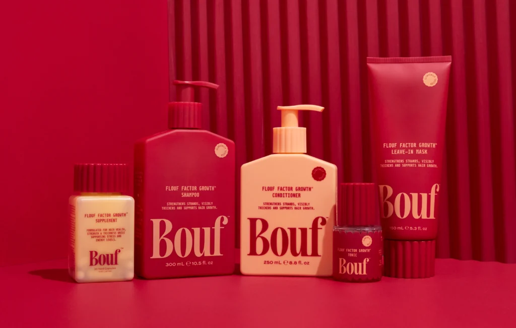
The risk of confusion, often cited as a deterrent, is increasingly overshadowed by the reward of standing apart. A brand like Bastét embraces the unfamiliar, making the identity itself the hero, rather than solely the product’s functional benefit. This creates a cultural signal of confidence and a distinct point of view. For a brand like Bouf, which packaging expert Lisa Cain reviewed, if its chosen name is perceived as “thick,” it highlights that subversion without clear intent or compelling execution can misfire. However, when executed thoughtfully, as with Nothing Personal’s identity for a tech platform, the unexpected emotional tone can deepen consumer engagement and reinforce core brand values like Mozilla’s utopian internet ideals. By early 2028, brands that strategically integrate counter-category messaging and visual systems will demonstrably gain a disproportionate share of cultural relevance and consumer advocacy compared to their functionally literal competitors.
The primary opposing force to this intelligent incongruity comes from traditional market research methodologies. These methods frequently emphasize surveys measuring immediate comprehension and direct message recall, which inherently penalize anything that requires a second thought or an emotional leap. Clients, often under pressure to justify marketing spend with easily quantifiable metrics, gravitate towards identities that test “safe” in these environments. This reliance on data that prioritizes immediate clarity over long-term emotional resonance actively suppresses the very forms of distinctiveness that contribute to enduring brand equity.
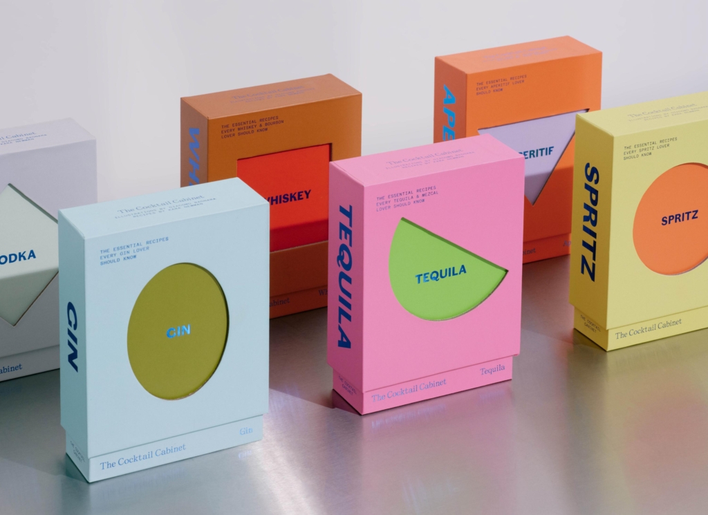
A working Branding professional should, this week, challenge project briefs that prioritize direct, literal representation within category conventions. Instead, advocate for conceptual exploration that seeks to define a brand through unexpected associations, visual abstraction, or deliberately provocative naming, like A Friend Of Mine did for The Cocktail Cabinet to evoke a sense of stirring possibility. The goal is to create a unique cultural signal that builds deeper resonance, rather than simply communicating functional attributes.
TL;DR
Brands gain equity by subverting category expectations and prioritizing surprising, memorable design over literal clarity.
Curated References


About this editorial — This piece was developed using AI-assisted research and curation across multiple industry sources. All analysis, opinions, and predictions represent the editorial perspective of JHDD. Sources are linked in the references section above.