JHDD Typography Report — 2026.08.24
Seymour Chwast, at 95, continues to produce work where distinct typographic voices are paramount, as noted by Steven Heller. The
Read MoreExploration of experimental typefaces, editorial layouts, and the evolving aesthetic of letterforms in modern design.
Seymour Chwast, at 95, continues to produce work where distinct typographic voices are paramount, as noted by Steven Heller. The
Read MoreSeymour Chwast, at 95, continues to create, exemplifying a dedication to craft that challenges contemporary notions of design longevity. The
Read MoreSeymour Chwast, at 95, continues to produce work, a specific detail highlighted by Steven Heller. This persistence of individual creative
Read More
Monotype’s introduction of Gotham Variable, as explored by Sara Soskolne, marks a significant moment in the evolution of established type
Read More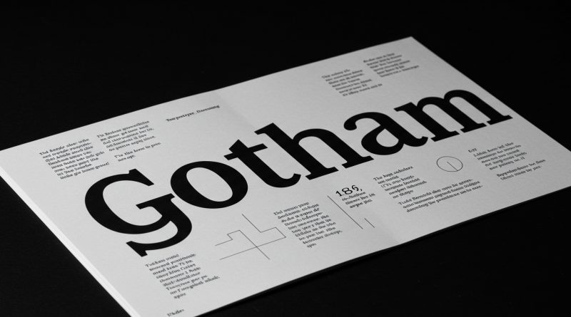
Monotype’s decision to release Gotham Variable twenty-five years after the original typeface demonstrates a conscious engagement with legacy in contemporary
Read More
Instagram’s recent visual refresh subtly highlights a design tension often overlooked in grander brand narratives. This tension, connecting the established
Read More
Instagram’s recent refresh illustrates a prevalent misunderstanding of typographic evolution in digital spaces. The news items collectively reveal a pattern
Read More
Instagram’s recent “little refresh” exemplifies a pervasive tension in contemporary digital design practice. The pattern connecting several recent industry observations
Read More
Instagram’s recent “little refresh” provided a superficial update to its visual identity. This event, alongside the discussion of “editorial dissonance”
Read More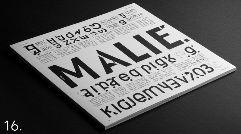
The editorial dissonance evident in ‘MALE.’ highlights an ongoing challenge in contemporary editorial design. Across these varied accounts, from the
Read More