JHDD Branding Report — 2026.10.06
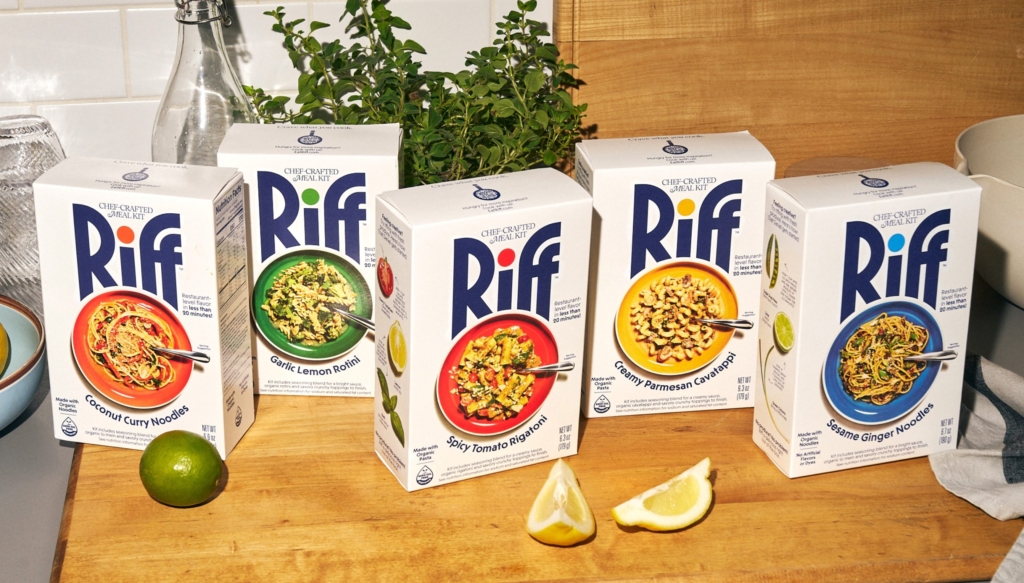
JKR’s rebrand for Tropical Smoothie Cafe demonstrated the power of being “deliciously on the nose.”
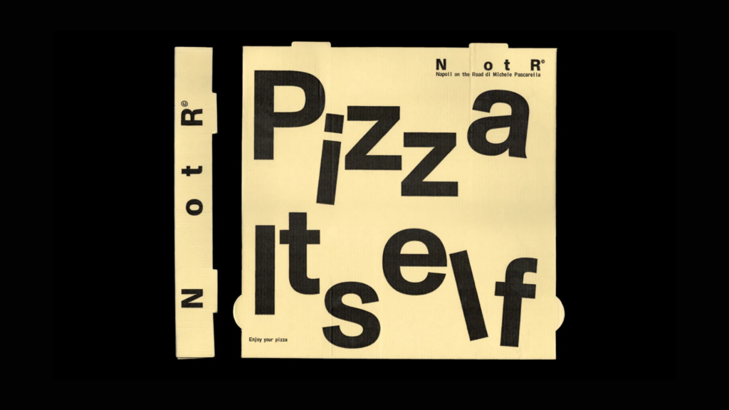
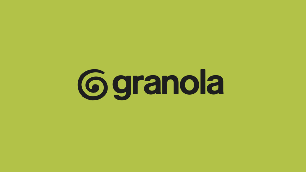
This directness, often eschewed by conventional design wisdom, appears as a potent strategy across recent brand projects. From Vrints-Kolsteren’s identity for Napoli on the Road adding “mischief to minimalism” to Ragged Edge’s bold assertions for AI notepad Granola, a pattern emerges: successful branding increasingly embraces overt, easily decipherable signals. These approaches prioritize immediate recognition and clear communication over conceptual ambiguity, leveraging existing cultural touchpoints directly.
Mainstream industry opinion frequently champions subtlety, innovation, and breaking visual norms as hallmarks of sophisticated branding. This perspective, however, risks creating a sea of aesthetically pleasing yet ultimately undifferentiated brands, diluting brand equity through a shared pursuit of abstract “elegance.” The contrasting view is that calculated overtness, when executed with precision, can be a superior strategy for market positioning. Consider Ragged Edge’s work for Granola. Its London Underground campaign, declaring “not for breakfast,” did not shy away from literal differentiation. Instead of inventing a complex visual metaphor for an AI notepad, it directly challenged consumer assumptions about its name, immediately carving out a distinctive space. This directness bypasses layers of interpretation, making the brand’s purpose undeniable and memorable. Such an approach solidifies cultural signals around a brand with speed and clarity. Within two years, more B2B SaaS brands will shift their visual identity systems to incorporate more literal, descriptive elements, moving away from abstract geometric forms to enhance user comprehension and market cut-through.
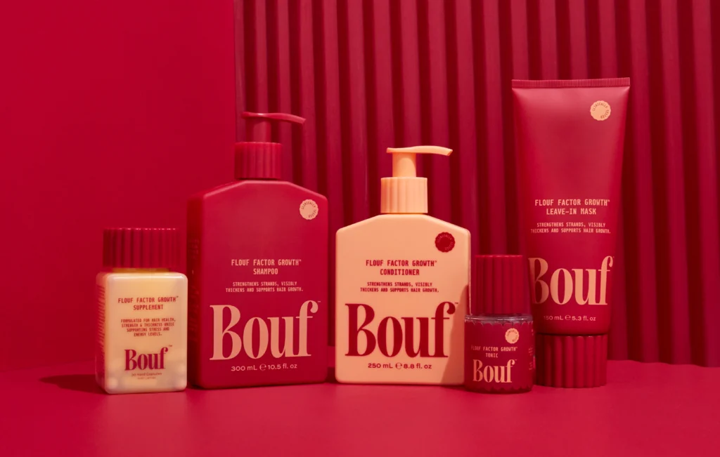
This focus on direct communication extends beyond overt advertising. Vrints-Kolsteren’s design for Napoli on the Road, which injects “mischief to minimalism,” demonstrates how distinctiveness can be built even within established aesthetic frameworks by adding specific, memorable character rather than solely relying on abstract polish. Similarly, Lisa Cain’s observations about the brand name Bouf for a postpartum hair loss product, which some perceive as “thick,” highlight how consumer perception of direct language, even if initially jarring, can contribute to a robust, if polarizing, brand identity. This suggests that avoiding “clichés” at all costs may be a misguided pursuit. Sometimes, the most effective cultural signal is one already well-understood, simply reframed or presented with a unique twist.
The primary resistance to this strategic embrace of overtness comes from an ingrained design culture that often equates perceived “artistry” with complexity, conceptual depth, or understated elegance. Many creative professionals and brand guardians operate under the assumption that true innovation in visual identity must involve a departure from the literal or the familiar. This professional bias, coupled with a desire for awards and critical acclaim within design circles, can inadvertently steer projects toward visually interesting but strategically opaque solutions, hindering effective market positioning and the clear articulation of brand equity.
Branding professionals should conduct an internal audit of current creative briefs and ongoing projects, specifically scrutinizing mandates that prioritize “disruption” or “novelty” above all else. Instead, redefine project objectives to emphasize “distinctive clarity” and “immediate comprehension” in both visual identity systems and key messaging. Actively explore how direct, even literal, visual or verbal cues can be integrated to accelerate brand recognition and simplify its value proposition without sacrificing aesthetic quality.
TL;DR
Direct and clear brand communications are proving more effective than overly subtle or abstract approaches for building brand equity.
Curated References

About this editorial — This piece was developed using AI-assisted research and curation across multiple industry sources. All analysis, opinions, and predictions represent the editorial perspective of JHDD. Sources are linked in the references section above.