JHDD Branding Report — 2026.10.03
JKR’s rebrand for Tropical Smoothie Cafe leaned into “bright, bold” tropical iconography rather than creating a generic abstract identity.
This approach highlights a quiet but persistent pattern emerging in brand identity work: a strategic embrace of direct, culturally resonant signals. Across diverse sectors, designers are finding success by confidently expressing what a brand is, often with a knowing self-awareness, rather than attempting to transcend its category through abstraction. This is not a simplistic reversion, but a sophisticated commitment to immediate recognition and emotional connection, bypassing the perceived need for conceptual distance.
Mainstream branding often operates on the premise that true sophistication lies in abstraction – elevating a brand beyond the obvious tropes of its category to achieve a perceived timelessness. The assumption is that by shedding literal associations, a brand gains broader appeal and intellectual weight. However, JKR’s work for Tropical Smoothie Cafe, described as “deliciously on the nose,” suggests this conventional wisdom is increasingly out of step with consumer receptivity. The rebrand embraced the “bright, bold” iconography of ‘tropical’ and its association with “a big body of water,” rather than attempting to invent a new visual language for health or refreshment. This approach strengthens brand equity not by moving away from easily understood cultural signals, but by mastering their precise, confident deployment. This allows for immediate recognition and emotional accessibility, circumventing the intellectual overhead often required by more abstract identities.
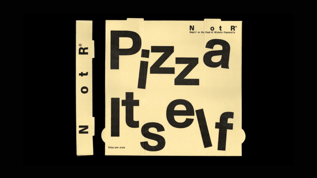
Consider Ragged Edge’s identity for the AI notepad Granola, which featured prominently in London Underground ads proclaiming it was “not for breakfast.” The name itself is a deliberate cultural signal, playfully contradicted by its actual function, forging a distinctive market position through confident specificity and self-aware humor. This isn’t a subtle wink; it’s a direct engagement with audience expectations, creating memorable engagement by leaning into the inherent tension of its name and purpose. Such clarity also applies to Vrints-Kolsteren’s identity for Napoli on the Road, which injects “mischief to minimalism” into a pizza restaurant’s branding, making it instantly engaging without sacrificing its core category identity. Within two years, more brands will prioritize identities that are robustly “on the nose,” leveraging inherent cultural fluency for immediate recognition and deeper, more authentic connection than abstract visual systems often provide.
The resistance to this trend often comes from within the design community itself, particularly among practitioners who champion minimalism for its own sake or who view direct visual communication as unsophisticated. These voices may criticize work like Vrints-Kolsteren’s identity for Napoli on the Road, seeing its playfulness or category-specific cues as a dilution of purity rather than a strategic enhancement of appeal. They are the purists who often favor subtlety over overt declaration, believing that such overtness diminishes a brand’s perceived value. This perspective overlooks the power of confident, well-executed directness to cut through noise and establish immediate resonance.
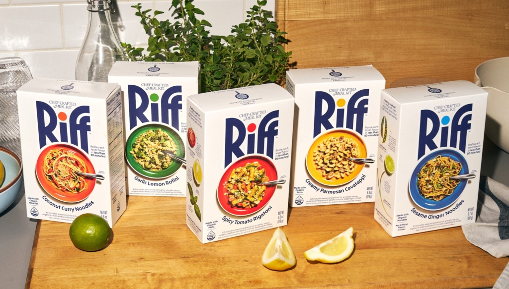
A working branding professional should re-evaluate the initial stages of visual identity development. Instead of immediately seeking to “elevate” or abstract core brand concepts, professionals should proactively identify the most visceral, unvarnished cultural signals and associations linked to the product or service, as highlighted by packaging expert Lisa Cain’s reviews of Riff and Bouf. Explore how these direct signals can be embodied with precision, craft, and self-awareness, rather than being filtered or refined out of existence. This involves asking: “What is the most immediate, compelling thing this brand is, and how can we express that with confidence and charm, ensuring it resonates authentically with its target audience?”
TL;DR
Brands are building equity by confidently embracing direct, culturally fluent identities, not by pursuing abstraction.
Curated References



About this editorial — This piece was developed using AI-assisted research and curation across multiple industry sources. All analysis, opinions, and predictions represent the editorial perspective of JHDD. Sources are linked in the references section above.