JHDD Branding Report — 2026.09.25
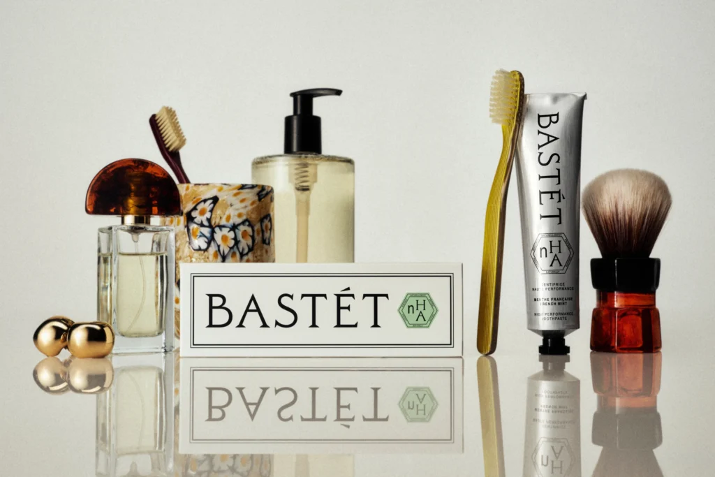
Wedge’s design for Bastét toothpaste leverages a visual identity that deliberately makes “no sense” for its category.
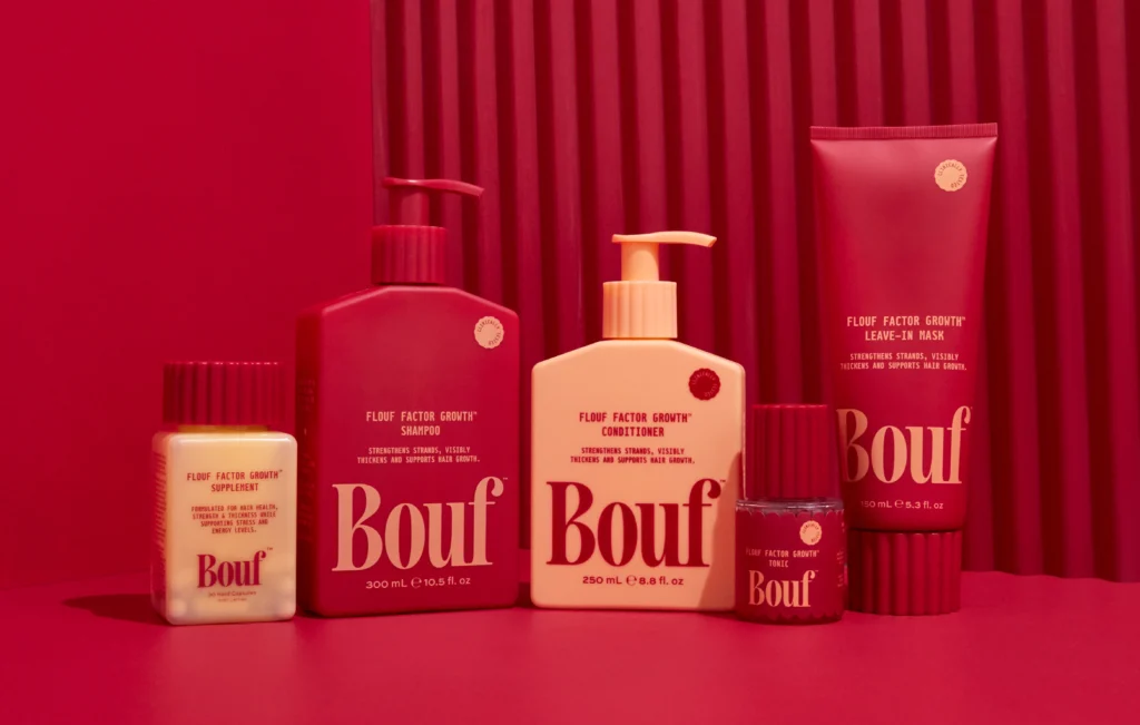
This deliberate incongruity, also seen in Mother Design’s approach for Keen and Pentagram New York’s work for Nothing Personal, points to an emerging pattern where brands are actively detaching their visual identity and market positioning from conventional category expectations. These projects prioritize aesthetic resonance and unexpected emotional connection over direct, functional representation, fundamentally transforming how brand equity is built.
The industry often champions clarity and immediate consumer recognition through adherence to established category codes. For a product like toothpaste, this typically translates to clinical visuals, hygiene cues, and direct communication of functional benefits, such as “Nano-hydroxyapatite.” However, Wedge’s Bastét challenges this, embracing an aesthetic described as “utterly gorgeous” despite its perceived illogicality within the oral care category. This move contradicts the mainstream belief that a brand must first signal its utility and reliability within known parameters to gain trust and secure market positioning. Instead, Bastét demonstrates that a distinctive, emotionally resonant visual identity, even one that initially confounds, can build significant cultural equity by standing apart from a crowded, functionally-driven market. It elevates its market positioning beyond a mere commodity, creating intrigue and a premium feel through unconventional beauty rather than straightforward benefit communication, signaling a brand for those who seek aesthetic pleasure even in mundane routines.
This strategy suggests a fundamental shift in how brand equity is formed. Rather than accruing through exhaustive feature lists or price competition, it is increasingly built on distinct personality and deep cultural signals that align with a desired lifestyle. Brands that master this approach, such as Mother Design did for Keen by tapping into a 90s New Age sensibility, will find loyalty in unlikely places and carve out valuable market niches. By mid-2028, more brands in historically conservative sectors, from financial services to industrial supplies, will experiment with visual identities that prioritize abstract cultural resonance over direct category signaling. This will be an effort to capture attention and differentiate through unexpected design, deliberately challenging established visual identity systems to occupy a more distinct cultural space.
The primary resistance to this approach comes from entrenched brand guardians and risk-averse marketing departments who prioritize incremental gains within established frameworks. These stakeholders often rely on traditional market research metrics that favor direct, unambiguous communication, viewing deviation from category norms as a threat to immediate consumer comprehension and sales conversion. They are the ones who insist on “safe” design choices, fearing any perception of irrelevance or confusion in market positioning.
Branding professionals should actively expand their visual audits beyond direct competitors to include cultural touchstones, niche communities, and even art movements that resonate with their target audience’s broader aspirations. The goal is to identify unexpected aesthetic languages that can imbue a brand with unique meaning, even if those signals seem initially unrelated to the product’s function, thereby building stronger brand equity and cultural relevance.
TL;DR
Brands are building equity by using unexpected, culturally resonant visual identities that defy category conventions.
Curated References


About this editorial — This piece was developed using AI-assisted research and curation across multiple industry sources. All analysis, opinions, and predictions represent the editorial perspective of JHDD. Sources are linked in the references section above.