JHDD Branding Report — 2026.09.20
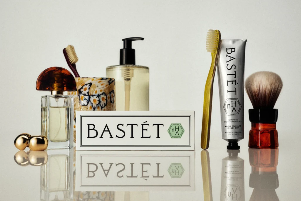
Wedge’s Bastét toothpaste design actively disregards typical oral care aesthetics, presenting a technically advanced ingredient with an identity more akin to a luxury beauty item than a dental product.
This approach extends beyond oral hygiene. A distinct pattern emerges where brands achieve differentiation and build equity by deliberately adopting visual identities and market positions that subvert their conventional categories. From psychic platforms embracing 90s New Age sensibilities to noodle joints appearing like skate brands, a new strategic imperative prioritizes cultural signaling over direct category clarity. This shift redefines how brands accrue value in a crowded market.
Mother Design’s work for the psychic platform Keen exemplifies this strategic dissonance. By embracing a 90s New Age sensibility, the design elevates a previously dismissed concept into something aspirational and culturally relevant for a ‘post-woo-woo’ audience. Conventional branding wisdom frequently advocates for category clarity, emphasizing immediate recognition and adherence to established visual codes to build trust and facilitate purchase. However, this perspective overlooks the power of strategic genre-bending, where a brand’s visual identity communicates a specific cultural stance before it communicates its functional utility.
Studio South’s identity for noodle joint Oodles, which deliberately mirrors the aesthetic of a hip skate brand, further confirms that the most impactful brand equity today is often built through cultural alignment rather than overt product description. This suggests that authenticity is perceived not in conformity, but in unexpected visual fluency, attracting consumers who identify with a particular lifestyle or subculture. By mid-2027, brands will increasingly prioritize resonant subcultural signals over broad, generic appeals, leading to a proliferation of category-defying visual identities across consumer goods and services.
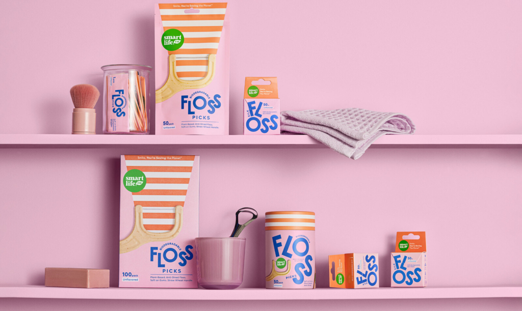
The primary resistance to this methodology comes from risk-averse corporate structures and established brands. Their reliance on extensive market research often reinforces ‘safe’ visual conformity, prioritizing mass appeal and immediate product comprehension over cultural resonance or long-term differentiation. This resistance often manifests in continued adherence to the very category norms that Lisa Cain observes make “oral care shelves…where good design usually goes to die.”
A working branding professional should actively seek inspiration and visual cues outside a client’s direct competitive set. Identify aspirational cultural movements or unrelated product categories whose visual lexicons could inject specific, differentiated meaning into a brand’s identity system, rather than simply optimizing for category norms.
TL;DR
Strategic visual identity systems gain brand equity by intentionally subverting category norms and aligning with specific cultural signals.
Curated References


About this editorial — This piece was developed using AI-assisted research and curation across multiple industry sources. All analysis, opinions, and predictions represent the editorial perspective of JHDD. Sources are linked in the references section above.