JHDD Branding Report — 2026.09.16
Studio South’s identity for the noodle joint Oodles directly borrows the visual language of a hip skate brand, employing no-nonsense stocky black lettering on a postbox red background.
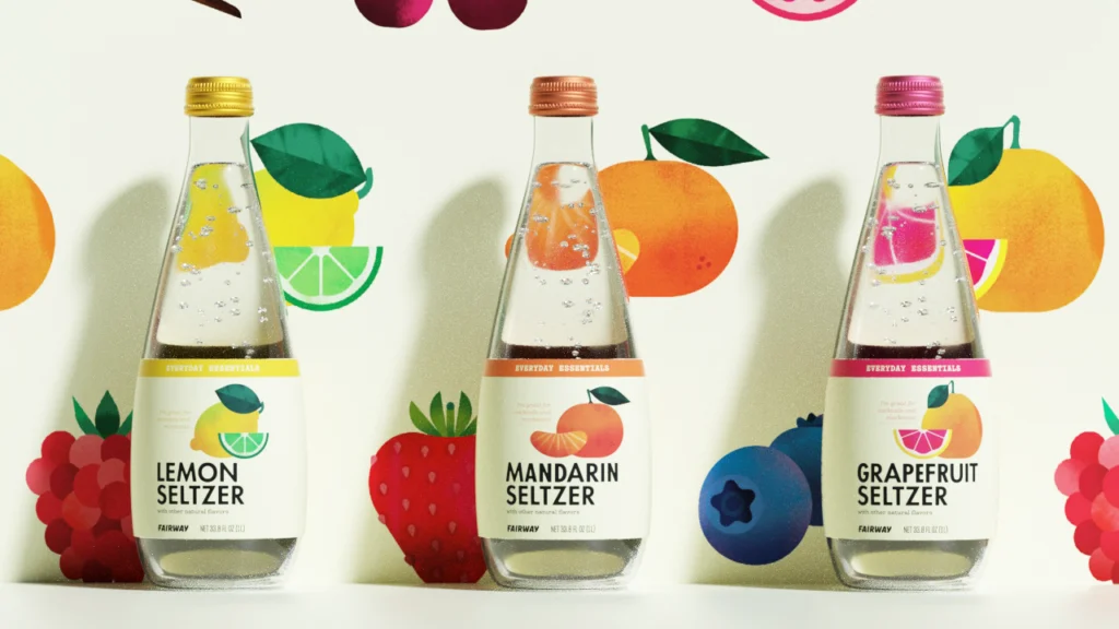
This intentional subversion of category norms appears repeatedly across recent successful branding efforts. From psychic platforms adopting 90s New Age visual cues to everyday supermarket essentials presented with distinctive character, brands are actively foraging for cultural signals in unexpected places, then recontextualizing them to forge unique market positions. They identify design languages that typically exist outside their immediate competitive set and integrate them, creating unexpected visual identities that resonate deeply.
Consider the implications for brand equity and market positioning. Many industry strategists still advocate for “category best practices,” suggesting that clarity within an established visual lexicon is paramount. This conventional wisdom, however, overlooks a crucial aspect of cultural resonance: differentiation often arises from unexpected contrasts, not conformity. The success of Oodles demonstrates that deliberately borrowing from an unrelated cultural sphere—like skate culture for a noodle restaurant—creates an immediate, strong brand signal. It tells a story beyond mere product function, implying a specific attitude, a curated experience, or a distinct community.
This approach directly counters the assumption that consumers seek visual familiarity above all else. Consumers often reward brands that surprise them with sophisticated, self-aware references. Rather than simply indicating “noodle shop,” the Studio South design for Oodles communicates “cool noodle shop that understands contemporary visual culture.” This builds a deeper connection and enhances brand equity by associating the brand with a broader, more desirable cultural landscape. By late 2027, the most effective brand launches will overtly derive their visual identities from two or more seemingly incompatible cultural references, pushing against established category boundaries.
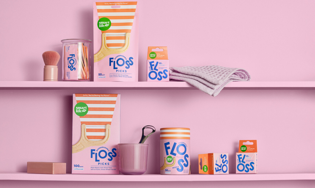
The primary resistance to this strategy comes from entrenched market leaders and the agencies that serve them, often operating within risk-averse structures. Their preference for incremental evolution within existing visual frameworks—as described by Lisa Cain regarding “oral care shelves where good design usually goes to die”—perpetuates visual homogeneity. This adherence to perceived safety prevents them from exploring the very cultural signals that could create distinct competitive advantages.
Branding professionals should, this week, identify a client’s core product or service and then brainstorm five entirely unrelated cultural scenes, subcultures, or product categories. The task is to extract three distinct visual identity elements—like a color palette, a typographic style, or an illustrative motif—from each of those unrelated sources. These findings should then be presented as “cross-pollination” concepts, demonstrating how such unexpected combinations can generate original market positioning and distinct brand equity, rather than simply iterating on category norms.
TL;DR
Brands are gaining cultural relevance and market share by intentionally cross-pollinating visual identity systems from disparate, often unexpected, cultural territories.
Curated References


About this editorial — This piece was developed using AI-assisted research and curation across multiple industry sources. All analysis, opinions, and predictions represent the editorial perspective of JHDD. Sources are linked in the references section above.