JHDD Branding Report — 2026.09.14
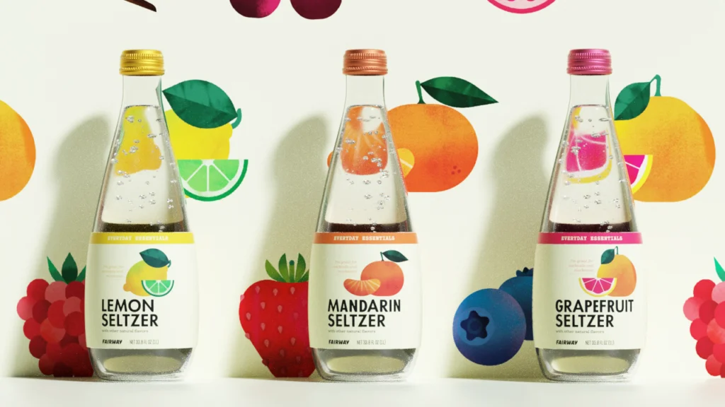
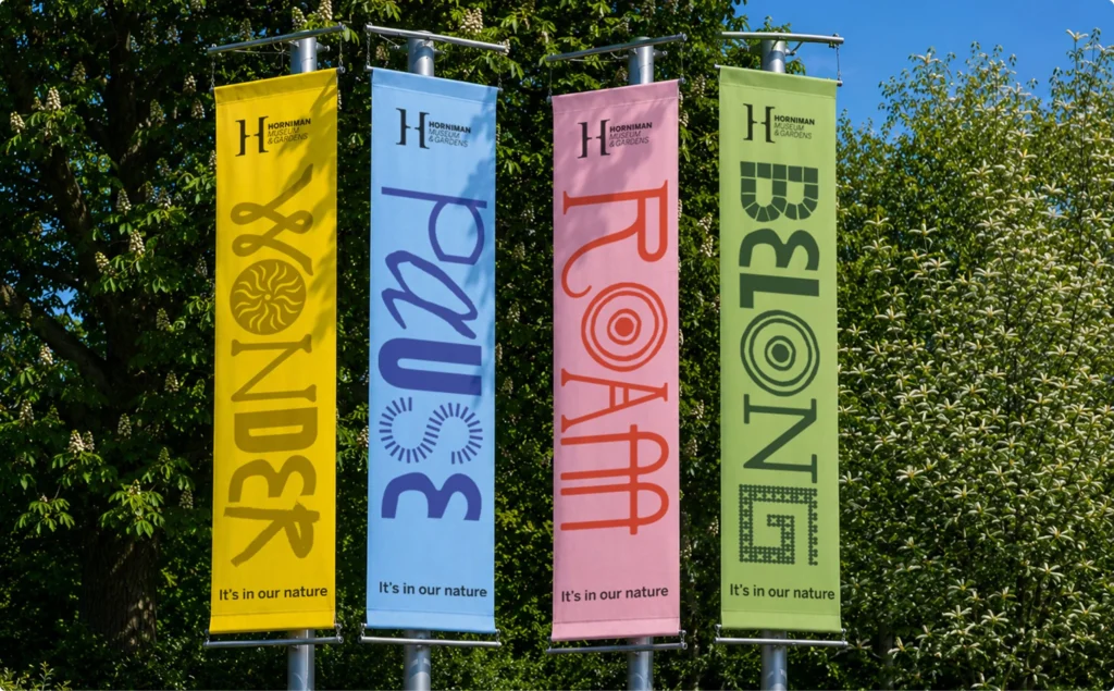
Studio South’s identity for noodle joint Oodles applies a no-nonsense stocky black lettering on a postbox red background, evoking skate brand aesthetics for a quick-service restaurant. This approach, along with Mucca’s work for Fairway Market’s everyday essentials and Anatomy’s charming identity for the Horniman Museum, illustrates a quiet but persistent redirection in design intelligence. These projects do not merely refresh existing brands; they fundamentally redefine how category norms are challenged, even in the most overlooked or historically staid sectors. The focus shifts from merely appearing contemporary to actively subverting conventional visual cues, injecting distinct personality where bland utility once dominated.
The mainstream industry often posits that brand equity in consumer goods thrives on aspiration, particularly in lifestyle or luxury segments, where visual sophistication signals premium value. However, Studio South’s strategy for Oodles presents a compelling counter-narrative to this conventional wisdom. By drawing parallels to a “perennially hip skate brand” for a noodle establishment, the studio demonstrates that powerful cultural signals of authenticity, distinctiveness, and desirability are increasingly transferable across vastly different market categories. This contradicts the traditional belief that strong brand equity requires rigid adherence to category-specific visual lexicons, or that functional, high-volume segments must settle for generic or overtly literal branding. Instead, the unexpected juxtaposition of visual codes, such as the Supreme-like lettering on a fast-casual eatery, can generate significantly stronger cultural traction and brand memorability than expected refinement, fostering a unique connection that transcends mere product utility.
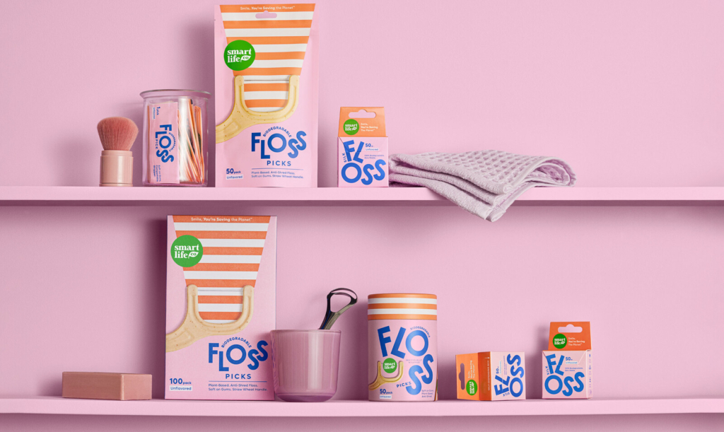
This willingness to imbue fast food with subcultural cool, or to elevate supermarket staples beyond basic function as Mucca did for Fairway Market’s everyday essentials, will profoundly reshape consumer expectations. The consistent injection of thoughtful, category-defying design into previously ignored spaces will establish new benchmarks for brand engagement. By mid-2027, the default expectation for brands operating in historically unglamorous or purely functional categories will shift from a tolerance for mediocrity to an active demand for personality and distinction. Consumers will not just accept but actively seek out visual identities that challenge their category’s traditional aesthetic, forcing even established players, from oral care to home goods, to reconsider their visual language or risk appearing dated, uninspired, and out of touch with contemporary cultural currency. The competitive edge will belong to those who dare to make the mundane memorable.
The primary opposing force to this trend comes from deeply entrenched marketing departments and risk-averse brand managers within large corporations and established institutions. These entities often prioritize perceived “safety” and conventional category cues, fearing that a disruptive or “ridiculous” visual identity might alienate a broad customer base, trigger negative feedback, or compromise perceived professionalism. Their resistance is rooted in existing brand guidelines, historical success metrics tied to conservative visual strategies, and a reluctance to deviate from what has, on paper, worked before. The internal inertia of large organizations, coupled with a focus on incremental gains rather than bold shifts, acts as a significant barrier to embracing truly transformative design.
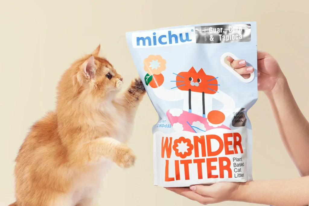
A working Branding professional should conduct an internal audit of their client’s product portfolio, specifically identifying products or services that occupy historically unglamorous or overlooked market categories, much like the oral care shelves Lisa Cain critiqued or Michu’s cat litter range. Develop a strategic brief to explore how a truly category-disrupting visual identity, leveraging unexpected cultural signals and visual language, could significantly elevate brand equity and market positioning for these items. The goal is not merely to refresh or modernize, but to fundamentally redefine the category’s aesthetic potential, creating distinct cultural value where only functional utility previously existed. This proactive exploration should challenge internal assumptions about “appropriate” branding.
TL;DR
Brand equity now strengthens by injecting disruptive, culturally resonant visual identities into overlooked or mundane market categories.
Curated References

About this editorial — This piece was developed using AI-assisted research and curation across multiple industry sources. All analysis, opinions, and predictions represent the editorial perspective of JHDD. Sources are linked in the references section above.