JHDD Branding Report — 2026.10.02
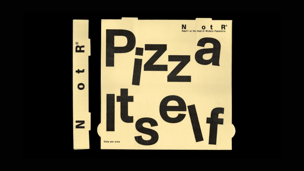
Vrints-Kolsteren’s identity for pizza restaurant Napoli on the Road leverages a deliberate “mischief to minimalism.”
This approach mirrors a broader, often unacknowledged shift across several recent brand identity projects. From the “deliciously on the nose” embrace of tropical iconography by JKR for Tropical Smoothie Cafe to Ragged Edge’s refreshingly wholesome identity for AI notepad Granola, a common thread emerges: a confident, often literal, and sometimes playfully subversive engagement with a brand’s core offering or category expectations. These projects demonstrate a strategic pivot away from abstract aspiration towards a more direct, yet still sophisticated, visual articulation of brand equity.
The work by Ragged Edge for the AI notepad Granola serves as a prime example of this emerging sensibility. Its prominent “not for breakfast” advertising campaign on the London Underground directly confronted the immediate, culinary association of its name, turning a potential cognitive dissonance into a memorable positioning statement. This strategy stands in direct contrast to the prevailing industry wisdom that often advises brands to distance themselves from literal product attributes or to elevate their visual identity into a generic, aspirational realm. Conventional thinking suggests abstracting a brand like Granola to connote innovation or efficiency in a corporate, unspecific manner. However, Ragged Edge’s approach built immediate, distinctive cultural signals precisely by acknowledging and then subverting the obvious.
This deliberate engagement with the literal, or playfully counter-literal, is a powerful mechanism for building brand equity. Rather than diluting meaning through broad aspirational imagery, these brands are sharpening their market positioning by leaning into specific, often unexpected, visual and verbal cues. The directness generates memorability and offers a clear point of differentiation. Within two years, more brands will consciously adopt this direct or counter-literal strategy in their visual identity systems, seeking to carve out unique cultural signals that resonate precisely because they are unafraid to acknowledge their tangible roots.
This directness encounters resistance from established branding methodologies focused on creating “universal appeal” or “elevating” brands beyond their functional category. Many corporate clients, advised by agencies prioritizing perceived sophistication, often default to minimalist or abstract visual identities in a bid for broad market acceptance, inadvertently homogenizing their presence.
Branding professionals should challenge client briefs that seek only abstract or aspirational solutions. Instead, deeply explore the brand’s most specific and tangible attributes, its name, or its category’s inherent assumptions, seeking opportunities for visual identity systems that can be either overtly descriptive or playfully contradictory to forge strong, memorable cultural signals.
TL;DR
Brands are building stronger equity by confidently engaging with literal or counter-literal aspects of their core offering.
Curated References



About this editorial — This piece was developed using AI-assisted research and curation across multiple industry sources. All analysis, opinions, and predictions represent the editorial perspective of JHDD. Sources are linked in the references section above.