JHDD Interior Report — 2026.09.25
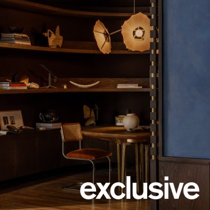
Federico Stefanovich’s renovation of his studio in Mexico City’s Edificio Humboldt deliberately showcases expressive metal lighting within a 1920s structure.
This collection of projects indicates a prevailing engagement with existing architectural envelopes, ranging from adaptive reuse to sensitive integration. The core challenge involves injecting contemporary function and aesthetic while maintaining spatial integrity, often through deliberate material and chromatic juxtapositions that redefine human interaction with established forms. The real task is to move beyond superficial contrasts toward a deeper understanding of how these interventions influence tactile quality and human flow.
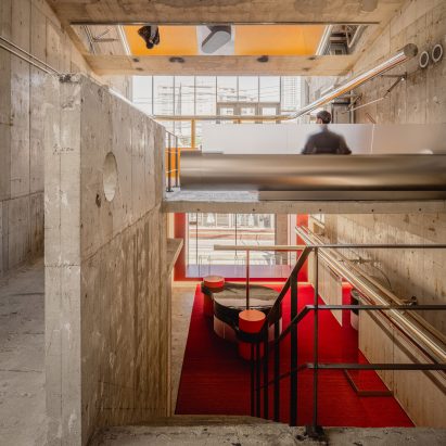
The I IN studio’s design for the Andersson Bell store in Tokyo’s Aoyama neighborhood exemplifies a deliberate spatial tension by contrasting the original 1993 exposed concrete architecture with glossy, reflective surfaces and warm red and yellow hues. This approach, while visually striking, often draws praise for its “boldness.” However, a deeper analysis reveals a common pitfall: such strong material and colour declarations risk overwhelming the merchandise and dictating a singular, high-energy human flow, rather than facilitating varied engagement. The mainstream view applauds these high-contrast statements as dynamic, yet for an actual retail experience, they can create sensory fatigue, diverting attention from the product itself. The perceived “dynamism” often translates to a transactional, rather than exploratory, customer journey. By late 2027, the market will likely see a recalibration towards more modulated spatial experiences in retail, moving away from purely high-impact visual contrasts in favour of material palettes that offer nuanced tactile and visual shifts without sensory overload.
Consider also the Apple Music Hall within the Battersea Power Station. Its placement overlooking Turbine A positions it as a grand spectacle, designed for mass appeal and controlled large-scale human flow. While admirable in its scale and integration within a heritage structure, the corporate-driven creation of such cultural anchors often prioritizes brand visibility and functional efficiency over genuine, spontaneous tactile engagement with the space. The prevailing industry narrative celebrates these corporate cultural investments as drivers of urban revitalization. Yet, the danger lies in homogenizing public spatial experiences, where bespoke material character gives way to standardized acoustic and visual programs. Within two years, more critical assessments of these corporate cultural venues will emerge, questioning their genuine contribution to diverse urban spatial textures beyond mere spectacle.
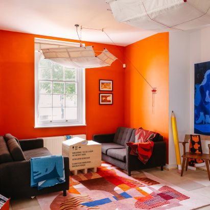
The commercial imperative for immediate visual impact and easily marketable “neurodiverse-friendly” features, as critiqued by Ellie Foster, actively resists the pursuit of nuanced spatial tension and authentic human flow. This pressure often results in superficial application of colour or texture, sacrificing genuine tactile quality for a photographable moment or a marketing claim, rather than a considered environment.
Interior professionals should commit to a rigorous material audit for every project, scrutinizing how each chosen surface, finish, and texture contributes to (or detracts from) varied sensory experiences and human flow, beyond its immediate visual appeal. This means actively experimenting with prototypes and mock-ups, focusing on how different materials feel to the touch, absorb or reflect light, and influence acoustics, particularly in transitional zones and areas of prolonged human occupation.
TL;DR
Thoughtful material and spatial tension, rather than superficial spectacle, defines enduring design.
Curated References


About this editorial — This piece was developed using AI-assisted research and curation across multiple industry sources. All analysis, opinions, and predictions represent the editorial perspective of JHDD. Sources are linked in the references section above.